All posts by weeden

Recent trends in party identification

Between the 2012 and 2016 elections, evangelical and less-educated whites moved further toward Republicans, while non-Christian and more-educated whites moved further toward Democrats.

I’ve been maintaining a cumulative file of all the publicly released Pew political and religious surveys since the beginning of 2013. It’s simply enormous, currently containing data from over 100,000 respondents.

For today’s post, I was curious about the extent of recent changes in party identification across demographic groups, changes that are fairly subtle and require a ton of data to identify reliably. So I took my big Pew database and started looking for the major movements.

Turns out the basic story combines two themes, one involving white evangelicals vs. white non-Christians and the other involving non-degreed vs. degreed whites. Generally speaking, when looking from early 2013 to mid-late 2016, white evangelicals and non-degreed whites have tended to increasingly identify as Republicans, while white non-Christians and degreed whites have tended to increasingly identify as Democrats. More specifically, the groups shifting towards Republicans have been white evangelicals (of all education levels) along with white non-evangelical Christians without college degrees, and the groups shifting towards Democrats have been white non-Christians (of all education levels) along with white non-evangelical Christians with college degrees.

The chart below shows the trend lines. (The scale here assigns 1 to Democrats, 2 to independents who lean towards Democrats, 3 to non-leaning independents, 4 to independents who lean towards Republicans, and 5 to Republicans.) In addition to the directional shifts among the two white groups, non-whites had an interesting pattern of increased Democratic support near the presidential elections but softened support in the time in between.

The next chart shows the percentage breakdowns at both ends of the time period, that is, in combined surveys from January to March of 2013 and from August to October of 2016. Comparing these two periods, non-whites are pretty similar, with around 69% landing or leaning Democratic and around 18% landing or leaning Republican. Among whites who are either non-Christian or degreed non-evangelical Christians, though, there was a noticeable shift—from 50% Democrat and 36% Republican in early 2013 to 56% Democrat and 33% Republican in mid-late 2016. And then there’s a particularly pronounced shift among whites who are either evangelicals or non-degreed non-evangelical Christians—from 33% Democrat and 57% Republican in early 2013 to 27% Democrat and 66% Republican in mid-late 2016.

(Note: HENEC refers to high-education non-evangelical Christians and LENEC refers to low-education non-evangelical Christians, where the dividing line between “high” and “low” is whether they have 4-year college degrees.)

Two things worth mentioning here. First, there’s a basic overlap between evangelical identification and having less education, on the one hand, and non-Christian identity and having more education, on the other. As I’ve noted in prior posts, people who label themselves “born again or evangelical” Christians tend to be churchgoing Protestants with less education, while people with more education are relatively more likely not to be Christians.

Second, the recent party trends among whites don’t appear to be a specific response to Trump’s nomination. That is, evangelicals and less-educated whites were already moving in a more solid Republican direction before Trump, and non-Christians and more-educated whites were already moving in a more solid Democratic direction. In fact, it seems likely that Trump’s nomination was itself made possible by the long-term decline in Republican identification among those with the most education, though it also seems likely that his nomination and subsequent victory have further reinforced this decline.

What are the big deals when linking demographics and politics?

Analyses of the public’s political opinions from Pew Research (and to an extent Gallup as well) often follow a certain script. On whatever topic they’re covering, they’ll usually start with the current numbers. Then they’ll compare the latest survey with older ones to look for trends over time.

Then they’ll break things down by party affiliation and/or liberal-conservative self-identification. For most kinds of issues, these breakdowns show very large differences—self-labeled liberal Democrats really tend to hold liberal views on various issues while self-labeled conservative Republicans really tend to hold conservative views. These kinds of splits are interesting, but often carry tremendous causal ambiguity. They result from complex mixtures of people who hold specific issue opinions because of their party or ideology along with people who favor a party or ideology because they have a given set of issue opinions.

To give a better sense of what’s driving things, the last step in the analysis often shows various demographic splits. In recent Pew political posts, for example, they showed trust in government broken down by gender, age, and education, views on the rich and the poor broken down by gender, education, and income, and budget preferences broken down by gender, age, education, and income.

Overall, it’s a pretty good script. But I’m frequently puzzled by one aspect: the choice of demographics. Gender, age, education, and income often contribute to political divisions. Yet they’re mere ripples in the pool these days compared with the crashing waves of religion and race.

In this post, then, I want to show as plainly as I can that the contributions of religion and race to political differences are typically much larger than the contributions of other standard demographic categories. That is, if you’re doing a demographic breakdown of public opinion on political topics, you’d usually want to start with religion and/or race, because they’re the biggest deals. In addition, I want to show where religion tends to be especially dominant versus where race tends to be especially dominant.

And that’s the chart below. Basically, I took a few years of recent Pew data, grouped a number of their individual questions into multi-item opinion measures (on rich-poor economic redistribution, on homosexuality, etc.), and used multiple regressions to predict differences in those political items as a function of (1) information on religious identity (whether folks are evangelical, Catholic, atheist, etc.) along with frequency of religious service attendance, (2) racial and ethnic information along with immigrant status, (3) education, (4) age, (5) gender, (6) family income, and (7) region of the country (South, Northeast, etc.) along with population density (urban/suburban/rural).

You can see in the chart that religion/church (the black bars) and race/immigrant (the green bars) are just way bigger deals than education, age, gender, income, and region/density. Further, there are some kinds of items where race/immigrant variables are particularly big deals (party identification along with views on rich-poor issues, immigration, gun regulation, racial issues, and white nationalism, which combines views on immigration, race, etc.), while there are other kinds of items where religion/church variables are clearly the dominant demographic predictors (self-labelled liberal/conservative ideology along with views on homosexuality, abortion, marijuana legalization, environmental regulation, and Middle Eastern conflicts).

(Notes: The displayed values are additive contributions to the overall multiple R in forward stepwise OLS regressions. The predictor set included a large number of binary categories—being black, being Catholic, having a college degree, having an income below $40k, going to church at least one a week, and so on, and so on—as well as interactions involving all predictors. I entered individual predictors based on which had the biggest impact at any given step.)

The demographic categories other than religion and race are never seriously big deals (at least with this set of political items). Sometimes they’re moderate deals, though. Income is a moderate deal in predicting rich-poor positions. Education is a moderate deal in predicting views on immigration and guns. Age differences are a moderate deal when it comes to immigration and marijuana legalization. And so on.

Some of these demographic differences would be larger in a stand-alone analysis. Here, I’m using a regression analysis that accounts for the biggest differences first, and then shows only the marginal contributions for less important items. So, for example, age differences in issue opinions and partisanship are in part driven by the fact that younger groups are more racially diverse and less religious. Thus, when religion and race go into the models at earlier steps, the remaining marginal contributions of age differences aren’t typically very large. The story is similar with regional and urban/rural differences, which are largely driven by racial, religious, and educational differences.

Also, there are some key demographic items that aren’t typically measured in Pew samples. From other sources, for example, I’ve found political differences based on sexual orientation, veteran status, and occupational information.

Why avoid religion and race?

So it’s puzzling to me that Pew analyses often highlight age, gender, education, and income while often avoiding religion and race. I suspect the neglect of religion relates in part to the fact that Pew has separate groups focused on politics and religion, so perhaps the politics folks don’t like to crowd into the religion folks’ turf. I also suspect some of it relates to the complexity of the religious divisions. To really find the religious fault lines, you have to spend some time grouping and regrouping the categories. In my analyses, I’ve usually ended up settling into a not-entirely-obvious system that combines Mormons and non-Catholic evangelicals into one category, other Christians in another category, “nothing in particular” and those with missing information in another, specific non-Christians (Jews, Buddhists, etc.) in another, and then atheists and agnostics in yet another. There’s no great a priori insight that drives any of this for me; it just tends to be a set of categories that carves the sample effectively when looking at political differences.

I also suspect that lots of people just don’t really enjoy thinking about religious and racial differences, and particularly don’t enjoy noticing just how much of our current political differences are attributable to these sources. There’s something creepy about it—it’s too close to home and it’s too near the bone, and all that. Or maybe that’s not it; I really don’t know.

Millennials and the 2016 Election

There seem to be at least three things that were true of Millennials in last year’s presidential election. First, they heavily favored Sanders over Clinton in the Democratic primary. Second, they heavily favored Clinton over Trump in the general election. But, third, they were substantially less likely than older folks to vote at all.

The charts below give a look at these patterns using data from the 2016 American National Election Studies (ANES). (It’s important to remember that this is just one sample. As I showed in a prior post, there are various differences among the ANES, the Cooperative Congressional Election Study (CCES), and the exit polls.)

If you’re used to thinking about exit polls, the big difference here is that I’m also showing non-voters. According to the ANES results, substantially more Millennials than older folks didn’t vote in the primaries (73% vs. 51%) and didn’t vote in the general election (38% vs. 20%). This isn’t something new—younger folks are usually quite a bit less likely to vote than older folks.

The ANES numbers, however, are almost certainly underestimating non-voters across the board. According to the United States Election Project (which uses actual vote tallies rather than after-the-fact surveys), around 41% of eligible voters didn’t vote in the general election. This is substantially higher than what the ANES sample suggests. In fact, to get to a 41% non-voting total, you’d have to assume something like a bit over half (rather than 38%) of Millennials and a bit over a third (rather than 20%) of older generations not voting. The problem with after-the-fact surveys is in part that some non-voters lie about voting, but it’s also that voluntary surveys disproportionately pick up the kinds of people who have opinions and don’t mind sharing them—that is, the kinds of people who are more likely to vote in the first place.

Millennials and the primaries

The top two charts show the primaries. And, sure enough, the ANES data suggests that, when they voted in the Democratic primaries, Millennials overwhelmingly chose Sanders over Clinton. But keep in mind that these data also suggest that older Democratic primary voters chose Clinton over Sanders in about the same overwhelming proportions. Here too, though, there are reasons not to oversell the exact numbers. The ANES sample gives Clinton a bigger total margin over Sanders (with about 59 Clinton votes for every 39 Sanders votes) than analyses based on the actual vote totals (where Clinton received 55 votes for every 43 Sanders votes). Also, the CCES sample shows Clinton running almost even with Sanders among Millennials, something that seems very unlikely given the ANES and exit poll results, but nonetheless represents a cautionary data point.

While Millennials seem to have heavily favored Sanders over Clinton in the primaries, their actual favorite option by far was to not turn out to vote (again, even the 73% non-voting number in the ANES sample for Millennials in the primaries is probably substantially too low). And, even among those Millennials who turned out, there were probably at least as many non-Sanders primary voters as Sanders voters. If you neglect these points, it’s easy to overstate Millennials’ support for Sanders.

Millennials and the general election

In the general election, we see again that Millennials were a lot less likely to vote than were older generations. And, as I discussed earlier, the ANES non-voting estimates for the general election are too low.

But for those who did vote, Millennials substantially preferred Clinton over Trump. Millennials also were more likely than older generations to support third-party candidates.

A big reason why Millennials generally favor Democrats over Republicans relates to generational differences in demographics such as race and religion. This shows up clearly in the CCES sample (which I analyzed in prior posts on Clinton/Trump voter demographics). Just looking at Clinton vs. Trump general-election voters in the CCES data, Clinton got 64% of the two-party vote among Millennials while she got only 48% of the two-party vote among older generations. That’s a 16-point gap.

And while a 16-point gap might seem like a big deal, it’s really not when you compare it to various bigger deals. So, for example, in the CCES data, there’s a 49-point gap between whites (42% voted for Clinton over Trump) and blacks (91% voted for Clinton over Trump), and there’s a 37-point gap between evangelicals (34% voted for Clinton over Trump) and non-Christians (71% voted for Clinton over Trump). Start combining such items—focusing, say, on white evangelicals—and the gaps grow even larger.

In fact, it turns out that the lion’s share of the Millennial gap in the CCES is due to the fact that, compared with older generations, Millennials have more racial minorities, fewer evangelicals and other Christians, more LGBT folks, and fewer military veterans. In short, what begins as a 16-point Millennial gap in the two-party 2016 vote gets reduced to a mere 5-point gap when statistically controlling for race, religion, sexual orientation, and veteran status.

While these fundamental demographics can explain most of the Millennial gap in the general election, they can’t, as far as I can tell, explain much of the Millennial gap in support for Clinton vs. Sanders. I have yet to see anything that really explains the strong generational splits within the Democratic primary (e.g., when I analyzed the issue positions of Millennials, it turned out that they’re actually not unusually liberal on Sanders-emphasized redistribution issues, even though they are unusually liberal in some other areas, such as views on homosexuality, marijuana, Middle Eastern conflicts, and immigration).

Another thing we don’t really know is the future. There are some safe bets, though. Like other generations before them, Millennial voter participation is likely to increase as they age. It’s also likely that, for the time being, given their demographics, Millennials will continue to prefer Democrats over Republicans when they do vote. Eventually, though, Millennials and those who come after them will inevitably force changes in the current party coalitions—there just won’t be enough white Christians around to support a viable national party organized primarily around white Christians, and so the parties will continue to evolve.

60 years of partisanship: Race, religion, and region

Back in the Eisenhower years (1953 to 1960), the U.S. electorate was over 90% white and over 90% Christian. These days, it’s closer to 70% white and 70% Christian, with people who are both white and Christian comprising just about half of potential voters.

Currently, white Christians are mostly Republicans while non-whites and non-Christians are mostly Democrats. If you were to project these modern political coalitions backward in time, you’d expect that the mid-1950s were years when the large majority of people voted Republican. But it wasn’t the case. Eisenhower himself was a Republican, but in six of his eight years both the House and Senate were controlled by Democrats.

The key, of course, is that Republicans haven’t always gathered their support from white Christians generally. Back in the 1950s, white Southerners and white Catholics were mostly Democrats. Republicans were primarily white Protestants outside the South.

Over time, however, things changed. Democratic support for the Civil Rights Acts in the 1960s contributed both to blacks becoming more solid Democratic supporters and to white Southerners moving towards Republicans. Then the slow evolution of Republicans into the party of “family values” since the 1980s led to additional movements among white, churchgoing Christians, including lots of Catholics and Southern evangelicals.

Let’s take a look at some of that. The chart below uses American National Election Studies (ANES) data from the 1950s to 2016. My “partisanship” measure combines self-labelled party identification with reported votes for president, house, and senate—so, the biggest Democrats here not only identify as Democrats but also turn out and vote for Democrats, and the same for Republicans.

I looked at ANES variables on race, religion, and region, and made splits that were big deals in predicting partisanship over time. The first splits were by race: non-Hispanic white vs. non-Hispanic black vs. Hispanic/Asian/other. Then I split whites into Protestants vs. Jews vs. “other religion” (which includes Catholics, “nones,” those in various minor religions, and also various Christians who don’t think of themselves as either Protestant or Catholic). Then I split white Protestants by South vs. not South and weekly church attendance vs. less than weekly. And I split the “other religion” folks into monthly attendance vs. less than monthly attendance—the large majority of the monthly attending folks here are Catholics and other non-Protestant Christians, while the less-than-monthly folks are a mix of “nones” and low-attending folks who nonetheless retain a religious identity.

The chart has a lot going on, but it’s not that complicated in the end. The different colors represent the different demographic groups. The size of the circles show the relative size of the groups in various years (so, e.g., you can see from the size of the red circles that the electorate used to have very few Hispanics/Asians/others but now it has quite a lot, approaching 20% in the 2016 ANES sample). The left-to-right position is the degree of Democratic vs. Republican partisanship (so, e.g., if you look at the recent years up top, you can see that blacks are especially strong Democrats while white, Protestant, Southern churchgoers are especially strong Republicans).

(Note: To smooth things out, the displayed results are based on averages of the relevant year along with the surrounding years—so, e.g., the earliest year, 1956, is based on averaging ANES data from 1952 to 1960. The exception is 2016, where I obviously didn’t have future data to average, so it’s mostly just based on 2016 data. One implication of this is that a sudden shift that occurs in Year X would actually start showing up on the chart a bit before that, and won’t fully appear until a bit after.)

If we start at the bottom of the chart in the mid-1950s, Republicans were mostly white Protestants from outside the South and Democrats were a hodge-podge of Jews, those in other religions or no religion (back then, this was mostly Catholics), non-whites, and Southern Protestants. Through the 1960s, as Democrats moved left on civil rights, blacks became very solidly Democratic and non-Southern white Protestants became less solidly Republican, while Southern white Protestants became less solidly Democratic.

Things were pretty stable for these various groups from 1970 to 1990, but then big shifts kicked in as white Protestants, churchgoers, and Southerners continued moving towards Republicans. These were the years when Republicans became paradigmatically home to white evangelicals, something that is as true today as it has ever been. In addition, the Bush II and Obama years saw further gains for Democrats among non-whites.

I’m just looking at race, religion, and region in this analysis. There are more details, obviously—income, gender, age, union membership, and so on. And, of course, the most recent election saw real splits along educational lines, especially among whites. But, still, race, religion, and region are, as far as I know, among the biggest demographic deals over this time period.

Can we know what’s coming?

Whenever I look at historical data like this—on politics, fertility, employment, religion, or whatever—I’m always struck by the tremendous uncertainty of projecting future long-term trends. I imagine someone looking at the massive downward fertility trends in the early 20th century trying to predict the mid-century Baby Boom. I imagine someone looking at the massive upward trend in prime-age women’s labor participation in the second half of the 20th century trying to predict that it would peak in 2000 and then decline. The next time you see, for example, projections of worldwide religion and fertility trends out to 2060, think about what such projections about 2016 would have looked like had we made them in 1972.

Such uncertainty is no less potent when it comes to political party coalitions. These coalitions are cobbled together and evolve in ways that rely on a variety of not-at-all-inevitable circumstances. For instance, six months ago the U.S. had a presidential election that given any one of a hundred subtle differences might have come out the other way—not quite as purely coin-tossy as 2000, but still. And the 2016 election involved complex changes from 2012, some from party switching but perhaps more so from differences in turnout.

Estimating how these kinds of complex matters might develop over longer timeframes involves a number of known unknowns and unknown unknowns. Such efforts are entertaining, to be sure, but it’s a little crazy to actually believe any of them.

Actually, epistocracy might have helped Clinton defeat Trump

But she probably would have been running against President Romney, and might have still lost.

Epistocracy is in essence the idea that voting participation or outcomes should be adjusted relative to citizens’ knowledge levels. For example, perhaps people should have to pass a basic political knowledge test before being allowed to vote, or perhaps we should allocate extra votes to people who do particularly well on such tests.

In a post last year, I took the 2016 exit polls, along with political knowledge test results from the 2012 American National Election Studies (ANES), and tried to estimate how various epistocracy proposals would have affected the 2016 presidential race between Clinton and Trump. It was complicated work, estimating party- and demographic-specific knowledge levels from the 2012 sample, and seeing how that would plug into the demographic voting patterns from the 2016 exit polls.

My conclusion was that various epistocracy proposals would have helped Trump. But the new 2016 ANES sample was recently released. And now it seems likely that my conclusion was wrong.

There’s no need for a complicated model this time. The 2016 ANES survey included nine political knowledge items (e.g., knowing which party controlled the U.S. House and Senate and being able to identify various domestic and foreign leaders). It asked people how they voted in the 2012 and 2016 presidential elections. So, you know, we can just look within the same sample at Obama vs. Romney voters and Clinton vs. Trump voters regarding how well they did on the nine-item test of political knowledge.

The chart below shows the main results, including political knowledge averages (the dots) and 95% confidence intervals (the lines). Looking at 2012, according the the 2016 ANES sample, Obama voters averaged 5.1 correct out of the 9 items measuring political knowledge, while Romney voters averaged 5.48. This was a highly significant difference (p = .00001); you can see that the 95% confidence intervals are pretty far apart. In 2016, in contrast, Clinton voters averaged 5.37, while Trump voters averaged 5.15. This was a smaller knowledge gap than in 2012, though still significant (p = .009); you can see that the 95% confidence intervals overlap a bit.

So, the headline here is that various epistocracy proposals likely would have helped Clinton over Trump. But such proposals would have especially helped Romney over Obama. (In fact, before anyone on the left gets too mouthy about the average political knowledge of Trump voters, they should note that the 2016 ANES data suggest that Trump voters were at least as knowledgeable on average as Obama voters.) And it’s entirely more difficult to say what the implications would have been for a contest pitting President Romney against challenger Clinton in 2016, though the ANES sample suggests that epistocracy proposals would have perhaps given a small boost to Romney.

OK, so how did this happen? What did my earlier estimates miss? What changed such that, in the 2016 ANES sample, we see substantially higher political knowledge for Romney voters relative to Obama voters, but then things flip in the Clinton-Trump race?

Changes from 2012 to 2016

There are at least a couple of basic things that caused my earlier analysis to differ from the results in the 2016 ANES sample. One, as I discussed in yesterday’s post, is that the 2016 exit polls have some substantial differences with the 2016 ANES sample. For example, relative to the ANES data, the exit polls contain a lot more college-educated folks, show a weaker pro-Clinton margin among the college-educated, and show a wider gender gap. In short, I checked what the 2016 ANES political knowledge outcomes would look like if the ANES sample mirrored the demographic composition of the exit polls, and Clinton’s epistocracy advantage would be reduced but not eliminated. In addition, the 2016 ANES data show marginally smaller racial and gender gaps in political knowledge than did the 2012 ANES, so that was part of it as well.

But the bigger impact comes from what the 2016 ANES sample shows about differences in turnout between 2012 and 2016. The new data suggest that two complementary things happened: A group of especially low-knowledge folks who had turned out for Obama ended up sitting out the 2016 election, while at the same time a different group of especially low-knowledge folks who had sat out the 2012 election ended up turning out for Trump. This raised the average political knowledge of Clinton voters relative to Obama voters and lowered the average political knowledge of Trump voters relative to Romney voters, something that went beyond what the basic demographics in the 2016 exit polls suggested.

As I discussed in a recent post, the 2016 ANES data show a lot of complex shifts from 2012 to 2016. These dynamics involved not only (or even primarily) voters switching between parties, but also (in fact, mainly) switches between voting and not voting.

The chart below shows averages in the nine-point political knowledge measure, split out by both 2012 and 2016 major-party votes (and non-votes).

  • There are three groups with pretty high knowledge averages: People who voted Romney and then switched to Clinton (though this is a pretty small group, which shows up in the wide 95% confidence intervals represented by the line), people who voted for Romney and then Trump, and people who voted for Obama and then Clinton.
  • And then there are three groups in the middle: People who voted for Romney and then didn’t vote for president in 2016, people who didn’t vote in 2012 and then voted for Clinton, and people who voted for Obama and then switched to Trump.
  • And then there are three groups with particularly low political knowledge averages: People who didn’t vote in 2012 and then voted for Trump, people who voted for Obama and then didn’t vote in 2016, and people who sat out both the 2012 and 2016 presidential elections.

Thus, you can see what I’m talking about at the low end of the chart. There was a group of low-knowledge Obama voters who didn’t turn out in 2016. And there was also a different group of low-knowledge Trump voters who hadn’t turned out in 2012. These groups have substantially lower political knowledge on average than both the Romney voters who didn’t turn out in 2016 and the Clinton voters who hadn’t turned out in 2012. It was these turnout dynamics that primarily drove the flip in the major parties’ political knowledge averages between 2012 and 2016.

As I’ve mentioned, these kinds of patterns might spell trouble in the 2018 midterms for Republicans. Just as Obama had personally attracted a segment of low-knowledge folks who don’t normally turn out and couldn’t be relied on in midterms, we now have indications that Trump also personally attracted his own (different) segment of unreliable, low-knowledge folks.

Political knowledge and the primaries

The 2016 ANES data provide a look at the primaries as well. The chart below shows political knowledge averages for the major contestants’ voters in the primaries (and also shows the lower average of people who didn’t vote in the primaries).

Would epistocracy proposals have affected the Clinton-Sanders primary race? It doesn’t look like it. Would epistocracy proposals have hurt Trump in the Republican primaries? Yes, it’s likely. This isn’t, though, because Trump’s primary voters were especially low-knowledge—they weren’t significantly lower than Clinton’s and Sanders’s primary voters. Instead, it’s because the other Republican primary voters were especially high in political knowledge.

These patterns reinforce a couple of earlier points. First, political knowledge is higher among people who regularly vote. And, second, typical Republican voters (whether voting for Romney in 2012 or for Cruz, Kasich, or Rubio in the 2016 primaries) do better on political knowledge tests than typical Democratic voters.

As usual, it’s complicated

So there are various ways that epistocracy might have stopped Trump in 2016. If there had been some significant epistocracy mechanism in the 2012 general election, then it’s likely that Romney would have won, and, under the usual assumptions, unlikely that Trump would or could have mounted a successful Republican primary challenge to a sitting president. Or, if some significant epistocracy mechanism had first been implemented in the 2016 Republican primaries, then it’s likely that Trump would have had a harder time winning that nominating contest—perhaps we would have seen a Cruz-Clinton race instead. Or, if some significant epistocracy mechanism had first been implemented in the 2016 general election, then it’s likely that Trump would have lost to Clinton.

But, again, just because epistocracy might have hurt Trump, it’s not the case that epistocracy would typically hurt Republicans. Quite the opposite. A significant epistocracy adjustment would have probably meant that Obama would have been, at best, a one-term president. And it also might have given an edge to any major non-Trump Republican in a race against Clinton.

And this is, of course, why support for epistocracy proposals usually comes from folks who prefer conservative economic positions but oppose Trumpian white nationalism—that is, libertarians, mostly. (In general, people who test well tend to hold more libertarian-leaning issue positions.) In the wake of Trump’s unusual, unlikely, skin-of-his-teeth Electoral College victory, though, a lot of liberals might start agreeing that some form of epistocracy would be desirable (even if impracticable). But, you know, be careful what you wish for.

Comparing samples from 2016: Exit Polls vs. ANES vs. CCES

The publicly available data on the 2016 presidential race tell a broadly consistent story, but have some important differences as well.

In addition to the 2016 exit poll results that were made public on election night, in the past month we’ve seen releases of new data from two other important samples, the American National Election Studies (ANES) and the Cooperative Congressional Election Study (CCES). The exit polls combine phone surveys of early and absentee voters with live surveys of exiting voters at a number of physical polling places; the available results appear to be from over 24,000 voters. The ANES combines an online sample and a face-to-face sample, containing around 2,800 voters. The CCES is an online sample containing around 45,000 voters.

After the actual ballots had been counted, Clinton won the popular vote over Trump by 48.2% to 46.1%. This margin of 2.1 points is very similar to the overall margins reported by the exit polls and the CCES, though the ANES sample is somewhat Clinton-skewed, containing around 49% for Clinton and 44% for Trump.

All these samples measure roughly comparable information on a number of demographic items—race, gender, religion, education, and so on. In this post, I’ll compare results across the three samples on a selection of them. While the samples are similar on some of the major themes of the election, there are also important differences. Some of these differences involve the percentages of the samples represented by various groups (e.g., the exit polls have a lot more college-educated folks than ANES and CCES). Other differences are in the Trump-Clinton margins within various subgroups (e.g., the exit polls show Trump with an especially large margin among non-degreed white men, while the ANES sample shows Clinton with an especially large margin over Trump among Hispanics).

So let’s see some details. The first chart below shows whites, blacks, Hispanics, and immigrants. There are small differences in the racial makeup of the samples, with relatively fewer whites and more Hispanics (and also more immigrants) in the exit polls, and relatively more whites and fewer Hispanics (and also fewer immigrants) in the CCES. The bigger differences are in the support margins. In particular, the ANES sample shows substantially more support for Clinton over Trump among immigrants and Hispanics. (The “Trump-Clinton Margin” here simply subtracts Clinton’s percentage from Trump’s percentage, thus showing bigger Clinton margins to the left of 0 and bigger Trump margins to the right of 0.)

The next chart below shows women, men, people with 4-year degrees, and people without 4-year degrees. Here, there are some really major differences between samples. Primarily, the exit polls show a markedly higher percentage of people with college degrees (50%), particularly as compared with the CCES (31%). Yet, recall that the exit polls and the CCES both show similar overall outcomes, giving Clinton around a 2-point advantage over Trump. And, sure enough, we see how it works in the margins by education: The exit polls have more college graduates, but show Clinton with a smaller relative advantage over Trump among college graduates—and, in this case, the smaller advantage among a larger group ends up producing an overall average similar to the CCES (which shows a larger advantage among a smaller group). The two samples end up taking different roads to the same place.

In addition, in the chart above, the exit polls showed a wider gender gap than either the CCES or (especially) the ANES. I had remarked in an earlier post using CCES data that I was surprised that gender wasn’t a bigger deal; this intuition came in part from my earlier look at the exit polls.

The next chart below shows whites split out by education and gender. Here, we see echoes from the prior chart—the exit polls had more college graduates (and, obviously, fewer non-graduates), different Trump-Clinton margins by education, and a wider gender gap. So, in this chart, we see some really big sample differences. While the exit polls showed Trump with a 48-point margin over Clinton among white men without degrees, the ANES data have this at only a 28-point margin. While the exit polls showed Trump with a 14-point margin over Clinton among white men with degrees, the CCES gave Clinton a 2-point edge over Trump with this group. While the exit polls showed Clinton with only a 7-point margin over Trump among white women with degrees, the ANES sample places Clinton’s advantage at 20 points. These are, umm, non-trivial differences.

The last chart below shows white evangelicals, non-Christians (of all races), LGBT folks, and military veterans. And there are more differences between the samples, particularly in the Trump-Clinton margins. For example, the ANES shows Clinton with a 67-point advantage over Trump among LGBT folks, while for the CCES it’s 50 points. (Actually, in the ANES, this is only LGB folks—they didn’t ask their sample about T.) Also, the CCES shows Trump with a 27-point advantage over Clinton among veterans, while in the ANES it’s 18 points.

Between deification and nihilism

Comparing across samples, there are some things we’re pretty damn sure of. For example, Clinton did a lot better than Trump among racial minorities, LGBT folks, non-Christians, immigrants, and the college-educated. Trump did a lot better than Clinton among white evangelicals, non-degreed whites, and veterans.

How much better, exactly? Well, that’s complicated. There’s no perfect data, no singular answer, no assumption-free yardstick. Each sample has idiosyncrasies and drawbacks. Each sample has “special sauce,” from sampling strategies at the front end to the construction of weighting variables at the back end. This stuff is really hard.

As a consumer of social science, a central challenge is to try to stay in that middle ground between the hazards of data deification and data nihilism. On the one side, sometimes we form opinions that are way too certain based on limited samples and stilted analyses. Indeed, as we just saw, even comparing very high-quality samples using simple percentage splits reveals a number of important differences. So just imagine all the crazy nonsense regularly produced by running, say, complex multivariate analyses using small and obviously non-representative samples. Seriously.

On the other side, sometimes the uncertainties in sampling and analysis make us too quick to throw out the baby with the bath water, or, you know, to deny that anyone ever knew there was a baby there in the first place. All population estimates based on limited samples are probabilistic, but that doesn’t somehow eliminate the fact that having more data from more sources tends to produce better estimates.

The mature response is a laborious one, one that consistently acknowledges the tremendous complexity of social science and the hard reality of noise. Ain’t nobody got time for that, I know. And I certainly haven’t always struck the right balance myself. But it’s important to try.

Electorates are like rivers

You can’t step into the same one twice.

According to the United States Election Project, around 137 million people voted for president in 2016 (out of 231 million who were eligible). In 2012, around 129 million voted for president (out of 222 million who were eligible).

Thus, there were lots of 2016 presidential voters who hadn’t voted for president in 2012—at the very least around 8 million. But, of course, it’s a much higher number than that. Some of the 129 million who voted in 2012 didn’t vote in 2016, either because they couldn’t (e.g., they died) or, more often, because they chose not to.

In fact, according to data recently released from the American National Election Studies (ANES), around 19% of presidential voters in 2016 hadn’t voted for president in 2012—that would be around 26 million out of 137 million. Further, around 12% of 2012 presidential voters who were eligible to vote in 2016 didn’t vote for president in 2016.

It’s understandable that folks prefer to think of the voting population as a rather fixed thing—as though, for example, when you look at Michigan in 2016 and see that Trump beat Clinton by 47.5% to 47.3%, while back in 2012 Obama beat Romney by 54.2% to 44.7%, then that probably means that the main story is that tons of Obama voters switched to Trump in Michigan. But it’s just really more complicated than that.

So let’s see some details from the ANES data. Here, I’m looking only at people who reported voting for president in either 2012 or 2016 (that is, I’m excluding people who didn’t vote for president in either election). In other words, it’s a sample of the combined 2012/2016 presidential voters, as surveyed in 2016 (which means it’s missing people who voted in 2012 but then died or otherwise became ineligible to vote before 2016).

The first chart below shows the full sample of 2012/2016 presidential voters. It’s broken down by major-party votes (Obama vs. Romney and Clinton vs. Trump) along with “neither,” which combines non-voters and third-party voters. So, for example, the “Neither Neither” category combines people who voted third party in both elections, people who didn’t vote for president in 2012 and then voted third party in 2016, and people who voted third party in 2012 and then didn’t vote for president in 2016.

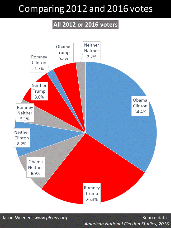
The results show a remarkably dynamic situation. Overall, in this sample of 2012 and 2016 presidential voters, around 61% voted for the same party in both elections. And then around 27% voted in one but not the other presidential election, including non-voters in 2012 who then voted in 2016 (17%) and 2012 voters who sat out 2016 (10%). And the other 12% voted in both elections but either switched between the major parties (7%) or switched between a major party and a third party/independent candidate (5%).

Given how close Trump’s Electoral College victory was, you can pin it on any number of causes. Would Clinton have won if more Obama voters had turned out? Yes. If she had been able to pull in more previous non-voters? Yes. If more Romney voters had sat this one out? Yes. If Trump had attracted fewer former non-voters? Yes. If she had converted more Romney voters? Yes. If Trump had converted fewer Obama voters? Yes.

Now, it’s certainly the case that Obama was more popular relative to Romney than Clinton was relative to Trump. This shows up in a number of ways. Most obviously, Obama’s popular vote win was bigger than Clinton’s popular vote win. And, according the ANES data, there were more Obama-to-Trump voters than Romney-to-Clinton voters. And, while both Clinton and Trump pulled in substantial numbers of prior non-voters, there were more Obama voters than Romney voters who sat out 2016 (or voted third party).

The thing I don’t get, though, is the continued narrative that particularly highlights Trump’s conversion of former Obama voters. Yes, it was a contributing factor. But, no, it doesn’t look like The Biggest Thing. Relative to the number who switched from Obama to Trump (5.3%), there were considerably more folks who had voted for neither Obama nor Romney in 2012 and then voted for Trump (8%) or who voted for Obama and then voted for neither Clinton nor Trump (8.9%).

A few subgroups

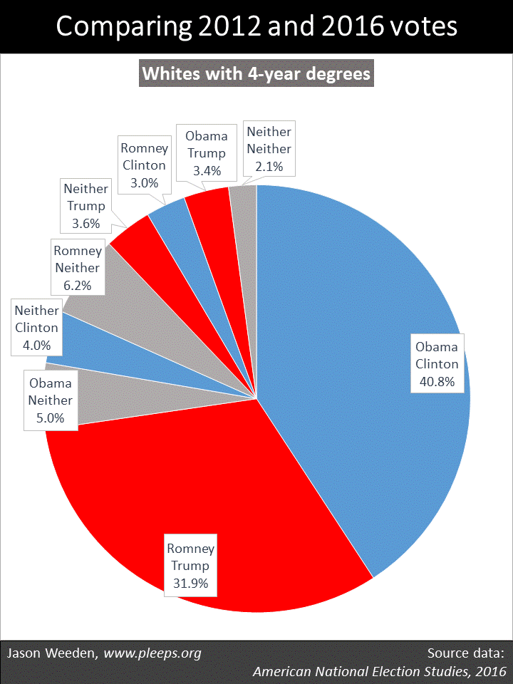
I suspect that many of my readers are surprised by the level and complexity of these electoral shifts. But I also suspect that many of my readers are college-educated whites. And college-educated whites are weird. Politically, among other things, they have high turnout rates and they’re much more likely than other folks to hold consistently liberal or consistently conservative positions.

So you just don’t see as much electoral instability among college-educated whites. The chart below shows it pretty clearly in the 2016 ANES data. Here, around 74% were in the voted-for-the-same-party-in-both-elections club, 7% were new voters, 6% were drop-outs, 6% switched between major parties, and 6% switched between a major party and a third party/independent. Further, the dynamics from 2012 to 2016 among whites with 4-year degrees had roughly balanced effects on the 2016 race. For example, Clinton and Trump attracted about the same number of new voters, about the same number of Romney and Obama voters voted for neither Trump nor Clinton, and about the same number switched from Obama to Trump as from Romney to Clinton.

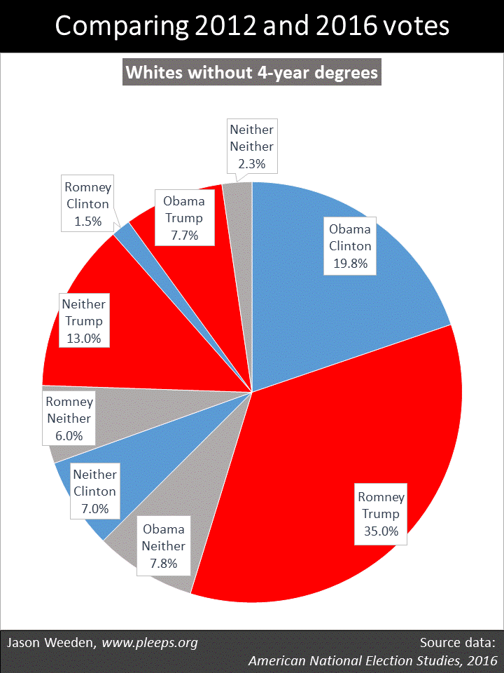
In contrast, things were just a lot less stable when you move away from degreed whites. The next chart below shows whites without 4-year degrees. For these folks, only around 55% were in the voted-for-the-same-party-in-both-elections camp. And you can really see Trump’s strengths with this group. In particular, while 35% voted for both Romney and Trump, another 13% voted for Trump after not having voted (or voted third party) in 2012, and then another 7.7% voted for Trump after voting for Obama in 2012. (Again, this doesn’t support a Trump-won-mainly-by-converting-Obama-voters narrative—there were substantially more new voters in Trump’s white working-class base than there were 2012 Obama voters, something I also found when I looked at recent data from the Cooperative Congressional Election Study (CCES).)

Non-whites also displayed similarly high levels of electoral instability when we compare 2012 with 2016, shown in the chart below. Here, only around 57% were in the voted-for-the-same-party-in-both-elections camp. Unlike non-degreed whites, though, when non-whites did turn out to vote, Democratic candidates had an enormous advantage. But there’s great variance in turnout. In this ANES sample of 2012/2016 voters, around 15% of non-whites voted for Obama but then not for either Clinton or Trump, which was almost exactly offset by around 15% who had voted for neither Obama nor Romney but then voted for Clinton.

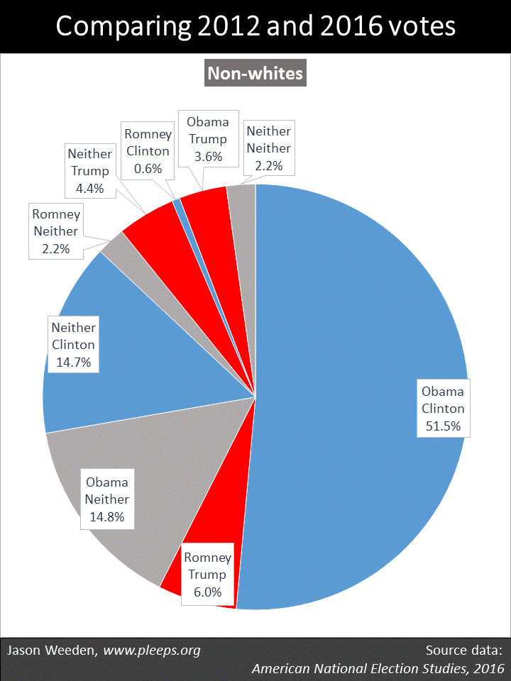
The ANES data on non-whites does suggest, though, some real weaknesses for Clinton relative to Obama. In general, one might have expected a larger portion of new Clinton voters relative to dropout Obama voters from at least a couple of sources—including from younger folks who came of voting age since 2012 and from recently naturalized immigrants. Further, there were hardly any Romney-to-Clinton converts among non-whites, while there was a small but not insignificant number of Obama-to-Trump converts. Indeed, in a pretty startling bit of detail, there were more non-whites who didn’t vote for Romney and then voted for Trump (8%) than who did vote for Romney and then voted for Trump (6%).

Yeah, but …

Yeah, but, it’s just one sample. True. It’s always better to have multiple independent data sources when addressing complex issues. I will say, though, that one of my main conclusions—that, among non-degreed whites, Trump had more prior non-voters than Obama converts—looks pretty similar in the ANES sample here as it did when I looked at the 2016 CCES sample. Now, having said that, I can also report a major difference between the ANES and CCES samples—the latter has fewer 2016 non-voters and, relatedly, more same-party 2012/2016 voters. I haven’t yet developed a good sense of why that is.

Yeah, but, retrospective surveys inflate the winner’s support, and in this case will especially inflate Obama’s support in 2012. Also true. Indeed, a suspiciously high percentage of the ANES sample report voting for Obama relative to Romney in 2012. Two things, though. First, you actually should expect some degree of Obama inflation here relative to Romney. This is because Romney did particularly well with seniors and, not to put too fine a point on it, people who were seniors in 2012 are less likely to show up in a 2016 survey than people who were not seniors in 2012. But, still, the Obama vs. Romney numbers remain high. Which raises a second point: If you think that the Obama vs. Romney numbers are off in favor of Obama, what that means is that you think that the number of Obama-to-Trump converts is probably even lower than these samples are showing. And, likewise, you think that the number of new Trump voters is probably even higher. That is, if anything, these samples are probably underreporting the extent to which new Trump voters outnumbered Obama converts.

Will Trump have his own midterm problems?

Before 2016, the presidential and midterm elections from 2008 to 2014 were marked by seesawing variations in the partisan makeup of the voting population. Obama scored strong victories in his presidential elections, only to be followed by a “shellacking” in both midterms. Prior to 2016, this created a conventional wisdom about how Democrats do well in presidential years but not midterms. After 2016, though, conventional wisdom shifted: This wasn’t a phenomenon about Democrats but more specifically about Obama—when Obama was personally on the ballot, he drew out a segment of supporters who don’t typically vote.

So now it seems we might see something similar with Trump. He drew out his own segment of supporters who don’t typically vote—whites without college degrees who are younger and poorer. It could be that many of them grow disillusioned with Trump, given that he seems likely to break some of his populist promises (e.g., to make sure everyone has better and cheaper healthcare). But we could also see a more basic Obama-like phenomenon, where many of Trump’s new voters simply don’t show up in midterms when he isn’t personally on the ballot, even if they’ll turn out in 2020 when he is.

We’ll have to wait and see. The details of who turns out to vote from year to year are messy, complicated, ever-changing. Or as Socrates put it (according to Plato): “Heracleitus says, you know, that all things move and nothing remains still, and he likens the universe to the current of a river, saying that you cannot step twice into the same stream.”

Who are the ideologues?

People whose issue opinions cluster into relatively consistent liberal or conservative bundles tend to be better educated, white, older, and richer.

It’s one thing to ask about the features that tend to divide liberals and conservatives. Religion and sexual orientation are big deals here, along with race, education, church attendance, military service, gender, income, and so on (see, e.g., here and here).

It’s another thing to ask about ideological consistency. When surveys solicit opinions on a number of different kinds of issues—on abortion, income redistribution, immigration, the military, same-sex marriage, the size of government, race, the environment, guns, and so on—some people are pretty thoroughly either liberal or conservative, where the large majority of their issue positions line up on the same side. But then some people pretty thoroughly mix-and-match their issue opinions, choosing about as many liberal positions as conservative ones.

The tendency to hold issue opinions that are ideologically clustered (or not) has its own set of demographic predictors. When we looked at General Social Survey data (in our book and an article), Kurzban and I identified a big divide between whites with college degrees and everyone else. Across different political issues, whites with college degrees have lots of the most consistently liberal folks as well as lots of the most consistently conservative folks.

The recent 2016 Cooperative Congressional Election Study (CCES) presents a good opportunity to dig deeper here. It’s really big, with over 64,000 respondents who were asked a nice range of different issue opinions. The downside is that it’s an online study, which self-selects a more sophisticated sample, thus overestimating things like political engagement and ideological consistency. But while the baseline might be off somewhat, we can still see what sorts of features tend to distinguish between the ideologues and the mixers-and-matchers.

Basically, I took my CCES ideology scale, which combines 10 different issue positions (on abortion, guns, the minimum wage, immigration, and so on), and instead of looking for what predicts liberals vs. conservatives, I looked for what predicts ideological consistency vs. inconsistency. I examined a broad range of available demographics and the big splits are shown in the chart below.

My results report two things. One is a basic breakdown on ideological consistency, where I’m using Pew’s definitions for what counts as “consistent” (i.e., people whose issue preferences almost all line up in the same direction), “mixed” (i.e., people whose issue preferences are pretty close to equally divided), and “mostly” (i.e., people in between “consistent” and “mixed”). The second thing I show is the percentage of variance that a single factor accounts for in a factor analysis of the 10 issue items within the given group. Don’t worry if you don’t know what that means—just understand that a bigger number here means a higher degree of ideological consistency.

The CCES sample confirms the big roles of education and race in ideological consistency, but suggests some other details as well. One is that, within college-educated whites, Millennials are substantially less likely to be left-right ideologues. This could say something about Millennials in particular, but, more likely, it’s probably a general effect of age. That is, I imagine that if I looked at a big sample from the mid-1990s, where now it’s the Gen Xers who are the younglings, we would see similar patterns of reduced ideological consistency. Or, to put it another way: Just wait—as they age, it’s likely that educated, white Millennials will come to match the ideological consistency of educated, white older folks.

Another detail is that, among the non-college folks, income shows up as a major secondary factor—here, those with lower incomes are less ideologically consistent than those with higher incomes. This overlaps, of course, with both race and education.

The overall differences here are large. Among non-Millennial whites with 4-year degrees in the CCES sample, around 50% are consistent ideologues. But among people who’ve never been to college and who have household incomes below $40,000, only around 17% are consistent ideologues. Among not-so-poor people who’ve never been to college as well as non-whites with at least some college, only around 25% are consistent ideologues. (And, again, all these numbers are inflated relative to the population as a whole, given the skew in online samples.)

Ideology and demographics

I’ve pointed out the big overlap among items such as demographics, identities, ideology, partisanship, issue opinions, and interests. For example, while some political scientists have argued that the electorate is driven by social identities rather than by ideology or issue opinions, it actually doesn’t make much sense to draw such distinctions too starkly.

Along these lines, we’ve just seen that some groups are more likely to hold ideologically clustered opinions than are other groups. In other words, left-right ideology is a bigger deal for some groups. Does this mean that social identities are less relevant for these groups? Not at all. In fact, in an important sense, the more ideological a group, the more relevant some basic demographics become in predicting their politics.

I show a bit of this in the chart below. Here, I’ve taken the six groups from the prior chart—groups that run from most ideologically consistent up top to least down below. Within these groups, I looked at how some of the big-deal demographics—religion, church attendance, sexual orientation, military service, and gender—predict their liberal vs. conservative leanings (using my 10-issue CCES ideology scale).

The question here is: Within these groups, how big of a difference do these demographics make in dividing liberals from conservatives? The clear overall pattern is that, in general, and especially with regard to religion, demographics are more predictive of issue opinions among more ideologically consistent groups than among less ideologically consistent groups. For instance, on my 10-point scale, non-Christians are around 4.7 points to the left of churchgoing evangelicals when we look within the most ideological group (i.e., non-Millennial whites with 4-year degrees), but non-Christians are only around 1.9 points to the left of churchgoing evangelicals when we look within the least ideological group (i.e., people who haven’t been to college and have incomes below $40,000).

(Note for nerds:  The chart above reports OLS regression estimates from models where these demographics are simultaneously predicting my 10-point CCES ideology scale.)

Put another way, when you know their religion, sexual orientation, military service, and gender, it’s actually a lot easier to predict the various issue opinions of college-educated whites than those of other folks. Increased ideological tendencies actually make key social identities more (not less) relevant. So you shouldn’t view ideology and social identities as competing explanations here—again, there’s a big overlap.

Public opinion on budget trade-offs

Americans show a mix of self-interest and ideology in their reactions to trade-offs among domestic spending, defense spending, and taxes.

The 2016 Cooperative Congressional Election Study (CCES) asked its respondents an interesting item on budget priorities: “The federal budget deficit is approximately $1 trillion this year. If the Congress were to balance the budget it would have to consider cutting defense spending, cutting domestic spending (such as Medicare and Social Security), or raising taxes to cover the deficit. Please rank the options below from what would you most prefer that Congress do to what you would least prefer they do: Cut Defense Spending; Cut Domestic Spending; Raise Taxes.”

The item is explicitly built around trade-offs, given that it asks people for a rank order of their preferences among the three options. Overall, cutting defense spending was the most popular (37% tagged it as their first choice and only 23% as their last) while raising taxes was the least popular (24% placed it first while 42% placed it last). This is neither a “liberal” nor a “conservative” pattern—the most popular item (cutting defense) and the least popular (raising taxes) are both things that liberals tend to support and conservatives tend to oppose, in some form or another. Really, it’s the prioritization of domestic spending relative to the other two that divides the sides. (Indeed, the preference for domestic cuts was one of the items included in the 10-issue CCES ideology scale that I analyzed the other day.)

Who’s more likely to want to protect defense spending by cutting domestic spending, protect domestic spending by raising taxes, and so on? I examined a large range of demographic variables and identified the ones that seem to be making the most substantial contributions.

The chart below shows the results. For data nerds, I’ve included a set of regression results (see the notes below the chart for details). For everyone else, just focus on the “and what they mean” section at the bottom of the chart. In short, different demographic features predict different splits in priorities.

The most common trade-off was between domestic spending and defense spending. There were various features where, on average, it’s more likely for folks to want to protect domestic spending at the expense of defense spending (being black, atheist/agnostic, and LGBT), and others where folks are more likely to want to protect defense spending at the expense of domestic spending (being a veteran or a Christian, particularly an evangelical).

(Notes: The response items are coded 1=first preference, 2=second, and 3=third. The predictor variables are coded 1=applicable and 0=inapplicable. The results are from OLS regressions, and I’m reporting unstandardized coefficients. All evangelicals are also Christians, so the effects of “evangelical” are over-and-above being “Christian.”)

There were also features that predicted wanting to allow higher taxes in favor of protecting either domestic spending (being retired/disabled, atheist/agnostic, and LGBT) or defense spending (being a Baby Boomer or older). Obviously, most of the retired/disabled folks are also older, so this reveals particular support for raising taxes among older folks relative to cutting spending.

And keep in mind that things go the other way as well. The results show that older people and those retired/disabled are relatively more likely to favor higher taxes. But this also means that younger workers are relatively less likely to favor higher taxes, preferring to cut spending. Similarly, the results show blacks favoring domestic over defense spending, but this also implies a relative preference among non-blacks for defense over domestic spending.

Interests and coalitions

Some aspects of these results are consistent with an interest-based perspective. At first, I was surprised that I didn’t see poorer folks being much more likely to want to protect domestic spending (though race shows up). Instead, there was a pretty clear pattern where older folks and retired/disabled folks favored tax increases over spending cuts. But then I went back to the question wording. The question only mentions cuts in Social Security and Medicare as examples of “domestic” cuts. And, sure enough, retirees and disabled folks are more likely to favor protecting this spending (which for many of them is a big deal), trading it off against higher taxes (which wouldn’t greatly affect many of them). Similarly, military veterans want to protect defense spending—some of these veterans are currently enlisted, and, at any rate, almost 10% of the defense budget is allocated to the Department of Veterans Affairs.

The results remind me of another survey showing that, when forced to choose among spending priorities, older folks prioritize Social Security and defense, while younger folks prioritize job creation and education. If you don’t see at least a bit of self-interest there, then you need to check your glasses.

Other features show the potency of current ideological and party coalitions. In particular, atheists/agnostics and LGBT folks are often liberal on lots of different kinds of issues, whereas evangelicals (and particularly white evangelicals) are often conservative on lots of different kinds of issues (see, e.g., here).

Even for religion and sexual orientation, though, there’s a degree of interest-based thinking available. Some of the fight over safety-net spending involves relative preferences between governmental safety nets and private charitable programs. Kurzban and I have argued that people who might rationally worry about discrimination from white, Christian charities (e.g., non-whites, non-Christians, and LGBT folks) ought to have some degree of preference for non-discriminatory governmental safety-net programs.

But it’s clear that some dramatic recent shifts—in ideological clustering and specifically in the economic policy preferences of wealthier non-Christians—also have coalitional aspects. The Reagan era brought about a lasting alignment between religious conservatives and small-government conservatives, pushing many non-Christians to the left and away from their former libertarianish positions. Though I don’t have data directly on point, I’m assuming that the story has been similar for LGBT folks. It also seems likely that we’ve seen a related story with military veterans, as Republican support for defense spending has drawn veterans in and produced some coalitional shifts in veterans’ views on rich-poor and religious issues.

These kinds of coalitional trends aren’t, of course, wholly divorced from interests. They involve folks who really care about a given set of interest-based positions adjusting opinions on other issues that are less important to them. This produces results such as those we’ve just seen for budget priorities, where some predicting features seem interest-based while others seem coalitional. Yet, typically, the underlying patterns of coalitional choice are themselves linked to interests. It would be a real stretch to argue, for instance, that the current Democratic/liberal coalition (which strongly opposes group-based discrimination) doesn’t represent high-priority interests of most atheists and LGBT folks, and vice versa for the Republican/conservative coalition in relation to white evangelicals.

As I’ve said, there’s a big overlap among the standard toolkit of political explanations. It’s usually not very plausible to make this-thing-matters-but-that-thing-doesn’t sorts of arguments when thinking about demographics, identities, interests, partisanship, ideology, and issue positions. It’s all there, intermingled, thwarting facile answers.

The reality and myth of the decline in men’s employment

From the 1970s to the 1990s, the employment rate for prime-age men fell, while for women it rose dramatically. Since 2000, however, both have declined (and partially recovered) about equally. The recent pattern doesn’t point to a particular problem with men.

Men, apparently, are in trouble. In the 1950s and 1960s, typically around 94% of men ages 25 to 54 were working. But in the past 10 years, they averaged only around 84%. And the alarm bells are ringing: The Decline of Men. The Missing Men. Men at Work … or Not. The Nonworking Prime-Age Men. America’s Men Aren’t Working.

In a prior post, I looked at young men’s work and school patterns. There’s been all this talk of how they’re playing video games and living in their parents’ basements, and I wanted to get a better sense of the scope of the problem. I was genuinely surprised by what I saw, or, more to the point, didn’t see. When you look at men in their teens and early 20s, it just isn’t the case that they display a major new trend of idleness. Mostly, it’s just that the Great Recession really was a great recession.

However, heading into prime-age territory, I did see that there were worrying trends for men in their late 20s and early 30s. Their recent rise in idleness went beyond what we’ve seen before.

So for today’s post I wanted to take a closer look at prime-age men, defined as ages 25 to 54. The Bureau of Labor Statistics has employment-population ratios for this group going back to 1948. And as I was looking at that, I started focusing in on the similarities between men’s and women’s employment trends over the past 20 years. And I was again surprised.

There are three charts in the graphic below. The first shows the yearly employment-population ratios for both men and women ages 25 to 54 from 1948 to 2016. The main historical trends are immediately apparent. From the late-1940s through the late-1980s, women’s work rates rose spectacularly, particularly starting in the mid-1970s. They stalled in the early-1990s, but then crept up further, reaching their as-yet all-time high in 1999/2000.

Prime-age men, on the other hand, with various ups and downs, have been on a slow overall decline since the 1970s. They averaged around 94% working in the 1950s and 1960s, 91% in the 1970s, 88% in the 1980s and 1990s, 86% in the 2000s, and 83% in the 2010s.

But here’s the thing. Women’s employment has been declining since 2000 as well. You can see it more clearly in the middle chart, which zooms in on 2000 to 2016. Both men and women failed to reach their 2000 employment level in the period between recessions in the mid-2000s; both were hit hard by the Great Recession; and both have since made partial but not full recoveries, currently landing pretty close to their 2008 employment levels.

It’s the last chart that really shows it. I put men and women on the same scale, looking at both as a percentage of their 2000 employment levels. And there’s the story. Men and women were about equally affected by the early-2000s slowdown; men pulled ahead a bit in the subsequent housing-bubble recovery; then men were hit especially hard in the housing bust and financial collapse; men started recovering first; and now—and this is really the surprising point—for the past few years men and women have been making about equal progress along practically the same slope relative to their 2000 employment levels.

In short, that whole thing about how men have been experiencing a 21st century employment decline relative to women doesn’t seem to be actually, you know, true. Prime-age men are down from 2000, to be sure. But so are women, to basically the same degree.

(Note: The BLS has data through February of 2017, and I wanted to use the most recent data, so each year here goes from March of that year to February of the following year. So, for example, the 2016 numbers combine March 2016 to February 2017.)

I could see—maybe—telling a “recent decline of men” story around 2010 or 2011. Men were getting hit particularly hard then. But I really don’t understand how the employment numbers from 2012 to the present support that narrative. Yes, men are down. But so are women. We can tell all the stories we want about porn and drugs and marriage declines and video games, and how those things are sapping prime-age men’s will to work. But then we need to explain why women have been experiencing very similar declines since 2000. It seems likely that one should be looking for explanations that apply roughly equally to men and women.

Why the spotlight on men?

So, yes, I’m surprised. Given all the hype about declining men, this is not what I was expecting to see. While there is an essential reality to the hype—the percentage of prime-age men working has basically been declining since the 1970s—there’s also a big myth, in that the past 20 years have not seen an overall decline in men’s employment relative to women’s employment. Both have declined (and partially rebounded) to similar degrees, though the timing and scope of their hits from the Great Recession differed somewhat.

Which begs the question: What is it that makes so many people so eager to tell a men-only story about recent employment trends? I get why we tell separate stories about the second half of the 20th century—women’s employment was shooting up while men’s was creeping down. But what’s driving the 21st century narrative, when men and women are showing very similar trends?

Perhaps it has something to do with the fact that, when we really don’t want to do anything to help struggling people, we often focus on some blame-worthy caricature. Perhaps uneducated, responsibility-avoiding men are the high-education liberal/libertarian analog to the right’s welfare queens—the narrative figures that suggest that the only urgent response warranted is vigorous finger-wagging. Or maybe that’s not it. I really don’t know.