
The publicly available data on the 2016 presidential race tell a broadly consistent story, but have some important differences as well.
In addition to the 2016 exit poll results that were made public on election night, in the past month we’ve seen releases of new data from two other important samples, the American National Election Studies (ANES) and the Cooperative Congressional Election Study (CCES). The exit polls combine phone surveys of early and absentee voters with live surveys of exiting voters at a number of physical polling places; the available results appear to be from over 24,000 voters. The ANES combines an online sample and a face-to-face sample, containing around 2,800 voters. The CCES is an online sample containing around 45,000 voters.
After the actual ballots had been counted, Clinton won the popular vote over Trump by 48.2% to 46.1%. This margin of 2.1 points is very similar to the overall margins reported by the exit polls and the CCES, though the ANES sample is somewhat Clinton-skewed, containing around 49% for Clinton and 44% for Trump.
All these samples measure roughly comparable information on a number of demographic items—race, gender, religion, education, and so on. In this post, I’ll compare results across the three samples on a selection of them. While the samples are similar on some of the major themes of the election, there are also important differences. Some of these differences involve the percentages of the samples represented by various groups (e.g., the exit polls have a lot more college-educated folks than ANES and CCES). Other differences are in the Trump-Clinton margins within various subgroups (e.g., the exit polls show Trump with an especially large margin among non-degreed white men, while the ANES sample shows Clinton with an especially large margin over Trump among Hispanics).
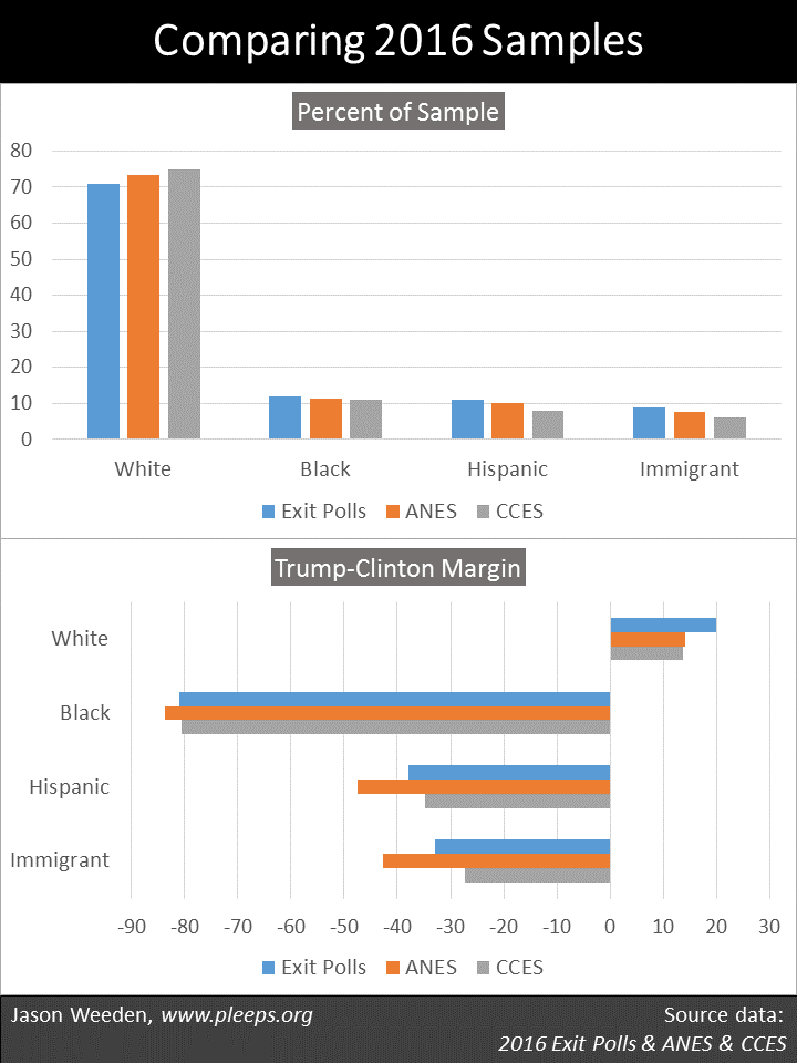
So let’s see some details. The first chart below shows whites, blacks, Hispanics, and immigrants. There are small differences in the racial makeup of the samples, with relatively fewer whites and more Hispanics (and also more immigrants) in the exit polls, and relatively more whites and fewer Hispanics (and also fewer immigrants) in the CCES. The bigger differences are in the support margins. In particular, the ANES sample shows substantially more support for Clinton over Trump among immigrants and Hispanics. (The “Trump-Clinton Margin” here simply subtracts Clinton’s percentage from Trump’s percentage, thus showing bigger Clinton margins to the left of 0 and bigger Trump margins to the right of 0.)
The next chart below shows women, men, people with 4-year degrees, and people without 4-year degrees. Here, there are some really major differences between samples. Primarily, the exit polls show a markedly higher percentage of people with college degrees (50%), particularly as compared with the CCES (31%). Yet, recall that the exit polls and the CCES both show similar overall outcomes, giving Clinton around a 2-point advantage over Trump. And, sure enough, we see how it works in the margins by education: The exit polls have more college graduates, but show Clinton with a smaller relative advantage over Trump among college graduates—and, in this case, the smaller advantage among a larger group ends up producing an overall average similar to the CCES (which shows a larger advantage among a smaller group). The two samples end up taking different roads to the same place.
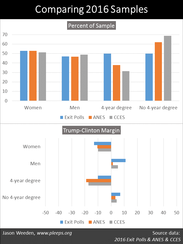
In addition, in the chart above, the exit polls showed a wider gender gap than either the CCES or (especially) the ANES. I had remarked in an earlier post using CCES data that I was surprised that gender wasn’t a bigger deal; this intuition came in part from my earlier look at the exit polls.
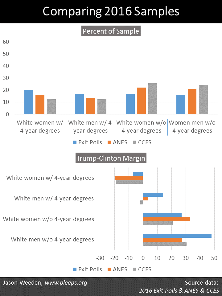
The next chart below shows whites split out by education and gender. Here, we see echoes from the prior chart—the exit polls had more college graduates (and, obviously, fewer non-graduates), different Trump-Clinton margins by education, and a wider gender gap. So, in this chart, we see some really big sample differences. While the exit polls showed Trump with a 48-point margin over Clinton among white men without degrees, the ANES data have this at only a 28-point margin. While the exit polls showed Trump with a 14-point margin over Clinton among white men with degrees, the CCES gave Clinton a 2-point edge over Trump with this group. While the exit polls showed Clinton with only a 7-point margin over Trump among white women with degrees, the ANES sample places Clinton’s advantage at 20 points. These are, umm, non-trivial differences.
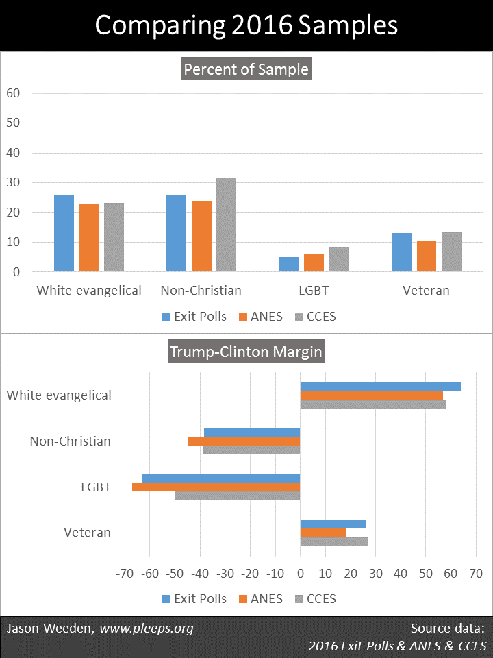
The last chart below shows white evangelicals, non-Christians (of all races), LGBT folks, and military veterans. And there are more differences between the samples, particularly in the Trump-Clinton margins. For example, the ANES shows Clinton with a 67-point advantage over Trump among LGBT folks, while for the CCES it’s 50 points. (Actually, in the ANES, this is only LGB folks—they didn’t ask their sample about T.) Also, the CCES shows Trump with a 27-point advantage over Clinton among veterans, while in the ANES it’s 18 points.
Between deification and nihilism
Comparing across samples, there are some things we’re pretty damn sure of. For example, Clinton did a lot better than Trump among racial minorities, LGBT folks, non-Christians, immigrants, and the college-educated. Trump did a lot better than Clinton among white evangelicals, non-degreed whites, and veterans.
How much better, exactly? Well, that’s complicated. There’s no perfect data, no singular answer, no assumption-free yardstick. Each sample has idiosyncrasies and drawbacks. Each sample has “special sauce,” from sampling strategies at the front end to the construction of weighting variables at the back end. This stuff is really hard.
As a consumer of social science, a central challenge is to try to stay in that middle ground between the hazards of data deification and data nihilism. On the one side, sometimes we form opinions that are way too certain based on limited samples and stilted analyses. Indeed, as we just saw, even comparing very high-quality samples using simple percentage splits reveals a number of important differences. So just imagine all the crazy nonsense regularly produced by running, say, complex multivariate analyses using small and obviously non-representative samples. Seriously.
On the other side, sometimes the uncertainties in sampling and analysis make us too quick to throw out the baby with the bath water, or, you know, to deny that anyone ever knew there was a baby there in the first place. All population estimates based on limited samples are probabilistic, but that doesn’t somehow eliminate the fact that having more data from more sources tends to produce better estimates.
The mature response is a laborious one, one that consistently acknowledges the tremendous complexity of social science and the hard reality of noise. Ain’t nobody got time for that, I know. And I certainly haven’t always struck the right balance myself. But it’s important to try.