I blogged a bunch in 2016

This year I made blogging a semi-regular thing. I typically spend a good deal of time looking at data, but it hadn’t really occurred to me before to blog about it as I’m doing it. It’s been a lot of fun, and it’s interesting for me to see when other people find it interesting (and when they don’t).

I did a couple of somewhat-organized series of posts, but mostly the blog has just followed whatever I happened to be looking into at a given moment. It often has to do with what new dataset I’m unpacking. For example, many of the posts this year stem from my having decided to tackle Pew’s political datasets. I was able to do a bunch of posts pretty quickly once I had my big recoded/merged Pew file in shape.

Given that the blog jumps around quite a bit, I thought I’d end the year with a narrative index. Below are quick pointers to this year’s posts, roughly organized by subject matter.

Politics

Many of my posts were about how demographics relate to politics. Some of these posts were on general themes: Ideology (and ideological extremes), party affiliation (and also specifically on white partisanship), voting patterns in the Obama elections, and voter registration. I also had some general posts on the decline of white Christians, the rise of libertarian demographics, and the funky differences between Millennials and older folks.

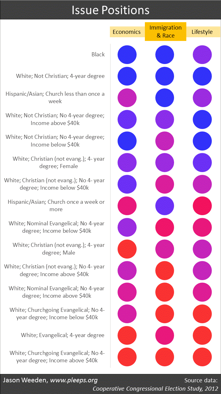
Other posts were about demographic differences in views on specific kinds of issues: racial discrimination, immigration and anti-Muslim views (and white nationalism generally), income redistribution (and how different groups’ economic views have changed over time), and marijuana legalization. I also had a post that was more explanatory and less data-driven on discrimination and political correctness.

Some political posts were specific to the 2016 presidential election, including two posts involving pre-election polls, one on the 2016 exit polls, and one that tried to puzzle through what would have happened in the Clinton/Trump race under various epistocracy scenarios that give more voting power to knowledgeable voters.

I responded to a review of my book, mainly to try to clear up some points about the relationship between evolutionary psychology and behavioral genetics. (Back in 2015 I also had a very long back-and-forth with Bryan Caplan about the book. It goes Caplan, then me, then Caplan, then me, then Caplan, then me, then Caplan, then me, then Caplan, then me.) I also had a post this year about some problematic claims by Achen and Bartels in their book.

Religion

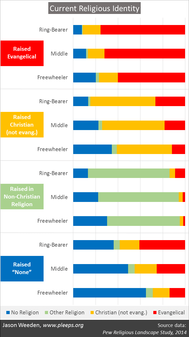
I did a four-part series on religiosity and lifestyles. First, I introduced the issue—namely, there are contrasting claims about whether increased church attendance is associated with fast or slow life-history patterns. Then I covered a problem with the religiosity-is-fast position—it’s based on group-level data. Then I covered a problem with the religiosity-is-slow position—it mistakenly claims that restricted sociosexuality is part of slow life-history. And, finally, I gave what I’m pretty sure is the right answer: Churchgoers are restricted individuals in fast groups.

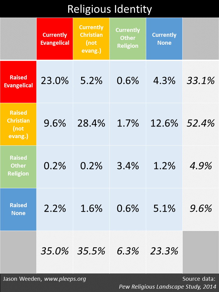
I summarized my new article with Kenrick and Kurzban about our views on religiosity and reproductive strategy. I showed some basic religion-switching patterns from childhood to adulthood, including how these patterns relate to lifestyle differences. I also showed the longer-term generational trends, where religiosity has been declining for every generation since those born in the late 1930s.

I looked at the basic differences in religiosity between degreed and non-college folks, as well as the issue of when Christians tend to see themselves as “born again or evangelical.”

Fertility

I did a long series of posts on modern fertility from an evolutionary point of view. I introduced the puzzle and then I gave some empirical background on U.S. fertility over the past century (mainly to show that we’re not talking about a simple phenomenon). I then presented some new analyses of college women, where it turns out that the vast majority of them really want to have kids. That set up the central theme—namely, why lots of women who start off wanting two or more kids end up have none or only one these days. To give a (partial) answer, I introduced the idea of a three-way trade-off by imagining an advice-column response to a young woman who wants to have lots of rich, sexy offspring.

Then came the key post of this fertility series, one that includes some new analyses showing the 3D rich-sexy-lots trade-off in modern fertility. This suggests that one explanation for very-low modern fertility is that it’s in part a consequence of attempting to simultaneously maximize the wealth and attractiveness of one’s potential offspring. I then did a sidebar post on how evolution can produce strategic flexibility that goes beyond the usual concept of decision rules. And, finally, I offered concluding thoughts, mostly about how complicated it’ll be to really sort this stuff out.

Economics

I did a couple of posts on basic economic trends. In one, I looked at how personal incomes have changed over the past few decades as a function of gender, age, education, and hours worked. In another, I took a look at the recent alarm over idle young men living with their parents (turns out that the basic facts are less impressive than many have claimed).

Hits and misses

Three of my posts went viral (umm, you know, to the extent that extremely nerdy, data-driven posts can go viral): the one on how Millennials’ political opinions differ from those of older folks, the one that looks at how the Clinton/Trump race might have turned out in an epistocracy, and the one about how the big new thing involving idle men living with their parents isn’t very big or very new. Basically, those three posts have accounted for around two-thirds of the clicks my blog has ever received. I owe particular thanks here to Tyler Cowen for linking to those posts—thanks Tyler!

Beyond those, there were some basic political posts that did pretty well—on liberal/conservative demographics, on libertarian demographics, on the 2016 exit polls, and others. Also, some of the posts in the two multi-part series I mentioned above—on religiosity and life-history and on modern fertility and evolutionary psychology—got decent numbers of hits.

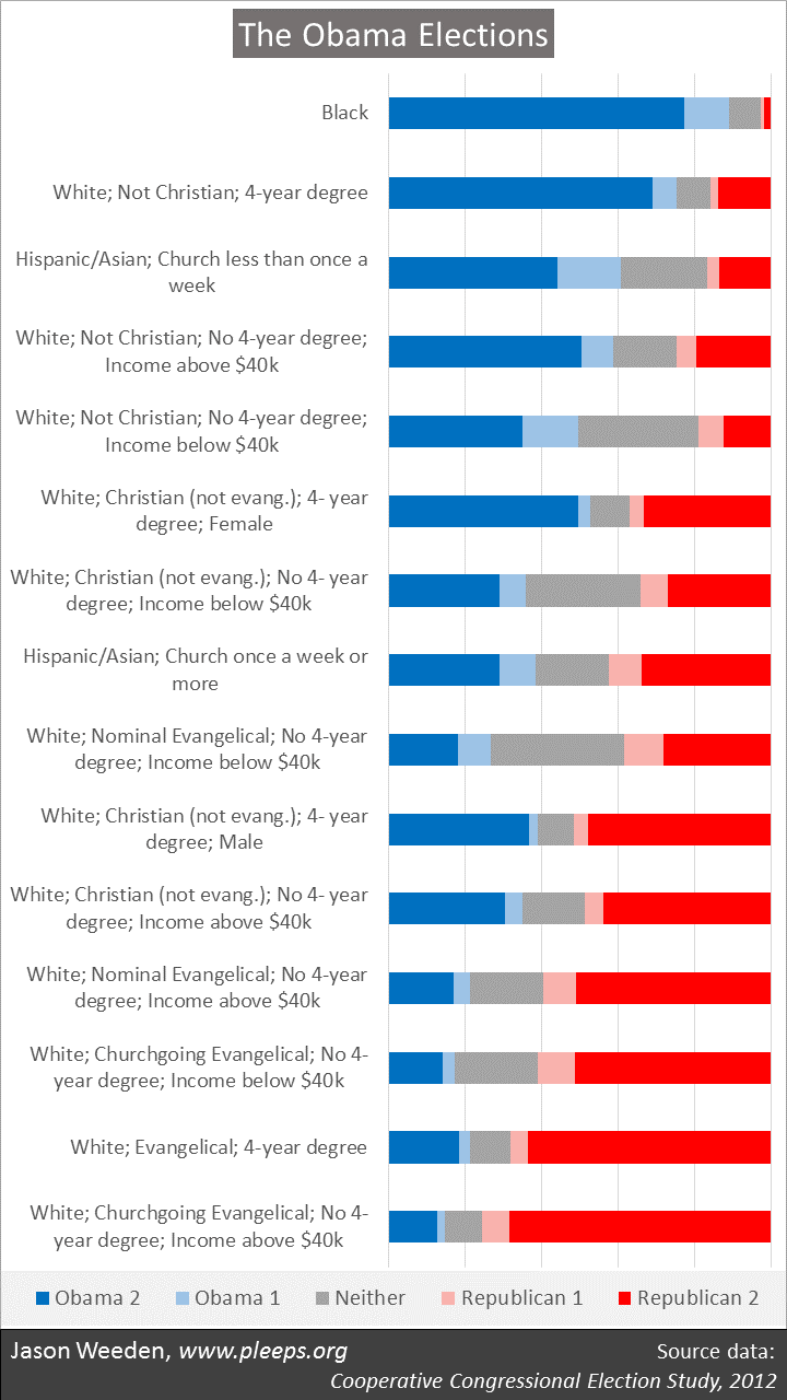
Of course, there were also a few posts that I thought were interesting, but weren’t widely read. For example: on the demographics of the Obama coalition (something that’s often misunderstood and/or misrepresented, which becomes important when thinking through possible future changes to the existing party coalitions), on how evolution can produce strategic flexibility in big-brained creatures like us, and on education differences in religiosity. (And, while I’m at it, I thought that some of my posts from past years were also pretty interesting, even though there weren’t many people reading the blog in those days: on how white southern and Catholic men changed their party affiliations in the latter half of the 20th century, on how migration between blue and red states actually ends up making red states redder and blue states bluer, on the role of genes in politics, etc.)

Looking forward

Currently I’m in a bit of a holding pattern, waiting for new data. Most particularly, I haven’t yet been able to analyze individual-level data on the 2016 election. Some key datasets should be made public in 2017—primarily from Pew, ANES, and CCES. Those releases will unleash new flurries of data-driven posts.

In 2017 I’ll also be helping out with another wave (they happen once every 5 years) of the Harvard/Radcliffe Class of ’77 longitudinal study, which I’ve been involved with since 2001 (Kurzban and I talked about it some in chapter 7 of our book). I’ll probably wait until after my presentation at their reunion in the Fall, but then I’m sure I’ll do a number of posts. The study has lots of intriguing themes.

Here’s hoping 2017 is an interesting year. (Though I wouldn’t mind if it’s a bit less interesting than 2016.)

The Obama elections

President Obama is down to his last month in office. Here, I look at his two elections using data from the 2012 Cooperative Congressional Election Study (CCES), a large online sample administered by YouGov/Polimetrix and freely available (thanks!) through the Harvard Dataverse.

The 2012 CCES had both pre-election and post-election surveys of its panel. The pre-election wave included questions about whether and for whom the respondents voted in 2008, and the post-election wave covered 2012 voting. The surveys also included a range of policy preferences, including economic items about taxes and government spending, items about immigration and race, and lifestyle items about abortion and gay rights. I excluded non-citizens, people too young to have voted in 2008, and people with missing information on either 2008 or 2012 voting, leading to a final sample of over 42,000.

Looking back at the Obama elections is timely as a reality check for ongoing discussions on how Hillary Clinton fell short of Obama’s margins and how the parties (and particularly Democrats) should seek to alter their current coalitions. There’s been a lot of talk about how the “Obama coalition” failed to fully materialize in the 2016 election, despite Clinton’s significant lead in the popular vote. For some, that talk has included the claim that Obama attracted, and Clinton subsequently neglected, poorer whites—with the further implication that future Democrats trying to recapture Obama’s magic should focus more on economic populism and less on civil rights (or, in the language of critics, “identity politics”). Related discussions claim that lots of folks who “voted twice for Obama” switched to Trump, discussions often based on state-level or county-level analyses that can’t actually reveal such individual-level patterns.

So, as we wait for individual-level data on 2016 voters to become publicly available, let’s revisit this discussion’s baseline—the Obama elections of 2008 and 2012. Who was in the Obama coalition, really? And who was in the Republican coalition? And, just as important, who sat out those elections? Further, what are the basic issue preferences of the various demographic groups, and what does this tell us about the inevitable trade-offs of using different policy packages to reconfigure the party coalitions?

The chart below gives the core demographic divisions of the Obama elections based on CCES data. It shows the proportion of various demographic groups that reported (1) voting for Obama twice (the dark blue portions labeled “Obama 2”), (2) voting for Obama once and either not voting or voting third-party in the other election (the light blue portions labeled “Obama 1”), (3) voting (a) for neither Obama nor a Republican in either election or (b) once for Obama and once for a Republican (the grey portions labeled “Neither,” the majority of whom are people who just didn’t vote in either election), (4) voting for either McCain or Romney but not voting or voting third-party in the other election (the light red portions labeled “Republican 1”), and (5) voting for both McCain in 2008 and Romney in 2012 (the dark red portions labeled “Republican 2”).

(Notes: Results are weighted. “White” means non-Hispanic white along with a few “others” (i.e., not black, Hispanic, or Asian)—I suspect the “others” in this sample combine some genuine “others” with lots of non-disclosing whites. “Not Christian” includes both the non-religious and those in non-Christian religions. “Evangelical” means Christians who self-identified as “born again or evangelical” or Mormon; “Nominal Evangelical” means Evangelicals who reported going to church less than once a month; “Churchgoing Evangelical” means Evangelicals who reported going to church once a month or more.)

The Obama Coalition (and the Pre-Trump Republican Coalition)

The Obama coalition is typically described as minorities and young people. Longer descriptions might add other demographic elements—for example, women (particularly college-educated women or unmarried women), the highly educated, and gays and lesbians.

There’s some truth to all these categories, but overall the conventional descriptions typically are somewhat misleading. Primarily, there are two key demographic features of the Obama coalition, and while one (race) is almost always mentioned, the other (religion) is almost always ignored. I’m not sure why that is.

Really, as shown in the chart, the central elements of the Obama coalition were: Blacks (who not only favored Obama very strongly in the CCES data, but also reported high turnout); white non-Christians (especially those with more education, or, if not more education, then more income); less-religious Hispanics and Asians; and white non-evangelical Christian women with more education—Hillary Clinton herself is an example of this last group. (These are the same kinds of divisions that I find when looking at post-2012 data from Pew political surveys on items such as ideology or party identification.)

Some of the demographic features often mentioned for the Obama coalition are probably best viewed as offshoots of the core demographics, or at best as second-tier themes. Yes, younger people tended to vote for Obama, but this is in large part because younger people are substantially more likely than older people to be racial minorities and less religious. If I look in the CCES sample at Millennials who are white Christians, for example, 35% reported voting for both McCain and Romney while only 23% reported voting for Obama twice. These folks are just not properly viewed as part of the Obama coalition. (Yet it’s worth noting that I would normally expect younger people to be less likely to vote, but this doesn’t really show up as a big deal in the CCES data—suggesting that these elections had unusually high turnout from Millennials relative to a low-expectation baseline.)

In a related manner, those with college degrees often voted for Obama, but not when they were white Christian men or white Evangelical women. And, sure, unmarried women often voted for Obama, but lots of black and/or less religious women are unmarried relative to religious whites.

Most of the typically mentioned features, though, do make differences at the margins. If I had made even more splits beyond those shown in the chart, then there would have been some additional marginal roles for age, gender, marriage, and education, mostly in line with the standard story. Also, even taking all these features into account, union members were more likely to support Obama and military veterans were more likely to support Republicans. But, still, the biggest deals (in terms of getting the most bang for one’s buck in teasing apart Obama voters from Republican voters from non-voters) are as shown in the chart.

The 2008/2012 Republican coalition was mostly the reverse of the Obama coalition. The chart shows the central Republican demographic groups: White evangelicals (especially when churchgoing and non-poor) and, secondarily, white non-evangelical Christians (especially with some combination of more income, moderate education, and maleness). Also, Hispanics and Asians who go to church weekly favored Republicans over Obama.

Many discussions of Democrats’ “identity politics” seem a bit weird when looking at both the Obama and Republican coalitions simultaneously. Was the Obama coalition more grounded in race and religion and gender than the Republican coalition? Not really. It’s just that it’s often noticeable when racial minorities, non-Christians, and women seek to level the playing field, whereas it’s more likely to be an unnoticed “normal background state of affairs” when white Christian men want to maintain the field’s tilt.

The myth of white working class Obama voters

As I mentioned, there have been some (revisionist) takes about how Obama attracted widespread support among the white working class (and particularly from low income whites), something Clinton failed to do. It certainly seems to be the case that whites without college degrees voted for Trump by historic margins and, in a related vein, that income differences between the two parties’ voters narrowed. But the CCES data should caution against the view that the white working class had previously been a core element of Obama’s voters.

Really, the CCES data suggest that whites who have both less education and less income were unusually likely to not vote at all in the Obama elections (i.e., in the chart above, there’s lots of grey in those groups). This is likely in part a general phenomenon—people with less education and less income are just less likely to vote, regardless of the candidates. But it also might be in part a response to the specific candidates in those races.

Given the low turnout of low education/low income whites in the Obama elections, one shouldn’t jump to conclusions about Trump’s voters. Some of Trump’s enhanced support from working class whites could have been Trump picking up previous Obama voters, but lots could have come from previous non-voters deciding to come out for Trump, or from previous Obama voters staying home in 2016. We’ll need to see very large individual-level (and not just state-level or county-level) datasets on 2016 voting in comparison with 2012 voting to figure out what really happened. (This, presumably, will be coming in 2017 when CCES releases its 2016 sample, and Pew probably already has such data as well, though public release won’t happen for a while.)

The complexity of coalitions

So now Democrats are thinking through how to fortify their existing coalition, which is still larger than the Republican coalition, but is not well-positioned geographically and is made of up some folks who require a lot of prodding to actually go vote. Many are calling for a renewed focus on low income whites, and while that would help geographically, it’s still a group that often has low turnout. But it’s also important to keep in mind that there are other options. For example, Trump’s white nationalism creates further Democratic openings with degreed whites—especially degreed non-evangelical Christians—who would actually be attracted by the adoption of more center-right rather than more progressive economic positions.

Whatever groups are to be courted, the key, ultimately, is giving them what they want—it’s in modifying existing position packages of the parties, perhaps not wholesale, but at least as a matter of emphasis. For example, many proponents of expanding Democratic appeal among the white working class argue (correctly, as we’ll see) that low income whites would often prefer more emphasis on economic populism coupled with less progressive positions on civil rights.

But such appeals are never without costs. For each voting group drawn closer by a given agenda, there are other voting groups that are pushed away.

To help in thinking about these complex matters—what groups might be further wooed, and what groups would be turned off by wooing them—I show in the chart below a basic analysis of how these demographic groups in the CCES sample land when asked about their policy preferences on economics (i.e., tax-and-spend items), immigration/race, and lifestyle (i.e., abortion and gay rights). The redder the dot, the more conservative on average; and the bluer the dot, the more liberal on average.

Yes, if you look at the white groups with low education and low income, they’re more conservative on immigration/race than on economics. But who’s more conservative on economics than on immigration/race—that is, who would be relatively turned off by an increased Democratic focus on progressive economics coupled with a decreased focus on civil rights? Mainly, it’s Hispanics/Asians, who are often economic centrists but progressive on immigration/race. Also, white non-evangelical Christian men with college degrees—they’re on average economic conservatives but more moderate on immigration/race (and on lifestyle issues).

I’ll leave the analysis there for now. Both of the charts in this post have other interesting things going on—take some time with them. (And if you’re really interested in this kind of thing, Kurzban and I have a book on the demographics of political positions using General Social Survey data, with issue-by-issue analyses as well as demographic group-by-group analyses.)

Religion from childhood to adulthood

If you look at the demographic predictors of ideology or party identification in the Unites States these days, the key religious divisions involve non-Christians on the left, evangelical Christians on the right, and non-evangelical Christians in the middle. In political matters, these basic religious identities further interact with other major items such as race, education, income, and gender.

How do people end up in one of these big religious camps? The usual first thought—and it’s not a bad one—is that people generally end up where they’re raised. Nonetheless, the facts here are surprisingly messy. Yes, the majority people raised in a given broad religious category end up as adults within that category, but it’s actually not a huge majority. Tons of people switch basic religious identities from childhood to adulthood.

To see what I mean, take a look at the chart below, based on data recently made public from Pew’s 2014 Religious Landscape Study, which surveyed more than 35,000 American adults. I looked at the “how were you raised?” items and the “what are you now?” items, breaking them down into (1) Christians who describe themselves as “born again or evangelical”, (2) Christians who don’t decribe themselves as “born again or evangelical,” (3) non-Christian religions (Jews, Muslims, Buddhists, Hindus, “spiritual but not religious,” etc.) and (4) the “nones” (i.e., “nothing in particular,” agnostics, atheists, and a handful of non-responders). The chart shows (weighted) percentages of the entire sample. So, for example, 23% of the sample members were raised as (self-identified) evangelicals and were also (self-identified) evangelicals at the time of the survey.

If you sum across the chart, only about 60% of the sample is in the same basic religious camp in which they were raised. In other words, when it comes to the basic politically salient religious categories, 4 in 10 adults are in a different category than their upbringing.

(Note: The religion-switching numbers I’m getting are higher than those produced by Pew, which reported only 34% switching. But we’re slicing the pie differently. I suspect that most of the difference is because I’m using the self-identified “evangelical” marker whereas I think they probably didn’t, at least not directly. I think they were more interested in denominational switching, whereas I’m focused in this post on the most politically salient distinctions, which definitely include the self-identified “evangelical” label.)

The biggest driver of religion-switching is people abandoning childhood Christianity. Around 19% of adults were raised Christian but are no longer Christian. The next-biggest deal involves shifts towards evangelicals. Around 12% of adults were not raised evangelical but are now. This is one of the basic modes of modern polarization, as the public has moved from the religious center to the leftward and rightward poles. You can see it in the basic subtotals on the chart—52.4% of the sample were raised non-evangelical Christian (the political center), but only 35.5% now hold that identity as adults. Most of that decline is picked up by “nones,” but there are also a few more evangelical adults (35%) than folks raised evangelical (33%).

One particularly striking fact is that most American “nones” were actually raised Christian. In fact, over 70% of adults who do not identify as religious grew up Christian.

Another important point is that some of these broad groups are “stickier” than others. Almost 70% of those raised evangelical are currently evangelical and the same percentage raised in non-Christian religions are currently in non-Christian religions. But non-evangelical Christians and “nones” are less “sticky”—the same-now-as-childhood portion is just a bit over half.

OK, so there’s a lot of fundamental religion-switching. But why?

Freewheelers and Ring-Bearers

One of the basic themes in my work on religion is the important connection between religiosity and people’s own sexual and reproductive lifestyles (the extent to which they engage in casual sex, marry or divorce or cohabit, have few or lots of kids, and so on). This theme then ends up linking with politics when you notice that lots of the particular issues at the heart of the divide between religious conservatives and secular liberals—abortion, birth control, gay rights, pornography, sex ed, and even marijuana legalization—are about favoring and disfavoring different sexual and reproductive lifestyles. Realizing these tangible connections opens up the possibility of viewing these “symbolic” or “cultural” religious fights as self-interest-based conflicts.

Kurzban and I have phrased people’s different lifestyles in terms of Freewheelers and Ring-Bearers. Freewheelers have more sex partners, less-committed relationships, fewer kids, and so on. Ring-Bearers are the don’t-fool-around-much, get-and-stay-married, have-lots-of-kids types. One of the key points is that these kinds of lifestyle differences aren’t just effects of one’s inherited childhood religiosity, but also important motivating causes of adopting or abandoning religion despite one’s upbringing. So, for example, lots of kids are raised religious, but then hit their teens and 20s when many (but by no means all) hear the call of the wild, and this ends up being a big reason why lots then abandon their childhood religions—those religions serve in large part as a support groups for Ring-Bearers, but when one heads down a Freewheeler path it makes less practical sense to maintain connections to religious groups.

The Pew data just barely allow a look at how lifestyle patterns factor into religion-switching. The Religious Landscape Study asked two key lifestyle questions—current marital/cohabitation status and the number of children the person has ever had. I used these two items to split the sample roughly into thirds: Freewheelers, Ring-Bearers, and those in the middle. The Freewheelers combine never-married and divorced/separated folks who’ve had 0 or 1 child as well as everyone in a non-marital cohabitation. The Ring-Bearers are never-married or divorced/separated folks who’ve had 4 or more kids, married folks with 3 or more kids, and widowed folks with 2 or more kids. The middle group is everyone else (including, e.g., married folks with 0, 1, or 2 kids).

This is a pretty low-powered way to measure Freewheelers and Ring-Bearers. Usually I’d also want to see information regarding sexual activity, whether the currently married had previously divorced, how much people drink or use recreational drugs, and so on. So, for example, there’s a big religious difference between never-married young people who don’t hook up or party much and those who do, something that I can’t detect using this Pew sample. But we can still see some basic patterns using what we’ve got.

In the chart below I’ve split things out by childhood religious category and adult lifestyle category. You can see the basic stay-where-you-were-raised tendency—those raised evangelical have lots of red in their bars (indicating current evangelical affiliation), those raised as non-evangelical Christians have lots of yellow (indicating current non-evangelical Christian affiliation), those raised in non-Christian religions have lots of green (indicating current non-Christian religious affiliation), and those raised “none” have lots of blue (indicating current “none” status).

But you can also see the lifestyle trends. In general, within each childhood camp, the Ring-Bearers have relatively more red (indicating current evangelicals) and relatively less blue (indicating current “nones”), while the Freewheelers show relatively more blue and less red. This is a sign of people aligning religion with lifestyles, as Ring-Bearers often seek out groups that support their Ring-Bearer lifestyles while Freewheelers are more likely to turn away from religions that tend to offers them more hassles than benefits.

Some items on the chart above really pop out. Look at those who were raised “none” and have a Ring-Bearer lifestyle—over 60% have adopted a religion. Look at those raised as non-evangelical Christians who have a Freewheeler lifestyle—almost 40% are no longer Christian. (Again, I should note that these kinds of patterns would be even more striking if we had a better set of lifestyle measures.)

The lifestyle patterns are even clearer when it comes to church attendance. The chart below shows average times-per-year at religious services for the Pew sample. So, for example, Ring-Bearers raised evangelical on average attend church about 40 times a year, while Freewheelers raised as “nones” attend on average only about 12. Even though we’re using a weak measure, the lifestyle differences are pretty substantial. This is especially true for those raised either non-evangelical Christian or “none” (recall that I mentioned earlier that these are the less “sticky” childhood categories). For both of these groups, the Ring-Bearers are going to church about twice as frequently as the Freewheelers. It’s also remarkable that, taking lifestyles into account, those raised non-evangelical Christian go to church only marginally more than those raised “none.”

In short, when thinking about the sources of basic religious divisions, upbringing is a big deal, but it’s not the whole story. Lots of people fundamentally change religions over their lives, often to match their lifestyles. In fact, this is a big part of the generational decline in religiosity—as lifestyles have generally shifted in a Freewheeler direction over the past several decades, religious patterns have followed suit.