Who are the ideologues?

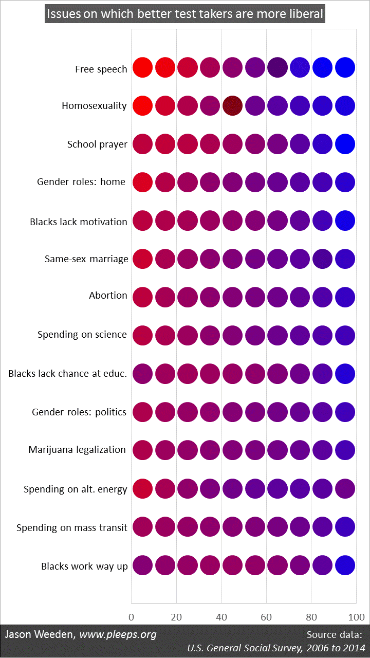
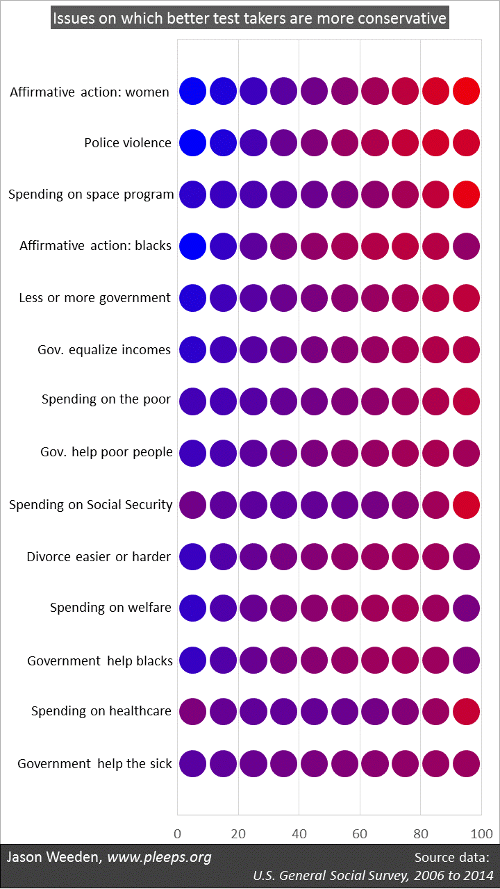
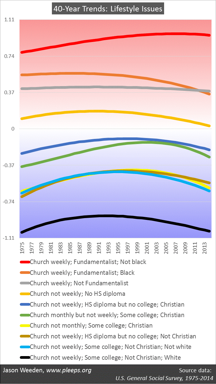
People whose issue opinions cluster into relatively consistent liberal or conservative bundles tend to be better educated, white, older, and richer.

It’s one thing to ask about the features that tend to divide liberals and conservatives. Religion and sexual orientation are big deals here, along with race, education, church attendance, military service, gender, income, and so on (see, e.g., here and here).

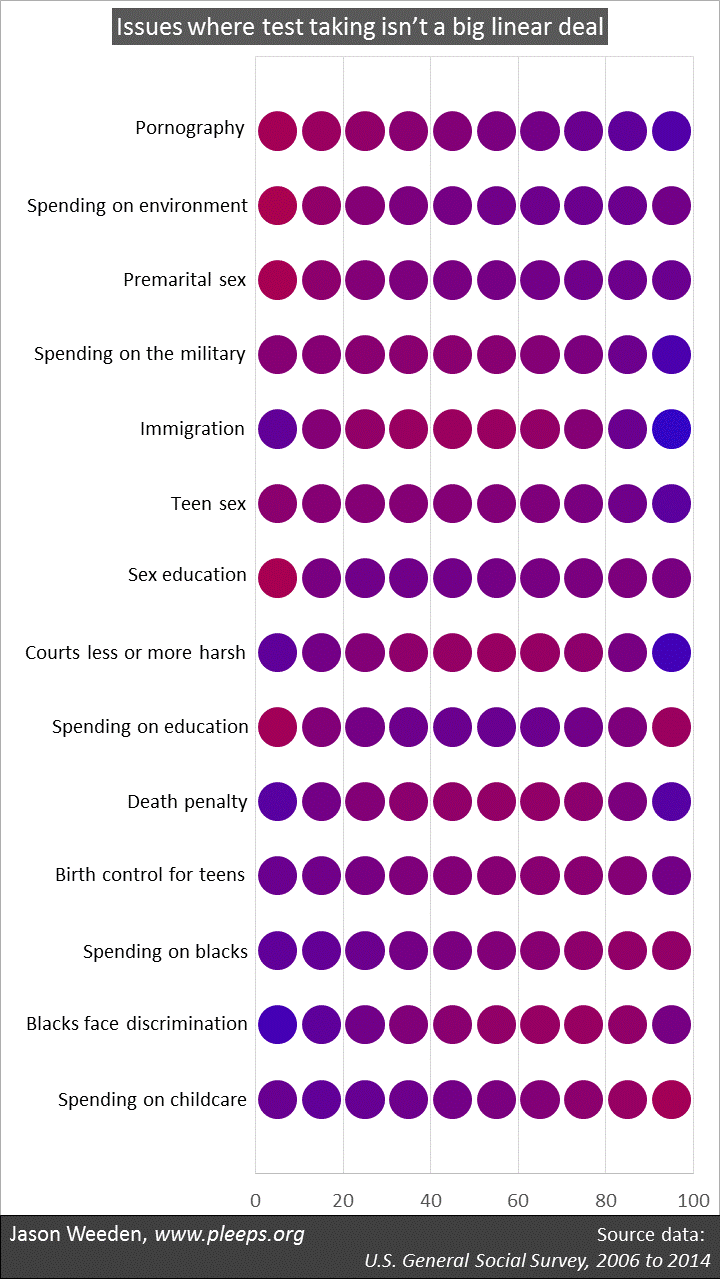
It’s another thing to ask about ideological consistency. When surveys solicit opinions on a number of different kinds of issues—on abortion, income redistribution, immigration, the military, same-sex marriage, the size of government, race, the environment, guns, and so on—some people are pretty thoroughly either liberal or conservative, where the large majority of their issue positions line up on the same side. But then some people pretty thoroughly mix-and-match their issue opinions, choosing about as many liberal positions as conservative ones.

The tendency to hold issue opinions that are ideologically clustered (or not) has its own set of demographic predictors. When we looked at General Social Survey data (in our book and an article), Kurzban and I identified a big divide between whites with college degrees and everyone else. Across different political issues, whites with college degrees have lots of the most consistently liberal folks as well as lots of the most consistently conservative folks.

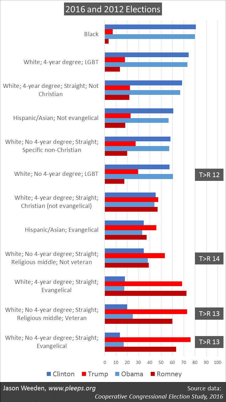
The recent 2016 Cooperative Congressional Election Study (CCES) presents a good opportunity to dig deeper here. It’s really big, with over 64,000 respondents who were asked a nice range of different issue opinions. The downside is that it’s an online study, which self-selects a more sophisticated sample, thus overestimating things like political engagement and ideological consistency. But while the baseline might be off somewhat, we can still see what sorts of features tend to distinguish between the ideologues and the mixers-and-matchers.

Basically, I took my CCES ideology scale, which combines 10 different issue positions (on abortion, guns, the minimum wage, immigration, and so on), and instead of looking for what predicts liberals vs. conservatives, I looked for what predicts ideological consistency vs. inconsistency. I examined a broad range of available demographics and the big splits are shown in the chart below.

My results report two things. One is a basic breakdown on ideological consistency, where I’m using Pew’s definitions for what counts as “consistent” (i.e., people whose issue preferences almost all line up in the same direction), “mixed” (i.e., people whose issue preferences are pretty close to equally divided), and “mostly” (i.e., people in between “consistent” and “mixed”). The second thing I show is the percentage of variance that a single factor accounts for in a factor analysis of the 10 issue items within the given group. Don’t worry if you don’t know what that means—just understand that a bigger number here means a higher degree of ideological consistency.

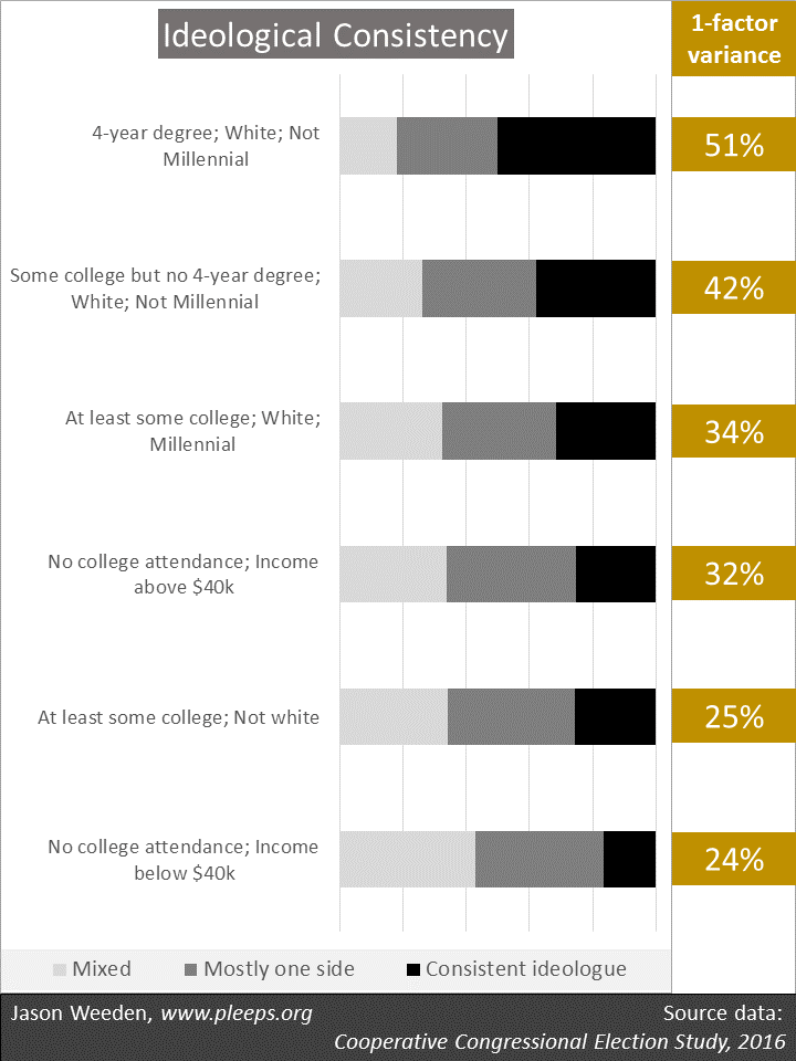
The CCES sample confirms the big roles of education and race in ideological consistency, but suggests some other details as well. One is that, within college-educated whites, Millennials are substantially less likely to be left-right ideologues. This could say something about Millennials in particular, but, more likely, it’s probably a general effect of age. That is, I imagine that if I looked at a big sample from the mid-1990s, where now it’s the Gen Xers who are the younglings, we would see similar patterns of reduced ideological consistency. Or, to put it another way: Just wait—as they age, it’s likely that educated, white Millennials will come to match the ideological consistency of educated, white older folks.

Another detail is that, among the non-college folks, income shows up as a major secondary factor—here, those with lower incomes are less ideologically consistent than those with higher incomes. This overlaps, of course, with both race and education.

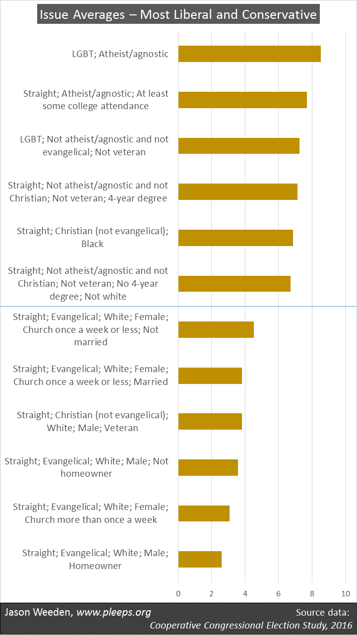
The overall differences here are large. Among non-Millennial whites with 4-year degrees in the CCES sample, around 50% are consistent ideologues. But among people who’ve never been to college and who have household incomes below $40,000, only around 17% are consistent ideologues. Among not-so-poor people who’ve never been to college as well as non-whites with at least some college, only around 25% are consistent ideologues. (And, again, all these numbers are inflated relative to the population as a whole, given the skew in online samples.)

Ideology and demographics

I’ve pointed out the big overlap among items such as demographics, identities, ideology, partisanship, issue opinions, and interests. For example, while some political scientists have argued that the electorate is driven by social identities rather than by ideology or issue opinions, it actually doesn’t make much sense to draw such distinctions too starkly.

Along these lines, we’ve just seen that some groups are more likely to hold ideologically clustered opinions than are other groups. In other words, left-right ideology is a bigger deal for some groups. Does this mean that social identities are less relevant for these groups? Not at all. In fact, in an important sense, the more ideological a group, the more relevant some basic demographics become in predicting their politics.

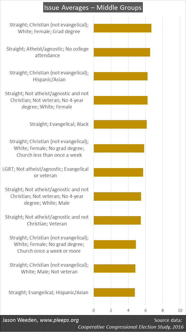
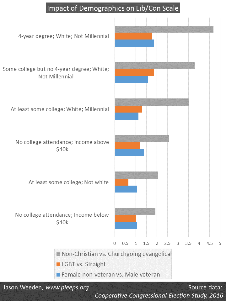
I show a bit of this in the chart below. Here, I’ve taken the six groups from the prior chart—groups that run from most ideologically consistent up top to least down below. Within these groups, I looked at how some of the big-deal demographics—religion, church attendance, sexual orientation, military service, and gender—predict their liberal vs. conservative leanings (using my 10-issue CCES ideology scale).

The question here is: Within these groups, how big of a difference do these demographics make in dividing liberals from conservatives? The clear overall pattern is that, in general, and especially with regard to religion, demographics are more predictive of issue opinions among more ideologically consistent groups than among less ideologically consistent groups. For instance, on my 10-point scale, non-Christians are around 4.7 points to the left of churchgoing evangelicals when we look within the most ideological group (i.e., non-Millennial whites with 4-year degrees), but non-Christians are only around 1.9 points to the left of churchgoing evangelicals when we look within the least ideological group (i.e., people who haven’t been to college and have incomes below $40,000).

(Note for nerds:  The chart above reports OLS regression estimates from models where these demographics are simultaneously predicting my 10-point CCES ideology scale.)

Put another way, when you know their religion, sexual orientation, military service, and gender, it’s actually a lot easier to predict the various issue opinions of college-educated whites than those of other folks. Increased ideological tendencies actually make key social identities more (not less) relevant. So you shouldn’t view ideology and social identities as competing explanations here—again, there’s a big overlap.

Public opinion on budget trade-offs

Americans show a mix of self-interest and ideology in their reactions to trade-offs among domestic spending, defense spending, and taxes.

The 2016 Cooperative Congressional Election Study (CCES) asked its respondents an interesting item on budget priorities: “The federal budget deficit is approximately $1 trillion this year. If the Congress were to balance the budget it would have to consider cutting defense spending, cutting domestic spending (such as Medicare and Social Security), or raising taxes to cover the deficit. Please rank the options below from what would you most prefer that Congress do to what you would least prefer they do: Cut Defense Spending; Cut Domestic Spending; Raise Taxes.”

The item is explicitly built around trade-offs, given that it asks people for a rank order of their preferences among the three options. Overall, cutting defense spending was the most popular (37% tagged it as their first choice and only 23% as their last) while raising taxes was the least popular (24% placed it first while 42% placed it last). This is neither a “liberal” nor a “conservative” pattern—the most popular item (cutting defense) and the least popular (raising taxes) are both things that liberals tend to support and conservatives tend to oppose, in some form or another. Really, it’s the prioritization of domestic spending relative to the other two that divides the sides. (Indeed, the preference for domestic cuts was one of the items included in the 10-issue CCES ideology scale that I analyzed the other day.)

Who’s more likely to want to protect defense spending by cutting domestic spending, protect domestic spending by raising taxes, and so on? I examined a large range of demographic variables and identified the ones that seem to be making the most substantial contributions.

The chart below shows the results. For data nerds, I’ve included a set of regression results (see the notes below the chart for details). For everyone else, just focus on the “and what they mean” section at the bottom of the chart. In short, different demographic features predict different splits in priorities.

The most common trade-off was between domestic spending and defense spending. There were various features where, on average, it’s more likely for folks to want to protect domestic spending at the expense of defense spending (being black, atheist/agnostic, and LGBT), and others where folks are more likely to want to protect defense spending at the expense of domestic spending (being a veteran or a Christian, particularly an evangelical).

(Notes: The response items are coded 1=first preference, 2=second, and 3=third. The predictor variables are coded 1=applicable and 0=inapplicable. The results are from OLS regressions, and I’m reporting unstandardized coefficients. All evangelicals are also Christians, so the effects of “evangelical” are over-and-above being “Christian.”)

There were also features that predicted wanting to allow higher taxes in favor of protecting either domestic spending (being retired/disabled, atheist/agnostic, and LGBT) or defense spending (being a Baby Boomer or older). Obviously, most of the retired/disabled folks are also older, so this reveals particular support for raising taxes among older folks relative to cutting spending.

And keep in mind that things go the other way as well. The results show that older people and those retired/disabled are relatively more likely to favor higher taxes. But this also means that younger workers are relatively less likely to favor higher taxes, preferring to cut spending. Similarly, the results show blacks favoring domestic over defense spending, but this also implies a relative preference among non-blacks for defense over domestic spending.

Interests and coalitions

Some aspects of these results are consistent with an interest-based perspective. At first, I was surprised that I didn’t see poorer folks being much more likely to want to protect domestic spending (though race shows up). Instead, there was a pretty clear pattern where older folks and retired/disabled folks favored tax increases over spending cuts. But then I went back to the question wording. The question only mentions cuts in Social Security and Medicare as examples of “domestic” cuts. And, sure enough, retirees and disabled folks are more likely to favor protecting this spending (which for many of them is a big deal), trading it off against higher taxes (which wouldn’t greatly affect many of them). Similarly, military veterans want to protect defense spending—some of these veterans are currently enlisted, and, at any rate, almost 10% of the defense budget is allocated to the Department of Veterans Affairs.

The results remind me of another survey showing that, when forced to choose among spending priorities, older folks prioritize Social Security and defense, while younger folks prioritize job creation and education. If you don’t see at least a bit of self-interest there, then you need to check your glasses.

Other features show the potency of current ideological and party coalitions. In particular, atheists/agnostics and LGBT folks are often liberal on lots of different kinds of issues, whereas evangelicals (and particularly white evangelicals) are often conservative on lots of different kinds of issues (see, e.g., here).

Even for religion and sexual orientation, though, there’s a degree of interest-based thinking available. Some of the fight over safety-net spending involves relative preferences between governmental safety nets and private charitable programs. Kurzban and I have argued that people who might rationally worry about discrimination from white, Christian charities (e.g., non-whites, non-Christians, and LGBT folks) ought to have some degree of preference for non-discriminatory governmental safety-net programs.

But it’s clear that some dramatic recent shifts—in ideological clustering and specifically in the economic policy preferences of wealthier non-Christians—also have coalitional aspects. The Reagan era brought about a lasting alignment between religious conservatives and small-government conservatives, pushing many non-Christians to the left and away from their former libertarianish positions. Though I don’t have data directly on point, I’m assuming that the story has been similar for LGBT folks. It also seems likely that we’ve seen a related story with military veterans, as Republican support for defense spending has drawn veterans in and produced some coalitional shifts in veterans’ views on rich-poor and religious issues.

These kinds of coalitional trends aren’t, of course, wholly divorced from interests. They involve folks who really care about a given set of interest-based positions adjusting opinions on other issues that are less important to them. This produces results such as those we’ve just seen for budget priorities, where some predicting features seem interest-based while others seem coalitional. Yet, typically, the underlying patterns of coalitional choice are themselves linked to interests. It would be a real stretch to argue, for instance, that the current Democratic/liberal coalition (which strongly opposes group-based discrimination) doesn’t represent high-priority interests of most atheists and LGBT folks, and vice versa for the Republican/conservative coalition in relation to white evangelicals.

As I’ve said, there’s a big overlap among the standard toolkit of political explanations. It’s usually not very plausible to make this-thing-matters-but-that-thing-doesn’t sorts of arguments when thinking about demographics, identities, interests, partisanship, ideology, and issue positions. It’s all there, intermingled, thwarting facile answers.

The reality and myth of the decline in men’s employment

From the 1970s to the 1990s, the employment rate for prime-age men fell, while for women it rose dramatically. Since 2000, however, both have declined (and partially recovered) about equally. The recent pattern doesn’t point to a particular problem with men.

Men, apparently, are in trouble. In the 1950s and 1960s, typically around 94% of men ages 25 to 54 were working. But in the past 10 years, they averaged only around 84%. And the alarm bells are ringing: The Decline of Men. The Missing Men. Men at Work … or Not. The Nonworking Prime-Age Men. America’s Men Aren’t Working.

In a prior post, I looked at young men’s work and school patterns. There’s been all this talk of how they’re playing video games and living in their parents’ basements, and I wanted to get a better sense of the scope of the problem. I was genuinely surprised by what I saw, or, more to the point, didn’t see. When you look at men in their teens and early 20s, it just isn’t the case that they display a major new trend of idleness. Mostly, it’s just that the Great Recession really was a great recession.

However, heading into prime-age territory, I did see that there were worrying trends for men in their late 20s and early 30s. Their recent rise in idleness went beyond what we’ve seen before.

So for today’s post I wanted to take a closer look at prime-age men, defined as ages 25 to 54. The Bureau of Labor Statistics has employment-population ratios for this group going back to 1948. And as I was looking at that, I started focusing in on the similarities between men’s and women’s employment trends over the past 20 years. And I was again surprised.

There are three charts in the graphic below. The first shows the yearly employment-population ratios for both men and women ages 25 to 54 from 1948 to 2016. The main historical trends are immediately apparent. From the late-1940s through the late-1980s, women’s work rates rose spectacularly, particularly starting in the mid-1970s. They stalled in the early-1990s, but then crept up further, reaching their as-yet all-time high in 1999/2000.

Prime-age men, on the other hand, with various ups and downs, have been on a slow overall decline since the 1970s. They averaged around 94% working in the 1950s and 1960s, 91% in the 1970s, 88% in the 1980s and 1990s, 86% in the 2000s, and 83% in the 2010s.

But here’s the thing. Women’s employment has been declining since 2000 as well. You can see it more clearly in the middle chart, which zooms in on 2000 to 2016. Both men and women failed to reach their 2000 employment level in the period between recessions in the mid-2000s; both were hit hard by the Great Recession; and both have since made partial but not full recoveries, currently landing pretty close to their 2008 employment levels.

It’s the last chart that really shows it. I put men and women on the same scale, looking at both as a percentage of their 2000 employment levels. And there’s the story. Men and women were about equally affected by the early-2000s slowdown; men pulled ahead a bit in the subsequent housing-bubble recovery; then men were hit especially hard in the housing bust and financial collapse; men started recovering first; and now—and this is really the surprising point—for the past few years men and women have been making about equal progress along practically the same slope relative to their 2000 employment levels.

In short, that whole thing about how men have been experiencing a 21st century employment decline relative to women doesn’t seem to be actually, you know, true. Prime-age men are down from 2000, to be sure. But so are women, to basically the same degree.

(Note: The BLS has data through February of 2017, and I wanted to use the most recent data, so each year here goes from March of that year to February of the following year. So, for example, the 2016 numbers combine March 2016 to February 2017.)

I could see—maybe—telling a “recent decline of men” story around 2010 or 2011. Men were getting hit particularly hard then. But I really don’t understand how the employment numbers from 2012 to the present support that narrative. Yes, men are down. But so are women. We can tell all the stories we want about porn and drugs and marriage declines and video games, and how those things are sapping prime-age men’s will to work. But then we need to explain why women have been experiencing very similar declines since 2000. It seems likely that one should be looking for explanations that apply roughly equally to men and women.

Why the spotlight on men?

So, yes, I’m surprised. Given all the hype about declining men, this is not what I was expecting to see. While there is an essential reality to the hype—the percentage of prime-age men working has basically been declining since the 1970s—there’s also a big myth, in that the past 20 years have not seen an overall decline in men’s employment relative to women’s employment. Both have declined (and partially rebounded) to similar degrees, though the timing and scope of their hits from the Great Recession differed somewhat.

Which begs the question: What is it that makes so many people so eager to tell a men-only story about recent employment trends? I get why we tell separate stories about the second half of the 20th century—women’s employment was shooting up while men’s was creeping down. But what’s driving the 21st century narrative, when men and women are showing very similar trends?

Perhaps it has something to do with the fact that, when we really don’t want to do anything to help struggling people, we often focus on some blame-worthy caricature. Perhaps uneducated, responsibility-avoiding men are the high-education liberal/libertarian analog to the right’s welfare queens—the narrative figures that suggest that the only urgent response warranted is vigorous finger-wagging. Or maybe that’s not it. I really don’t know.

The demographics of liberals and conservatives (with CCES data)

I previously looked how demographics—race, religion, gender, and so on—relate to whether people are more liberal or more conservative on Pew’s ideology scale, which combines ten different issue items (on government spending, environmental regulation, race, immigration, homosexuality, and so on) into a single measure. Today, I’ll do the same thing with data from the recently released 2016 Cooperative Congressional Election Study (CCES).

The best thing about the CCES is that it’s yuge. The Pew data in my prior post included around 16,000 survey-takers, which is pretty damn good, but this CCES sample is over 64,000. (According to dictionary.com, this is pronounced: siks-tee fohr muhth-er fuhk-ing thou-zuhnd.)

The pre-election wave of the CCES included a number of questions about policy preferences. I chose a set of ten of these to make my CCES ideology scale—including items on assault rifles, conceal-carry permits, border patrols, deportation, abortion rights, abortion funding, environmental regulations, same-sex marriage, government spending priorities, and the minimum wage (I include the full items at the bottom of this post). Most of the CCES issue questions were in a binary support/oppose format, which made the ideology scale straightforward: For each of the ten policy items, I coded the liberal option as 1 and the conservative option as 0, and then added them all up. Thus, an extreme liberal would score 10 (by giving the liberal response on all ten survey items) and an extreme conservative would score 0.

The CCES has a nice range of demographic information, including race, religion, church attendance, age, gender, education, income, marital status, employment status, sexual orientation, transgender status, whether the respondents have been union members, whether they’ve served in the military, whether they own their home, whether they invest in the stock market, and whether they or their parents are immigrants.

In short, I took the 10-point issue-based ideology scale and started looking for demographic splits. The biggest deals were sexual orientation and religion, so I first split up the sample by the major divisions there. Then I went into the largest of the remaining subgroups and looked for whatever the next-biggest deals were, and created even smaller subgroups, and so on. I stopped when I had 24 subgroups. These 24 groups are mutually exclusive and encompass the entire sample.

And that’s what’s shown on the two charts below. They contain each group’s average score on the 10-point issue-based ideology scale. In the first chart, I show the most liberal six groups and the most conservative six groups. So, the first line is “LGBT; Atheist/agnostic”—these are people who both (1) indicated that they are either lesbian, gay, bisexual, or transgender and (2) chose either atheist or agnostic as their religious category. And it’s just a really liberal group. When asked the ten different issue questions, they chose the liberal responses on 8.5 items on average. In fact, almost two-thirds of these folks are mega-liberals (scoring 9 or 10) while less than 1% are mega-conservatives (scoring 0 or 1). The most conservative group is at the bottom of the chart—straight (i.e., not LGBT), evangelical, white, male homeowners. They average around 2.6, where over 40% are mega-conservatives while less than 3% are mega-liberals.

Overall, on the first chart above, the most liberal groups are a sort of demographic rebel alliance, including many LGBT folks, atheists/agnostics, other non-Christians (Jews, Buddhists, “nothing in particular,” and so on), and racial minorities. (Keep in mind, though, that we’ve got a second chart coming, which will show some not-so-liberal LGBT folks, non-Christians, and racial minorities. For example, LGBT folks who are also either evangelicals or military veterans are actually middle-of-the-road on average.)

The most conservative groups, in contrast, are almost all anchored by straight, evangelical whites. In fact, I ended up with five groups made up of straight, evangelical whites, and they’re all among the six most conservative groups. The other group showing up here includes straight, white, non-evangelical Christians who are male military veterans.

The second chart below shows the 12 groups in the middle. As I mentioned, some of the more interesting ones here involve groups you’d normally think of as pretty liberal—LGBT folks, non-Christians, and racial minorities—that actually aren’t so liberal among some narrower segments. These include: straight atheists and agnostics who’ve never attended college; other straight non-Christians who don’t have 4-year degrees or who are military veterans; straight, Christian Hispanics and Asians; straight, evangelical blacks; and, as already mentioned, LGBT folks who are either evangelicals or veterans.

Another way to frame what’s going on here is to think about the averages on the 10-point issue-based ideology scale as simultaneously influenced by a wide range of characteristics. Some demographic features push the average up in a more liberal direction (being LGBT, atheist/agnostic, black, etc.) and other features push the average down in a more conservative direction (being evangelical, white, a veteran, etc.).

In fact, here’s some actual math allowing you to estimate the average ideological positions of a wide range of very specific profiles:

  • Think of a group defined simultaneously by LGBT status (yes/no), religion (atheists and agnostics vs. other non-Christians vs. non-evangelical Christians vs. evangelicals), whether they attend religious services more than once a week (yes/no), race (white/black/other), veteran (yes/no), whether they have PhDs, MDs, MBAs, or other graduate degrees (yes/no), and gender (female/male).
  • Start with 6.4.
  • Then, if applicable to the group you’re thinking about, add 1.3 for LGBT folks, 1.3 for atheists/agnostics, 0.9 for blacks, 0.7 for folks with graduate degrees, and 0.7 for women.
  • Then, if applicable to the group you’re thinking about, subtract 2.1 for evangelicals, 0.8 for whites, 0.8 for folks who go to religious services more than once a week, 0.7 for veterans, and 0.7 for non-evangelical Christians.

The result gets you very close to that group’s average on the 10-point ideology scale. A quick example. People similar to Barack Obama: start with 6.4, add 0.9 (black), add 0.7 (grad degree), and subtract 0.7 (non-evangelical Christian). The result is 7.3, a rather liberal average.

From these numbers, you can see where the big-deal divisions are. Atheists/agnostics (+1.3) and evangelicals (-2.1) are, thus, on average, 3.4 units away from each other. Blacks (+0.9) and whites (-0.8) are, on average, 1.7 units apart. LGBT folks are, on average, 1.3 units more liberal than straight folks. As shown in the charts above, these can really add up when people contain multiple features pointing in the same direction (e.g., people who are both LGBT and atheist/agnostic), but can also create politically conflicted groups when some major feature pushes one way and another pushes the opposite way (e.g., people who are both evangelical and black).

Unpacking ideology

On the issue-based ideology scale I’m using here, fewer than 30% of the CCES sample are mega-liberals (with scores of 9 or 10) or mega-conservatives (with scores of 0 or 1). The other 70% have at least a couple of liberal views and a couple of conservative views among their ten issue positions. In fact, almost a third of the sample have more-or-less equal numbers of liberal and conservative issue opinions, landing in the middle range from 4 to 6.

Ideological consistency is a big and growing deal, but there remain interesting domain-specific factors creating ideological divergence. I’ve showed some of that in various posts I’ve done (mostly using Pew data) on the demographics of specific issues—for example, racial discrimination, marijuana legalization, income redistribution, and views on immigration and Islam—and especially when I directly contrasted white nationalist vs. economic issues, white nationalist vs. lifestyle issues, and economic vs. lifestyle issues.

And then Kurzban and I have a book that systematically goes through the varying demographic differences driving a wide range of political issues, mostly using data from the General Social Survey (GSS). There, we also spent a lot of time trying to figure out why there are all these domain-specific demographic patterns, and we primarily chalked it up to interests. Really, though, lots of the major pieces of political analysis are hard to tease apart—there’s a big overlap among interests, identities, demographics, ideology, partisanship, and issue positions.

I might do some issue-specific analyses of the CCES data in future posts. But online panels like the CCES are probably better for large-scale ideological patterns than for specific issues. Ideological clustering tends to be significantly stronger in online samples (and then it’s a bit less strong in phone samples like Pew, and then weaker still in knock-on-doors samples like the GSS), so the CCES probably overstates the similarity of demographic predictors across different kinds of issues. But, still, I might give it a shot. It’s just a blog after all.

Notes for nerds: Variables and terminology

I used CCES’s “commonweight” weighting variable for all analyses.

Here are the ten policy items from the CCES that make up my ideology scale: Ban assault rifles (support=1 and oppose=0); Make it easier for people to obtain concealed-carry permit (oppose=1 and support=0); Increase the number of border patrols on the U.S.-Mexico border (not selected=1 and selected=0); Identify and deport illegal immigrants (not selected=1 and selected=0); Always allow a woman to obtain an abortion as a matter of choice (support=1 and oppose=0); Prohibit the expenditure of funds authorized or appropriated by federal law for any abortion (oppose=1 and support=0); Strengthen enforcement of the Clean Air Act and Clean Water Act even if it costs US jobs (support=1 and oppose=0); Allowing gays and lesbians to marry legally (favor=1 and oppose=0); Raise taxes and cut defense rather than cut domestic spending (favor=1 and oppose=0); Raise the federal minimum wage to $12 an hour by 2020 (for=1 and against=0).

To arrive at the issue set, I used stepwise regression involving a number of CCES policy items to predict self-labelled ideology, party identification, and the two-party 2016 presidential vote. I selected the ten items that made the biggest contributions to these regressions. That is, I wanted a set of items, each of which contributed in its own way to predicting broad political orientations and voting.

Some terminology: “White” includes non-Hispanics who were coded as either white, native, or other. “Hispanic/Asian” includes Hispanics (regardless of other racial category), Asians, Middle Easterners, as well as mixed-race individuals. “Evangelical” includes all non-Catholics who identified as “born again or evangelical” as well as Mormons.

Voting against their own interests

In this week’s New York Magazine, Frank Rich repeats the what’s-the-matter-with-Kansas theme, claiming that working-class whites are “voting against their own interests.” I get why it’s a popular line on the left. In short, it frames white working-class support for Republicans as a simple failure of rational understanding, one that, if it could only be remedied, would result in landslide Democratic victories.

But it’s a fantasy. Worse, for liberal strategists it’s dangerous. The Kansas trope is selectively applied and unrealistically narrow, it misunderstands the nature of some central political fights, and it’s largely at odds with what we know about actual patterns of voting and non-voting.

If poorer Republicans are voting against their own interests, doesn’t that mean that wealthier Democrats are as well?

Since grad school, I’ve been involved with a longitudinal study of the Harvard Class of 1977. This class includes Bill Gates, Steve Ballmer, Mad Money’s Jim Cramer, and lots of other overachievers. Its members have median family incomes around the top 1% or 2% of the country. And it has many more Democrats than Republicans.

So why aren’t we asking, you know, what’s the matter with Harvard? Why are they voting against their own interests by supporting big-spending tax-raisers? Are they just fools in the end, unable to align their votes with simple rational understanding?

Actually, no. No, they’re not. And here’s why.

Tangible interests go beyond rich-poor issues

In addition to being a pretty wealthy group, Harvard graduates are also singularly reliant on meritocracy. And the main threat to meritocracy is group-based discrimination, discrimination that seeks to undermine education-based and performance-based regimes in favor of allocating societal benefits to white, native-born, male, heterosexual Christians.

Sure enough, if you look within the Harvard Class of 1977, the tilt towards Democrats is especially strong among blacks, women, LGB folks, and non-Christians. In addition, Democrats are more prevalent among members with family incomes below the top 1%. So, for example, there’s a segment of this Harvard Class that is actually (modestly) more likely to contain Republicans than Democrats: White, Christian men with incomes over $500k who aren’t married to working women (think, e.g., of George W. Bush and Mitt Romney).

So, really, it isn’t that Harvard folks are ignoring their interests. It’s instead that interests are multifaceted. In a time and place in which anti-discriminatory factions are in the opposing coalition from anti-redistribution factions, these ultimate meritocrats mostly choose the anti-discrimination coalition. That is, they do so unless they’re both super-rich and have group-based features that make them less concerned about discrimination, in which case they’re marginally more likely to choose the anti-redistribution coalition.

Is something similar happening with working-class whites? Are they taking into account a broader range of tangible interests? Actually, yes. Yes, they are.

Plunder and some zero-sums

We meritocrats are so opposed to group-based discrimination that we often don’t want to admit that anyone at all might be better off under old-style bias. I’ve been a bit surprised, then, by the popularity of Ta-Nehisi Coates, who (for example, in making the case for reparations) argues forcefully that America’s racial history has largely been about plunder. In a 2013 essay, he states it starkly:

“It is important to remember that atrocity is not simply insanity, that it is often not insanity at all, but hard interest, that even in the Holocaust there were interests, that there were winners and that they saw themselves as such. In our own land, we have long observed this. To better avoid the painful fact that there were ‘winners’ in a slave society, that those winners were not merely great planters, to avoid the fact that ordinary Americans are indicted in all that came from slave society, we discuss the ‘race problem’ as though it were a problem of manners and civility. I am sure the average African-American in 1963 could empathize with the dream of little white boys and little black girls holding hands. But he likely would have settled for a day when white people would no longer see him and his family as a field for plunder.”

And plunder, for Coates, is not limited to slavery or the Jim Crow South, but extends as well to more recent discrimination—in housing and lending markets, in employment, in law enforcement, and so on. Coates writes that “behind every great atrocity stands some particular winner,” but it’s true of the less great and less atrocious as well. When a white hiring manager at a plant is racially biased, there are particular jobs that some whites will get and minorities won’t. When an employer pays women less for the same work, that’s extra profit for the employer. Not everything is zero-sum, of course, but some things are.

The bottom line is that the fight between meritocracy and discrimination may not be about redistribution, but it’s nonetheless about distribution. It’s about the allocation of tangible benefits between white, native-born, straight, Christian men who happen to kind of suck at meritocracy, on one side, and non-whites, immigrants, LGBT folks, non-Christians, and women, particularly when they happen to be good at meritocracy, on the other side.

And, indeed, just as the Harvard folks are particularly Democratic when they’re blacks, LGB, non-Christians, or women, working-class folks are particularly Republican when they’re white, heterosexual, Christian men. Even in the Clinton-Trump race, straight, Christian whites with 4-year college degrees favored Trump, while whites without college degrees who are LGBT or non-Christians actually favored Clinton. These folks are not ignoring their interests.

Recognizing that group-based discrimination has winners is important in developing effective countermeasures. In particular, this isn’t just about teaching perspectives or good morals (or Coates’s “manners and civility”) or whatever; it’s about changing cost-benefit calculations. Indeed, I’ve argued that that’s what political correctness is—it’s the imposition of tangible costs on the coordinating signals of discrimination.

The Kansas thing isn’t really true on its own terms

In short, the main problem with the “voting against their own interests” claim is that it ignores interests that don’t relate to redistributions from rich to poor. And it’s actually discriminatory interests that primarily explain why working-class whites often vote Republican these days and why this is particularly the case among white, heterosexual, Christian men.

But there’s also more. The Kansas line has never really been all that convincing on its face. So, for example, when I looked at the demographics of the Obama elections, there were a couple of Kansas-relevant points: Within whites without college degrees, (1) those with low incomes tended to be less supportive of Republicans than those with higher incomes and (2) those with low incomes were just less likely than others to vote at all.

In other words, in the Obama era (and before) it simply wasn’t the case that whites with both less education and low incomes were particularly big Republican voters. Indeed, the only big Republican group I found among non-degreed, low-income whites was churchgoing evangelicals. And even those folks were noticeably more likely to sit out the Obama elections than were higher-income white evangelicals.

Among Harvard folks, both rich-poor interests and discriminatory interests factor into their voting decisions—that’s why both income and various group-based features predict their partisanship. And the same is true among the working class, where things like race, sexual orientation, religion, and gender have their effects, but so does income.

The Trump election does appear to have pulled a significant number of non-degreed, low-income whites off the electoral sidelines. Trump promised them more discrimination but not less redistribution, which would have been a sweet combo deal for them.

He now seems determined to break the latter promise. This might return some low-income whites to the sidelines, continuing their long dissatisfaction with elites in both parties. But it won’t be because they suddenly realized what their interests are. They’ve known that all along, the Kansas trope notwithstanding.

The politics of good and bad test takers

Should we increase taxes on the wealthy and use that money to give more help to the poor? Should we increase efforts to deport undocumented immigrants? Because of past discrimination, should businesses make special efforts to hire and promote blacks? Should abortion generally be legal? Should we allow teacher-led prayer in public schools?

There are many demographic differences in public opinion on these kinds of questions—differences related to race, religion, income, gender, and so on. And a lot of them aren’t very hard to understand. For example, poor people and minorities are much more likely than whites with higher incomes to favor increased income redistribution. Native-born folks are much more likely than immigrants to think that immigration is a burden on the country. Blacks are much more likely than whites to think that the country needs to make further changes to address racial discrimination. People who sleep around a lot and have fewer children are much more likely than monogamous, high-fertility types to think that abortion should be legal. Christians are much more likely than non-Christians to favor school prayer.

Another demographic factor that matters involves how well people do on tests. Sometimes surveys give people political knowledge tests, vocabulary tests, basic science tests, and so on. And it turns out that, on various kinds of political issues, good and bad test takers differ on average.

I’ll argue later in this post that—like differences related to race, religion, and so on—the political differences between good and bad test takers also often aren’t very hard to understand. But to see the patterns with test taking, there are hurdles to be cleared. Most politically engaged people are invested in the ideas (1) that there are correct answers to questions of political values and (2) that the people on one’s own political side are basically by definition smarter because they recognize these correct answers. Thus, unlike differences based on income or gender or whatever, people often really want and expect that the better test takers will favor their own political side. In contrast, I’ll suggest a different way to think about it.

But first let’s see what the political differences actually are.

The issue positions of good and bad test takers

The U.S. General Social Survey (GSS) often gives a 10-item multiple-choice vocabulary test. It also recently often includes a set of basic science questions—for example, true or false: The center of the Earth is very hot; All radioactivity is man-made; It is the father’s gene that decides whether the baby is a boy or a girl; Lasers work by focusing sound waves; Electrons are smaller than atoms. I chose a set of 10 of these science items, all of which are entirely non-political (that is, I did not include anything on evolution, global warming, etc.).

In the GSS waves from 2006 to 2014, there were over 3,400 people who were given both the 10-item vocabulary test and the 10-item science test. I’m using this portion of the sample that was given all 20 items—that’s the “test” when I’m talking about “test takers.” These folks were also asked various political issue opinions (some of the political items were asked to all of them and others to only a subset, though every political item I’m looking at was asked to at least 1,300 test takers).

Now, what are the issue differences relating to test performance? I’ve split it up into three charts. The first one below shows issues on which good test takers are more liberal than bad test takers. Rather than showing a bunch of numbers, I’m just using colored circles for various percentiles of test performance from the 5th to the 95th. Red circles indicate conservative averages, blue circles indicate liberal averages, and various shades of reddish and blueish purple are in between.

So, the first line on the first chart involves free speech issues—these are items where respondents are asked whether various unpopular groups should be allowed to give public speeches, have their books in libraries, and teach at public colleges. Here, those with good test performance are much more likely than those with poor test performance to say “yes.”

In addition, the good test takers are more likely than bad test takers to: find no moral issue with homosexuality, favor a ban on school prayer, disagree that traditional gender roles at home are generally best, disagree that blacks lack motivation, favor the legality of same-sex marriage, favor the legality of abortion, favor more government spending on science, agree that blacks lack an equal chance at education, disagree that men are better suited for politics than women, favor the legality of marijuana, favor more government spending on alternative energy, favor more government spending on mass transit, and disagree that blacks should be expected to work their way up without assistance like various white immigrant groups have.

The next chart shows issues on which good test takers are more conservative than bad test takers. Here, the good test takers are more likely than bad test takers to: disagree that businesses should make special efforts to hire and promote women, agree that police are sometimes justified in hitting adult males, favor more government spending on the space program, disagree that businesses should make special efforts to hire and promote blacks, want less government overall, think that the government should not concern itself with reducing income differences between the rich and the poor, disfavor higher government spending on or more help for the poor, disfavor higher government spending on Social Security, think divorces should be harder to get, disfavor higher government spending on welfare, disfavor government help for blacks, and disfavor higher government spending on or more help with healthcare.

And, lastly, the third chart below shows the issues that don’t have a big linear relationship with test performance—that is, the good test takers don’t differ very much from the bad test takers (though, in some cases, the good and bad test takers differ meaningfully from the middle-of-the-road folks; more on that in a bit). These issues involve: whether pornography should be legal, whether there should be more government spending on the environment, whether premarital sex is morally acceptable, whether there should be more government spending on the military, whether immigration levels should be reduced, whether premarital sex between teens is morally acceptable, whether public schools should include sex education, whether courts should be more or less harsh, whether there should be more government spending on education, whether the death penalty should be used, whether birth control should be available to teens without parental consent, whether there should be more government spending on blacks, whether the main cause of racial disparities is discrimination, and whether there should be more government spending on childcare.

As I mentioned, some of the issues show non-linear patterns—typically where both the best and worst test takers are more liberal than folks in the middle. Most of these issues relate (directly or indirectly) to race. So, on the last chart, take a look at the responses on immigration, how harsh courts should be, the death penalty, and whether blacks face discrimination. Similarly, on the second chart, this non-linear pattern shows up on affirmative action for blacks, spending on welfare, and government help for blacks. On the first chart, it peeks through on whether blacks lack a chance at education and whether blacks should be expected to work their own way up.

Are the best test takers liberal or conservative? Both/neither/it depends.

If we focus on the very high end (the 95th percentile), within the issue set I looked at, here are the 15 positions they are most unusually likely to hold relative to the rest of the public: (1) people from unpopular groups should nonetheless have the right to make speeches, teach, and have books in libraries; (2) the existing ban on school prayer should continue; (3) women should not get workplace affirmative action; (4) black achievement isn’t being held back by a lack of motivation; (5) government spending for space exploration should be increased (or at least not reduced); (6) homosexuality isn’t wrong; (7) blacks should not be expected to overcome prejudice and work their own way up like white immigrant groups have; (8) black achievement is being held back by a lack of educational opportunity; (9) Social Security spending should be reduced (or at least not increased); (10) traditional gender roles in the home aren’t generally best; (11) police are sometimes justified in hitting adult males; (12) immigration levels should be increased (or at least not reduced); (13) government healthcare spending should be reduced (or at least not increased); (14) abortion should be legal; (15) same-sex marriage should be legal.

Some of these positions are more typical of people who call themselves “liberal” (1, 2, 4, 6, 7, 8, 10, 12, 14, and 15) while some are more typical of people who call themselves “conservative” (3, 5, 9, 11, and 13). Really, though, the positions are most consistent with what is usually thought of as libertarian, which is a key reason why some libertarians favor epistocracy proposals that allocate more voting power to better test takers. Some issues don’t fit the pattern, though. For example, high-end test takers are more likely than others to favor the Supreme Court’s ban on school prayer and to favor higher government spending on the space program—positions not usually associated with libertarians.

And it’s really not that the best test takers are liberal on “social” issues but conservative on “economic” ones. On social issues, for instance, these folks tend to oppose traditionally discriminatory stuff (e.g., they don’t like school prayer, they don’t endorse stereotypical gender roles, they’re accepting of immigrants and homosexuals, and they see a lack of educational opportunity rather than a lack of motivation as more important to racial disparities) but they tend not to want workplace affirmative action. On economic issues, while they’re stingier than others with government money when it comes to Social Security, healthcare, and the poor, they’re actually more likely than others to favor government money for science, alternative energy, and mass transit.

A matter of interests

At this point, libertarian readers are likely to be high-fiving themselves, while liberal and conservative readers are likely to be coming up with a series of “yeah, but” objections (or, really, many have probably already clicked away). Both reactions, I think, come from the same set of shaky premises. Basically, they both assume that to say “the best test takers generally want political position X to prevail” somehow implies “political position X is something everyone ought to want to prevail”—as though political values present straightforward factual questions that have universally correct answers.

Kurzban and I proposed a different way to think about it. We focused on interests—whether different political outcomes help or hurt one’s self along with one’s family and social network. From this perspective, lots of demographic differences in political positions come into greater focus. It helps explain why poor folks and minorities tend to be a lot more liberal than wealthier whites on government safety nets. It helps explain why racial minorities are most opposed to racial discrimination, religious minorities are most opposed to religious discrimination, LGBT folks are most opposed to discrimination against LGBT folks, immigrants are most opposed to discrimination against immigrants, and so on. It helps explain why churchgoers are so much more conservative on sexual and reproductive lifestyle issues (abortion, pornography, marijuana, etc.), taking into account that people tend to adjust their level of religious attendance to match their own lifestyles.

And it helps make sense of the various patterns involving test-taking performance. Most obviously, good test takers really tend to like meritocracy—that is, they tend to want social advantages to be allocated based on test-taking ability and educational pedigree rather than based on the old divisions of race, religion, gender, and so on. From an interest-based perspective, it’s just not surprising that better test-taking performance correlates with wanting an open marketplace of ideas, with opposing the old barriers to meritocratic success, and so on. It also helps explain their relative opposition to workplace affirmative action—good test takers aren’t defending liberal positions here, but rather meritocratic ones, which involve opposing both disadvantages and advantages that are based on the old group-based criteria. And it helps explain why, when diagnosing the causes of racial inequality, they see it not as hopeless character defects but rather as a lack of educational opportunities.

And it goes the other way as well. If they’re adopting positions in their interests, don’t expect bad test takers to agree that social advantages should mostly come down to test-taking ability and related educational matters. Expect them to seek advantages where they can find them, including in ways meritocrats find deplorable.

While the primary effect of test-taking performance is on issues relating to meritocracy vs. discrimination, there are secondary themes as well. Good test takers tend to wait longer to have kids—and they’re more liberal on abortion. Good test takers tend to be wealthier—and they have stingier views on government spending on the poor. Good test takers are more likely to work in brainy fields—and they have more generous views on government spending on scientific pursuits.

It’s not that these kinds of interests explain everything or are the single most important factor in public opinion. Yet these concrete interests are in the mix of big-deal factors.

Lots of the political outcomes that good test takers want are the sorts of outcomes that would disproportionately benefit good test takers. On many of these issues, it actually wouldn’t be very smart for bad test takers to agree with them.

The Trump coalition

I’ve been going through the 2016 Cooperative Congressional Election Study, which was released last week. So far, I’ve noted that the primary demographics dividing Clinton and Trump voters followed the familiar themes of race, religion, and sexual orientation, but that Trump also appears to have attracted substantial numbers of whites without college degrees who didn’t vote in 2012.

The chart below combines these points, using the same breakdown from my demographic post, but showing as well how the 2016 CCES respondents reported voting in the 2012 Obama/Romney election. The sample here is limited to those who were old enough to vote in 2012. It includes both voters and non-voters, which is why the percentage voting for the two major-party candidates often doesn’t come close to 100%—most of the rest were non-voters (but also including some third-party voters).

You can see that Clinton attracted a similar percentage of each group as Obama (that is, the two blue lines within each group are pretty similar), but that there were several groups where Trump attracted substantially bigger percentages than Romney. This was particularly true among the groups that consist of whites without 4-year college degrees. I’ve tagged the biggest ones in the chart (with the T>R boxes), groups in which the percentage voting for Trump exceeded the percentage voting for Romney by 12 to 14 points, even though Clinton had come up short of Obama in these groups by only 3 to 5 points—that is, Trump pulled a bunch of non-voters (or non-major-party voters) off the sidelines among whites without 4-year degrees.

(Note: See the chart notes in my previous post for explanations of various terms.)

The Old Guard vs. the New Blood

The 2016 CCES is suggesting that, by pulling former non-voters into the mix, Trump expanded the Republican coalition without shrinking (much) the Democratic coalition. The Trump coalition, then, is one that adds new blood to an old guard.

So who are the old guard and the new blood? Specifically, among whites without 4-year degrees who voted for Trump (and who were old enough to vote in 2012), what are the major demographic differences between those who voted for Romney and those who didn’t?

The chart below shows two of the major differences. Primarily, among whites without 4-year college degrees who voted for Trump, those who are older and have higher incomes are substantially more likely to have also voted for Romney. For example, around 84% of Trump voters also voted for Romney among Baby Boomers and older folks with incomes above $40,000. Yet when we look at those who are young and poor—among white, non-degreed Trump voters who are Millennials with incomes below $40,000—only around 39% had voted for Romney (most of the rest didn’t vote at all, though, again, all these folks were old enough to vote in 2012).

And you may ask yourself, well, how did I get here?

Thus, as far as I can tell from the 2016 CCES data, the Trump coalition consists of a bunch of prior Republican voters plus a substantial new injection, many of whom are formerly sidelined non-degreed whites who are younger and have lower incomes.

Kurzban and I wrote The Hidden Agenda of the Political Mind between the 2012 and 2016 elections. Based primarily on General Social Survey data, we had spotted the pattern where lots of low-education and low-income whites weren’t voting (something that also shows up in the 2012 CCES data). Our diagnosis was that these folks were a relatively bad fit for the existing parties. In short, there were a lot of downscale whites who weren’t voting because they didn’t have candidates plausibly offering what they generally wanted—white nationalist priorities combined with left-leaning economic positions. We wrote (from p. 191):

“Is it any wonder, then, that so many downscale whites don’t vote? They typically favor robust income redistribution as well as group-based barriers. Democrats, on the one hand, favor income redistribution but oppose group-based barriers, and, worse, when push comes to shove, Democratic elites are more likely to protect human capital and cave on income redistribution. Republicans, on the other hand, oppose income redistribution and favor (some) group-based barriers; yet when push comes to shove, Republican elites are more likely to protect wealthy privilege and cave on group-based barriers. Unlike many European countries, the United States has no nationalist populist party that prioritizes the positions of downscale whites.”

Though we didn’t have a crystal ball, turns out that 2016 was their year. Trump campaigned on a platform of white nationalism (e.g., stressing a crackdown on immigrants and Muslims, favoring stop-and-frisk policing, and generally disdaining “political correctness”). And he combined it with an unorthodox mix of economic themes that emphasized working-class jobs (e.g., in manufacturing and the military) and gave assurances that he’d be gentle in altering redistributive policies (e.g., Trump’s promises that everyone would have great healthcare, that tax cuts wouldn’t be primarily for the rich, and that Social Security would be protected). He built it and they came.

Last in, first out?

So now a key question is whether these new Trump voters will stick around. Republicans are currently pushing an Obamacare replacement that would primarily give large tax cuts to the rich while reducing benefits for the poor. And Republicans see further tax cuts—again mostly for the rich—as another of their early priorities. And, not coincidentally, the drain in revenues created by these tax cuts will lead to further calls to reduce entitlements.

Will these kinds of legislative priorities end up returning significant numbers of Trump’s new blood to the electoral sidelines? Maybe, but it’s complicated. You’ve got to factor in that Trump is already giving his new voters something they wanted (i.e., a change in norms that permits more overt discrimination and reduces the influence of meritocrats), that cutting taxes for the wealthy doesn’t immediately affect working-class lives, that the current Republican plans schedule their Medicaid cuts to happen slowly over time, that there might yet be new infrastructure projects and a larger military to provide some new jobs targeted at working-class men, and so on. And then it’s never just about what one candidate or party offers, but rather it’s about the relative offers between competing candidates and parties. So, some of this depends on countermoves by Democrats, who continue to debate the electoral benefits and costs of adopting Sanders-style economic populism.

The picture of where we are and how we got here is coming into focus. Nevertheless, as the saying goes: Prediction is very difficult, especially about the future.

The demographics of Clinton and Trump voters

We already know a lot about who voted for Clinton and Trump from the exit polls. While there were a number of demographic features that produced meaningful splits—age, gender, rural/urban, and so on—the biggest of the big deals involved race, religion, sexual orientation, and education. According to the exit polls, Clinton did particularly well with blacks, LGBT folks, non-Christians, Latinos, Asians, immigrants, and people who never attend religious services, while Trump did particularly well with white evangelicals, Mormons, and whites without 4-year college degrees.

We now have another major sample. The Cooperative Congressional Election Study (CCES) made its 2016 raw data public last week, providing another look at these kinds of demographics. There are good and not-as-good points about the CCES. On the good side: It’s big (almost 50,000 respondents for the post-election wave), it includes both voters and non-voters, and it has a nice range of demographic variables. On the not-as-good side: It’s an online panel, which skews toward more sophisticated respondents and thus tends to be less reliable with downscale groups. So, for example, an unrepresentatively large percentage of the sample reported voting, which probably comes from a combination of the fact that it’s a more sophisticated volunteer sample (and those folks are more likely to vote) as well as the fact that there’s usually some self-reporting bias on this kind of question.

Nonetheless, on the whole, it’s a seriously helpful study. It’s nice to see the processed results from the exit polls, but then it becomes frustrating because you can’t ask follow-up questions like, you know, what was the deal with non-degreed whites who were not Christian? Or what was up with Hispanic evangelicals? The CCES data lets us look.

Here’s my analysis of the demographic splits that mattered most in the CCES sample. Turns out that it reveals the same basic big-deal items as the exit polls: race, religion, sexual orientation, and education. But, here, we get to see more fine-grained groups. The chart below shows the results, splitting the CCES sample (including both voters and non-voters) into 12 mutually exclusive demographic groups.

(Notes: The “Neither” response category includes both non-voters and third-party voters. “White” is a bigger category here than it usually is, including non-Hispanics who were coded as either white, native, or other; my guess is that lots of the CCES “natives” and “others” are actually whites giving cute answers. “Hispanic/Asian” includes Hispanics (regardless of other racial category), Asians, Middle Easterners, as well as mixed-race individuals. “LGBT” means people who indicated that they were lesbian, gay, bisexual, or transgender, and “Straight” means people who did not. “Evangelical” includes all non-Catholics who identified as “born again or evangelical” as well as Mormons. “Specific non-Christian” means everyone who chose a non-Christian religious identity (i.e., Jew, Muslim, Buddhist, Hindu, atheist, and agnostic) but excluding “nothing in particular” and “other”; basically, I think that among less-educated folks these latter categories pick up large numbers of Christians who just think of themselves as “Christian” rather than the given option of “Protestant.” “Religious middle” means people who are neither “Evangelical” nor “Specific non-Christian”—i.e., it combines non-evangelical Christians with the “nothing in particular” and “other” folks. Results are weighted.)

Dividing the public

The first thing you want to know about American voters these days is race, with blacks on the left, whites on the right, and other groups in between. Then, within blacks, there isn’t much else that really matters in predicting partisanship—it’s such a solidly Democratic group that additional demographic features tend not to be very interesting in the end. If I had made an additional split for this sample within blacks, it would have been by gender. Black men were a bit less likely to be such unwavering Clinton supporters (something that showed up in the exit polls as well).

Within Hispanics/Asians, the next-biggest deal is religion, with non-Catholic evangelicals and Mormons actually favoring Trump over Clinton. Within non-evangelical Hispanics/Asians, there aren’t other big demographic deals; had I done an additional split here, it would have been by home ownership, where the non-homeowners were particularly likely to support Clinton over Trump. (Also, Hispanic/Asian military veterans were pretty substantially to the right of non-veterans, though there weren’t enough Hispanic/Asian veterans in the sample (just a few hundred) to justify a further split.)

Within whites, the next-biggest deal is also religion, with non-Christians on the left, evangelicals on the right, and non-evangelical Christians in between. But I decided to first split out whites into those with and without 4-year college degrees, given that this division is currently receiving the most attention. Also, I decided to split out LGBT folks after education but before religion; this is because there aren’t a huge number of LGBT folks, and so you need to split them out pretty early to have big enough groups to be confident in what you’re seeing. I didn’t do further divisions within the white LGBT groups, but if I had pushed the data I would have split out Christians and non-Christians. White Christian LGBT folks were much more divided on the Clinton-Trump decision, while white non-Christian LGBT folks were very solid Clinton supporters.

Finally, military veterans were generally more supportive of Trump. This showed up just once in the chart, but if I had kept going with smaller splits, there would have been other groups where this division appeared.

So that’s the chart. The Clinton coalition was predominately blacks, white LGBT and non-Christian folks (both degreed and, to a lesser extent, non-degreed), and non-evangelical Hispanics and Asians.

The Trump coalition was predominately white, straight evangelicals (both non-degreed and, to only a somewhat lesser extent, degreed) along with white, non-degreed, straight veterans in the religious middle. Also leaning in Trump’s direction were white, non-degreed, straight non-veterans in the religious middle, as well as Hispanic and Asian evangelicals.

And, lastly, one group was pretty much split down the middle: white, degreed, straight, non-evangelical Christians. This group is politically quite important—indeed, it’s the group that contains both Clinton and Trump (not to mention Paul Ryan, Nancy Pelosi, John Roberts, and so on). Had I kept going with a further division here, it would have been to split out veterans (who favored Trump bigly) and non-veterans (who favored Clinton).

Big deals and not-as-big deals

I suspect, given the usual conversations around demographics, that some readers will be surprised with some of the things not showing up on the chart. For example, when people think of demographic splits, two of the things that typically come to mind are age and gender. Aren’t those big deals in partisan politics? Actually, no. No they’re not. They’re deals. In fact, they’re non-trivial deals. But they aren’t big deals.

Age differences in partisan voting these days have much to do with the racial and religious differences between younger and older folks. There are just a lot more minorities and non-Christians among younger cohorts. Thus, when you start splitting out a sample by the biggest deals—race and religion—you end up teasing out some of the key sources of age differences, so there often isn’t much statistical need at that point to make further splits based explicitly on age. Age is very similar to urban/rural and other regional differences in this regard—yes, there are political differences between different kinds of places, but they largely come down to the major racial, religious, and educational differences between cities and rural areas and between different parts of the country.

With gender, I’ve just never found that it regularly shows up as a major thing. Sometimes it’s a solid second-tier predictor. For example, when I look at whites who are college-educated and not super-religious, there are often substantial differences between men and women on average. And, frankly, I was expecting to see some bigger gender differences in the 2016 CCES sample, given that this was the first time a woman ran as a major party candidate. But no. It’s not that there were no reliable differences between men and women; it’s just that they weren’t sizable enough to make the cut.

Also absent from the chart are any splits based on income or church attendance. When I looked at the Obama elections using 2012 CCES data, income and church attendance were important secondary themes. But not this time. In fact, I didn’t see any indication in the 2016 CCES data that income differences were making more than a trivial contribution to the election. Church attendance had an impact, though not nearly enough to justify further splits once I made the main religion splits.

Identity politics and the changing party coalitions

The main patterns—the strong race/religion/LGBT differences, the increased salience of education among whites, and the decline in importance for income and church attendance—all point in the same direction: The 2016 election was mainly about Christian white nationalism. It was about discrimination vs. inclusion. It was about making America great again vs. being stronger together. These issues pit the interests of white, straight Christians with less education against the interests of minorities and meritocrats.

Democrats have faced some post-election complaints for relying too heavily on “identity politics.” It’s a weird charge in at least two ways. First, Trump surely deserves much of the blame for pushing these issues to the front burner. Prior Republican nominees had run campaigns that were focused more on small government and religious lifestyle issues (thus the typical relevance of income and church attendance), which makes Democratic positions on redistribution and lifestyle issues more salient (topics Clinton didn’t neglect, but that received less attention). Second, it makes little sense to look at the kinds of demographic splits in the chart above and think that race, sexual orientation, and religion are more relevant for one side than the other. These were the major drivers of both coalitions. And it can’t be the case that a party organized around racial minorities, LGBT folks, and non-Christians is about “identity” but a party organized around white, straight Christians is somehow not. Particularly when their candidate was so focused on a white nationalist message.

To be sure, there were strong elements of continuity between the 2016 election and other recent elections. The current major racial and religious divisions have been around since the last substantial reorganization of the parties in the mid-to-late-20th century that first drew blacks to Democrats and then drew white evangelicals and white Catholics to Republicans.

But we’re also seeing ongoing changes. Trump’s unprecedented success with non-degreed whites was based in part on converting former Obama voters, but seems to have been more about drawing former non-voters to the polls. Either way, this alters somewhat the Republican center of gravity—it’s still mostly white, straight Christians, but now with relatively more non-degreed folks and relatively fewer high-income and churchgoing folks. These kinds of coalitions are inherently fluid, with slow evolutions punctuated with periods of faster shifts that are difficult to anticipate.

Was Trump’s bump with non-degreed whites mainly from Obama voters or new voters?

According to exit polls from the 2016 presidential race, Trump did especially well with whites who don’t have 4-year college degrees. The polls showed Trump with a 37-point advantage over Clinton (66 to 29) among these folks, which was a real increase from Romney’s 25-point advantage over Obama (61 to 36). In addition, various state-level and county-level analyses have pointed to locations in which there are lots of non-degreed whites as those where Trump tended to outperform Romney’s numbers.

This has led some observers to talk about how Trump converted large numbers of former Obama voters—for example, the often-repeated claim the Trump won lots of folks who “voted for Obama twice.” Yet that’s getting ahead of the data. If it were the case that the exact same people voted in 2016 as in 2012, then it would be a safe assumption that lots of non-degreed whites who voted for Obama turned around and voted for Trump. But they weren’t the exact same people. Some folks who voted in 2012 sat out 2016. Some 2016 voters had previously not voted in 2012.

So where did Trump’s increased margin come from? Surely it involved a mix of converted Obama voters and former non-voters. But what’s the breakdown? Which was the bigger deal?

With the release on Friday of the 2016 Cooperative Congressional Election Study (CCES), we’ve got new data that provides an estimate. The 2016 CCES asked its respondents in its pre-election survey whether and for whom they had voted in 2012, and then asked those same folks in its post-election survey whether and for whom they had voted in 2016. This allows us to see not just margins among those who turned out, but also patterns of non-voting. I limited the sample to those old enough to vote in 2012 and who reported both their 2012 and 2016 votes (or non-votes).

The first chart below shows the basic percentages. According to the respondents’ recollections, in 2012 around 34% voted for Obama, 45% voted for Romney, and the other 21% voted for neither (most of these folks didn’t vote at all, but some reported voting for third-party candidates or not being able to recall). In 2016, 31% reported voting for Clinton, 59% for Trump, and 11% for neither. Thus, Trump’s gains with these folks appear to have been more a matter of attracting new voters rather than converting Obama voters—that is, only a bit fewer came out for Clinton than for Obama, but a lot more came out for Trump than for Romney.

We can see this directly in the chart below, which shows the full messy picture of 2012 to 2016 voting patterns among non-degreed whites in the CCES sample (again, limited to those old enough to vote in both elections). The biggest two groups were two-time voters within the same party—those who voted for Romney and then Trump (41%) and those who voted for Obama and then Clinton (25%). And then there are also various smaller percentages for every other combination. The two we’re particularly interesting in are those who voted for neither Obama nor Romney and then voted for Trump (11%) and those who voted for Obama and then Trump (6%)—in short, there are almost twice as many former non-voters (or non-major-party voters) here as there are converted Obama voters.

This isn’t, of course, the last word on this topic. It’s one sample. And it has some issues (e.g., it’s from an online panel, which tend to have trouble providing good estimates of downscale folks; e.g., while the reports on 2016 voting occurred right after the election, the respondents were reporting on their 2012 votes almost 4 years later, which is a lot of time for the quirks of memory and reporting bias to get amplified). But it’s something. For now, I’d say that we have a really compelling convergence of evidence that Trump did unusually well with non-degreed whites, and that we have indications that this improved performance was probably driven more by people who had voted for neither Obama nor Romney in 2012 than by former Obama voters (though we still need more data).

40 years of political trends

Some key political trends over the past decades are probably pretty well known. Views on issues involving race have become substantially more liberal over the past 40 years. Views on some lifestyle issues (e.g., on same-sex marriage and marijuana legalization) have recently become more liberal (though views on abortion have not). Before the 1980s, many more Americans identified as Democrats than Republicans; since the 1980s, Democrats are still more numerous than Republicans, but less so.

The chart below shows some high-level trends using U.S. General Social Survey (GSS) data from 1975 to 2014. Basically, I combined public opinion responses to a number of racial issues, lifestyle issues, and redistributive economic issues that have been frequently asked over the years. I converted these issue scales as well as party identification into standardized measures to make them directly comparable; values above 0 represent more conservative views and values below 0 represent more liberal views (or, in the case of party identification, represent Republican vs. Democratic skews).

And, sure enough, there it is. The U.S. public has become steadily more liberal on racial issues and has recently become more liberal on lifestyle issues, while views on economic issues have remained relatively flat. With party identification, the Democratic advantage shrunk through the late-1970s and the 1980s, leading to a weaker Democratic advantage in the 1990s to the present.

Some of these trends relate to overall demographic changes. One of the biggest involves education. According to GSS data, in the late-1970s only around 30% of the adult population had ever attended college; by the early-2010s this almost doubled to around 57%. Another big change has been rising racial diversity. In the late 1970s (again, from GSS data) around 86% of adult residents were non-Hispanic whites; by the early-2010s this had declined to around 67%. In addition, religiosity has continually declined over these years, as church-attendance rates have crept down and the percentage of religious “nones” has increased for each generation going back to those born in the late-1930s (something I showed in a prior post).

Given that racial minorities and high-education whites tend to be more liberal on racial issues, increasing racial diversity and increasing education levels should predict an overall liberalization of views on racial issues. Similarly, given that less-religious and more-educated folks tend to be more liberal on lifestyle issues, decreasing religiosity and increasing education levels should predict an overall liberalization of views on lifestyle issues. With economic issues, however, there are substantial cross-currents. Increasing racial diversity should predict more liberal economic views, but increasing percentages of high-school graduates and college attendees should predict more conservative views.

With party identification, matters are yet more complex. Parties are coalitions where the demographic fundamentals can change over time. And, indeed, they’ve changed in some pretty significant ways in the past 40 years. In the mid-20th century, the coalitions pitted Democrats’ combination of working-class folks and southern Dixiecrats against Republicans’ smaller group of wealthier and better-educated WASPs. But these days the coalitions more centrally involve Democrats’ combination of minorities and high-education non-Christians vs. Republicans’ white Christians (particularly those who are more religious and/or wealthier-but-not-highly-educated).

So, when we look at party identification broken down by demographics, there have been some big shifts in the past decades. The chart below gives a view of this, splitting the public into various demographic categories. The main divisions involve race and white religious affiliation (non-Christians vs. Catholics vs. fundamentalist Protestants vs. “other” Christians, i.e., mostly non-fundamentalist Protestants). I then did one further split within each white group, based on whatever demographic item was statistically the biggest deal (which turned out to be education for fundamentalists and non-Christians and income for Catholics and “other” Christians).

You can see in the chart above that various groups had major Republican shifts. White fundamentalists with at least some college attendance (the red line) went from being pretty evenly split between Democrats and Republicans in the mid-1970s to being the most Republican group. Both white Catholics with household incomes in the top 40% (the light-orange line) and white fundamentalists without college attendance (the dark-blue line) went from substantially favoring Democrats to significantly favoring Republicans. Also, white Catholics with incomes in the bottom 60% (the yellow line) went from strongly favoring Democrats to only modestly favoring Democrats. These sorts of shifts happened not just through generational replacement, but also from large numbers of middle-aged adults changing parties, something that undermines the frequent story from political scientists about the supposed fundamental stability of party identification.

Blacks have been remarkably consistent, remaining a very strong Democratic constituency over the past 40 years. And only one group has become decidedly more Democratic over time: white non-Christians with 4-year college degrees. They’ve favored the Democratic coalition throughout the survey period, but in the past 20 years have moved significantly further in that direction.

Within-demographic shifts in issue opinions

As I mentioned, some of the large-scale shifts in issue opinions have been driven by demographic changes, as a more educated, more racially diverse, and less religious population adopts more liberal racial and lifestyle positions. Yet there are still some interesting shifts within demographic groups.

The chart below shows trends in opinions on rich-poor redistributive economic issues (e.g., whether the government should do more to equalize income differences between the rich and poor). Here, it has generally been the case that wealthier whites are more conservative and poorer minorities are more liberal, but there have also been some large shifts. For example, blacks went from being incredibly liberal in the mid-1970s to merely really quite liberal in the 1990s and later years. This relates in part to increasing black education and income over these years. And then there’s also a really big liberal shift among wealthier white non-Christians (the dark-orange line). I discussed this shift in a prior post, identifying it as a key component of current ideological clustering—that is, if you’re wondering how ideological consistency increased in recent years, and why it has been a lot more pronounced among college-educated whites, the place to start is with the uniquely substantial liberalization of economic views among wealthier white non-Christians.

The next chart shows trends in racial opinions (e.g., views on discrimination against blacks and on government spending on blacks). It has generally been the case that more conservative views are held by whites, especially when less-educated, southern, and/or Christian, while particularly liberal views are held by blacks. Yet there are interesting shifts here as well. Primarily, while most non-black groups have become more liberal over time, blacks themselves have become less liberal, though they remain easily the most liberal group on these issues.

The last chart below shows trends in lifestyle issue opinions (on abortion, homosexuality, marijuana legalization, etc.). Here, the main predictor is religious service attendance—people who go about once a week or more are on average a lot more conservative on these kinds of issues. The liberals tend to be less religious and better educated.

There are some interesting trends going on in this last chart. One trend helps clarify why the public as a whole wasn’t getting much more liberal on these lifestyle issues over the late-1970s to early-1990s, despite the public’s decreasing religiosity and increasing education levels. In short, lots of groups were experiencing within-group conservative shifts over these years that were offsetting the shifts in overall demographic composition. So, think of yourself on the bank of a river flowing right-to-left, watching swimmers swimming left-to-right. If the swimmers match the speed of the river, in some sense it looks like they’re remaining stationary. For most groups, though, this changed around the mid-1990s. They started swimming right-to-left. This produced especially rapid leftward changes in public opinion as a whole on these lifestyle issues, as overall demographic changes and within-group shifts operated in the same liberal direction.

Another set of interesting points here involves the intersection of race and religion. Notice that, among weekly attending fundamentalists, blacks have been less conservative on lifestyle issues than non-blacks (and, further, the black vs. non-black gap among weekly churchgoing fundamentalists has been growing). But among college-educated non-Christians, whites have been more liberal than non-whites. Here, the main point isn’t that whites are either more conservative or more liberal on these lifestyle issues; it’s that the basic religious differences are just a bigger deal in predicting lifestyle issues among whites. These are further clues as to why ideological consistency has been increasing particularly among educated whites—many facets of their politics have become more centrally organized around basic religious differences.

The veiled mysteries of the future

There’s a fundamental stability to some kinds of political variables. On the core issue domains I’m looking at here—on redistributive economics, on race, and on lifestyles—the same basic domain-specific demographic divisions tend to hold over time. Indeed, as Kurzban and I discussed briefly in our book (at the end of chapters 4, 5, and 6), these kinds of issues also tend to be predicted by similar domain-specific demographics across the globe. Our argument is that this kind of stability reflects deep facts about the important role of self-interest on various kinds of issue opinions.

But this isn’t to say that interest-relevant, domain-specific demographics are the full story. Another big theme is coalitions, which are fundamentally flexible and contingent. They’re always changing. We just saw an example above in the demographic shifts in party identification. And these coalitional changes have their own effects on some coalition members’ issue positions. And, then, of course, there’s more going on with issue opinions than just coalitions and basic demographics.

All this makes forecasting political trends rather dicey. Primarily, party coalitions aren’t set in stone. You can’t sensibly make “demographics as destiny” claims about party identification. Yes, basic demographics are a really big deal in party identification these days. And, yes, demographics are changing in favor of the current Democratic coalition, as white Christians decline relative to non-whites and white non-Christians. But this doesn’t necessarily say much about the future, because the dividing lines of party coalitions can and do change over time. They’re changing right now. The 2016 election involved some further evolution as low-education whites were particularly attracted to Trump’s white nationalist version of Republicanism (something that showed up in both the exit polls and state-level shifts).

It’s a bit safer to make guesses about broad changes in some kinds of issue opinions, but, even here, one shouldn’t be too confident. For example, the population was getting better educated and less religious from the late-1970s to the mid-1990s, and the population was also getting better educated and less religious from the mid-1990s to the present, yet the population in the former time period wasn’t getting more liberal on lifestyle issues as a whole, whereas now it is. I don’t know that anyone has a good idea about why that is.

An overarching lesson is that one ought never get too attached to a particular set of facts. The determinants of party identification can be relatively stable over a given time period; and then they can change. Demographic shifts often lead to expected aggregate opinion changes; and sometimes they don’t. Demographic shifts themselves are hard to project into the future. For example, fertility and religiosity had been declining throughout the early 20th century, but then the trend lines suddenly and dramatically reversed in the 1950s, something that I don’t think anyone has ever actually explained (instead, lots of researchers just pretend that the 1950s were a generic representation of pre-modern times, which they totally were not). Or, for another example, think about how badly mistaken all those 40- or 50-year projections regarding the racial composition of the U.S. might become if the U.S. actually implements substantial efforts to deport undocumented immigrants and reduce future non-white immigration.

The good news is that all this is a kind of full employment act for social scientists. It’s never a given that past patterns will continue. The only way you’ll know what’s going on is to keep gathering and analyzing new data.