60 years of partisanship: Race, religion, and region

Back in the Eisenhower years (1953 to 1960), the U.S. electorate was over 90% white and over 90% Christian. These days, it’s closer to 70% white and 70% Christian, with people who are both white and Christian comprising just about half of potential voters.

Currently, white Christians are mostly Republicans while non-whites and non-Christians are mostly Democrats. If you were to project these modern political coalitions backward in time, you’d expect that the mid-1950s were years when the large majority of people voted Republican. But it wasn’t the case. Eisenhower himself was a Republican, but in six of his eight years both the House and Senate were controlled by Democrats.

The key, of course, is that Republicans haven’t always gathered their support from white Christians generally. Back in the 1950s, white Southerners and white Catholics were mostly Democrats. Republicans were primarily white Protestants outside the South.

Over time, however, things changed. Democratic support for the Civil Rights Acts in the 1960s contributed both to blacks becoming more solid Democratic supporters and to white Southerners moving towards Republicans. Then the slow evolution of Republicans into the party of “family values” since the 1980s led to additional movements among white, churchgoing Christians, including lots of Catholics and Southern evangelicals.

Let’s take a look at some of that. The chart below uses American National Election Studies (ANES) data from the 1950s to 2016. My “partisanship” measure combines self-labelled party identification with reported votes for president, house, and senate—so, the biggest Democrats here not only identify as Democrats but also turn out and vote for Democrats, and the same for Republicans.

I looked at ANES variables on race, religion, and region, and made splits that were big deals in predicting partisanship over time. The first splits were by race: non-Hispanic white vs. non-Hispanic black vs. Hispanic/Asian/other. Then I split whites into Protestants vs. Jews vs. “other religion” (which includes Catholics, “nones,” those in various minor religions, and also various Christians who don’t think of themselves as either Protestant or Catholic). Then I split white Protestants by South vs. not South and weekly church attendance vs. less than weekly. And I split the “other religion” folks into monthly attendance vs. less than monthly attendance—the large majority of the monthly attending folks here are Catholics and other non-Protestant Christians, while the less-than-monthly folks are a mix of “nones” and low-attending folks who nonetheless retain a religious identity.

The chart has a lot going on, but it’s not that complicated in the end. The different colors represent the different demographic groups. The size of the circles show the relative size of the groups in various years (so, e.g., you can see from the size of the red circles that the electorate used to have very few Hispanics/Asians/others but now it has quite a lot, approaching 20% in the 2016 ANES sample). The left-to-right position is the degree of Democratic vs. Republican partisanship (so, e.g., if you look at the recent years up top, you can see that blacks are especially strong Democrats while white, Protestant, Southern churchgoers are especially strong Republicans).

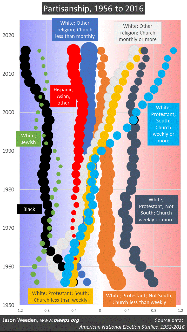
(Note: To smooth things out, the displayed results are based on averages of the relevant year along with the surrounding years—so, e.g., the earliest year, 1956, is based on averaging ANES data from 1952 to 1960. The exception is 2016, where I obviously didn’t have future data to average, so it’s mostly just based on 2016 data. One implication of this is that a sudden shift that occurs in Year X would actually start showing up on the chart a bit before that, and won’t fully appear until a bit after.)

If we start at the bottom of the chart in the mid-1950s, Republicans were mostly white Protestants from outside the South and Democrats were a hodge-podge of Jews, those in other religions or no religion (back then, this was mostly Catholics), non-whites, and Southern Protestants. Through the 1960s, as Democrats moved left on civil rights, blacks became very solidly Democratic and non-Southern white Protestants became less solidly Republican, while Southern white Protestants became less solidly Democratic.

Things were pretty stable for these various groups from 1970 to 1990, but then big shifts kicked in as white Protestants, churchgoers, and Southerners continued moving towards Republicans. These were the years when Republicans became paradigmatically home to white evangelicals, something that is as true today as it has ever been. In addition, the Bush II and Obama years saw further gains for Democrats among non-whites.

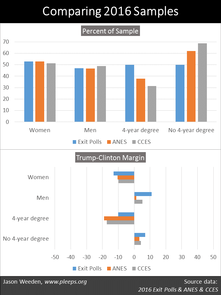
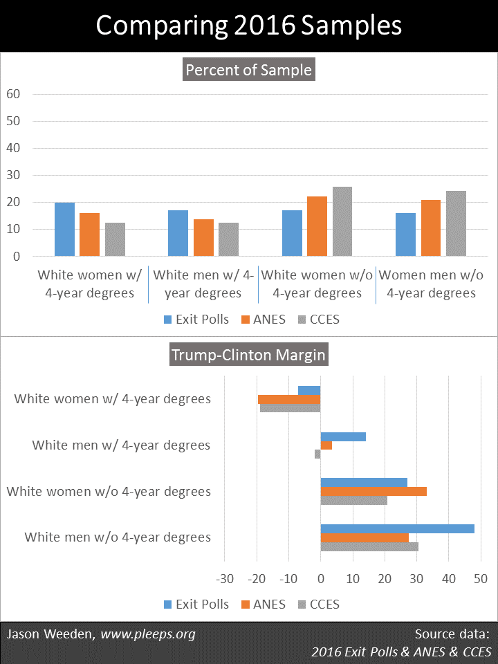
I’m just looking at race, religion, and region in this analysis. There are more details, obviously—income, gender, age, union membership, and so on. And, of course, the most recent election saw real splits along educational lines, especially among whites. But, still, race, religion, and region are, as far as I know, among the biggest demographic deals over this time period.

Can we know what’s coming?

Whenever I look at historical data like this—on politics, fertility, employment, religion, or whatever—I’m always struck by the tremendous uncertainty of projecting future long-term trends. I imagine someone looking at the massive downward fertility trends in the early 20th century trying to predict the mid-century Baby Boom. I imagine someone looking at the massive upward trend in prime-age women’s labor participation in the second half of the 20th century trying to predict that it would peak in 2000 and then decline. The next time you see, for example, projections of worldwide religion and fertility trends out to 2060, think about what such projections about 2016 would have looked like had we made them in 1972.

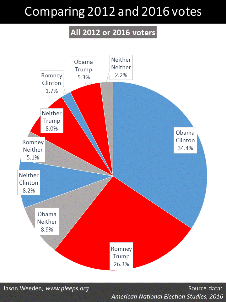
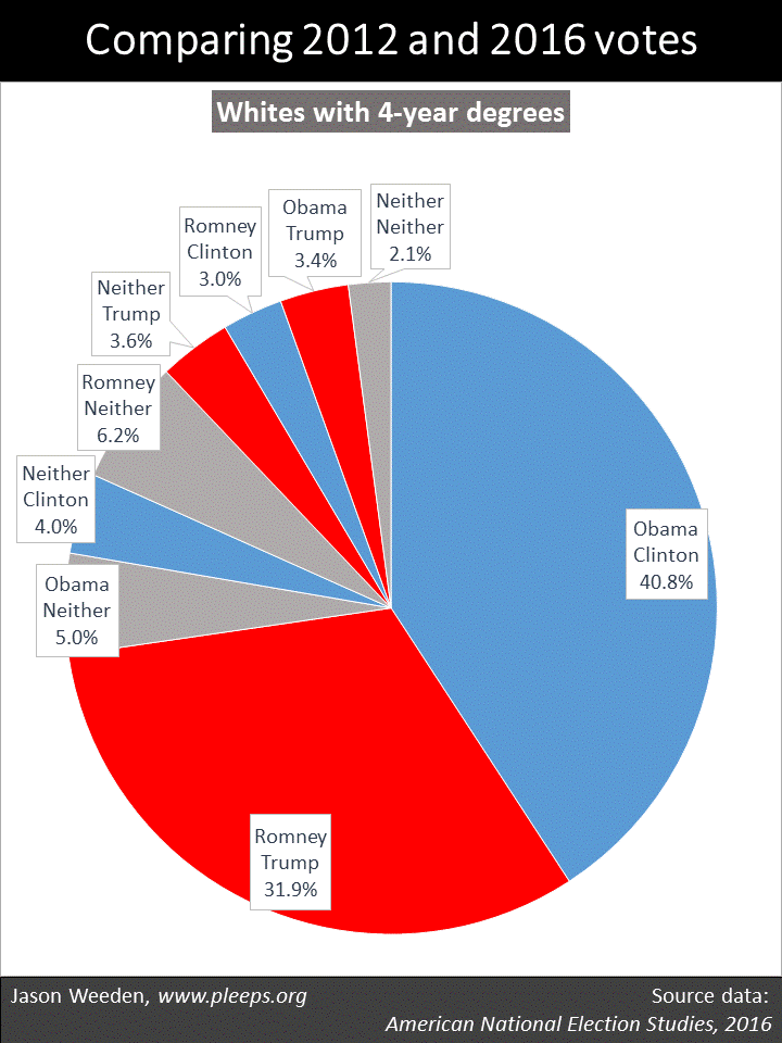
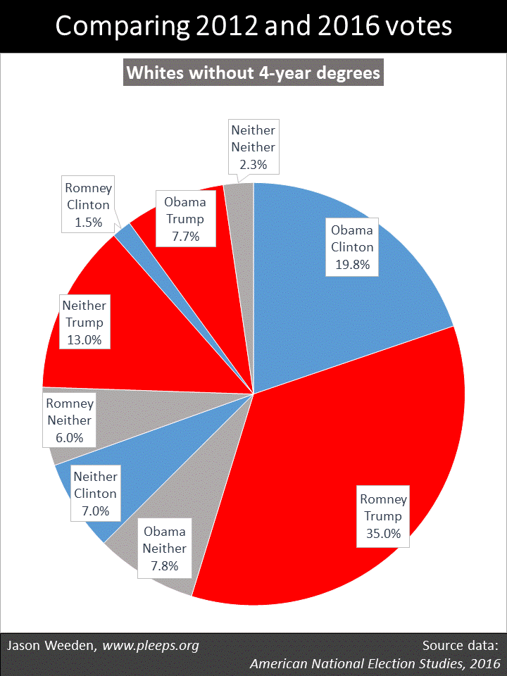
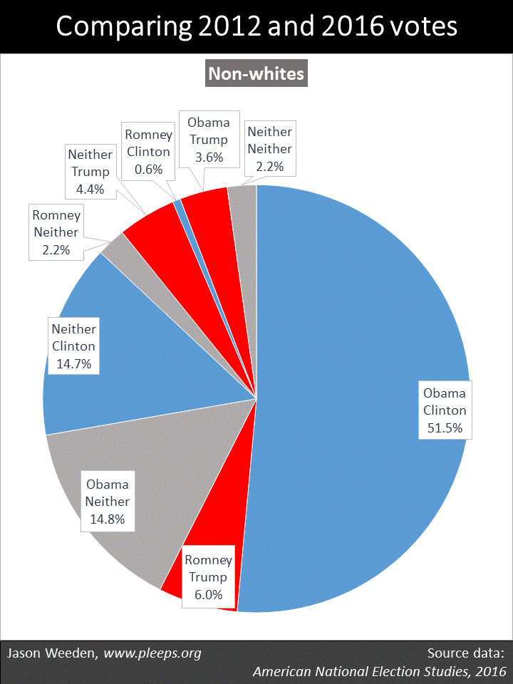
Such uncertainty is no less potent when it comes to political party coalitions. These coalitions are cobbled together and evolve in ways that rely on a variety of not-at-all-inevitable circumstances. For instance, six months ago the U.S. had a presidential election that given any one of a hundred subtle differences might have come out the other way—not quite as purely coin-tossy as 2000, but still. And the 2016 election involved complex changes from 2012, some from party switching but perhaps more so from differences in turnout.

Estimating how these kinds of complex matters might develop over longer timeframes involves a number of known unknowns and unknown unknowns. Such efforts are entertaining, to be sure, but it’s a little crazy to actually believe any of them.

Actually, epistocracy might have helped Clinton defeat Trump

But she probably would have been running against President Romney, and might have still lost.

Epistocracy is in essence the idea that voting participation or outcomes should be adjusted relative to citizens’ knowledge levels. For example, perhaps people should have to pass a basic political knowledge test before being allowed to vote, or perhaps we should allocate extra votes to people who do particularly well on such tests.

In a post last year, I took the 2016 exit polls, along with political knowledge test results from the 2012 American National Election Studies (ANES), and tried to estimate how various epistocracy proposals would have affected the 2016 presidential race between Clinton and Trump. It was complicated work, estimating party- and demographic-specific knowledge levels from the 2012 sample, and seeing how that would plug into the demographic voting patterns from the 2016 exit polls.

My conclusion was that various epistocracy proposals would have helped Trump. But the new 2016 ANES sample was recently released. And now it seems likely that my conclusion was wrong.

There’s no need for a complicated model this time. The 2016 ANES survey included nine political knowledge items (e.g., knowing which party controlled the U.S. House and Senate and being able to identify various domestic and foreign leaders). It asked people how they voted in the 2012 and 2016 presidential elections. So, you know, we can just look within the same sample at Obama vs. Romney voters and Clinton vs. Trump voters regarding how well they did on the nine-item test of political knowledge.

The chart below shows the main results, including political knowledge averages (the dots) and 95% confidence intervals (the lines). Looking at 2012, according the the 2016 ANES sample, Obama voters averaged 5.1 correct out of the 9 items measuring political knowledge, while Romney voters averaged 5.48. This was a highly significant difference (p = .00001); you can see that the 95% confidence intervals are pretty far apart. In 2016, in contrast, Clinton voters averaged 5.37, while Trump voters averaged 5.15. This was a smaller knowledge gap than in 2012, though still significant (p = .009); you can see that the 95% confidence intervals overlap a bit.

So, the headline here is that various epistocracy proposals likely would have helped Clinton over Trump. But such proposals would have especially helped Romney over Obama. (In fact, before anyone on the left gets too mouthy about the average political knowledge of Trump voters, they should note that the 2016 ANES data suggest that Trump voters were at least as knowledgeable on average as Obama voters.) And it’s entirely more difficult to say what the implications would have been for a contest pitting President Romney against challenger Clinton in 2016, though the ANES sample suggests that epistocracy proposals would have perhaps given a small boost to Romney.

OK, so how did this happen? What did my earlier estimates miss? What changed such that, in the 2016 ANES sample, we see substantially higher political knowledge for Romney voters relative to Obama voters, but then things flip in the Clinton-Trump race?

Changes from 2012 to 2016

There are at least a couple of basic things that caused my earlier analysis to differ from the results in the 2016 ANES sample. One, as I discussed in yesterday’s post, is that the 2016 exit polls have some substantial differences with the 2016 ANES sample. For example, relative to the ANES data, the exit polls contain a lot more college-educated folks, show a weaker pro-Clinton margin among the college-educated, and show a wider gender gap. In short, I checked what the 2016 ANES political knowledge outcomes would look like if the ANES sample mirrored the demographic composition of the exit polls, and Clinton’s epistocracy advantage would be reduced but not eliminated. In addition, the 2016 ANES data show marginally smaller racial and gender gaps in political knowledge than did the 2012 ANES, so that was part of it as well.

But the bigger impact comes from what the 2016 ANES sample shows about differences in turnout between 2012 and 2016. The new data suggest that two complementary things happened: A group of especially low-knowledge folks who had turned out for Obama ended up sitting out the 2016 election, while at the same time a different group of especially low-knowledge folks who had sat out the 2012 election ended up turning out for Trump. This raised the average political knowledge of Clinton voters relative to Obama voters and lowered the average political knowledge of Trump voters relative to Romney voters, something that went beyond what the basic demographics in the 2016 exit polls suggested.

As I discussed in a recent post, the 2016 ANES data show a lot of complex shifts from 2012 to 2016. These dynamics involved not only (or even primarily) voters switching between parties, but also (in fact, mainly) switches between voting and not voting.

The chart below shows averages in the nine-point political knowledge measure, split out by both 2012 and 2016 major-party votes (and non-votes).

  • There are three groups with pretty high knowledge averages: People who voted Romney and then switched to Clinton (though this is a pretty small group, which shows up in the wide 95% confidence intervals represented by the line), people who voted for Romney and then Trump, and people who voted for Obama and then Clinton.
  • And then there are three groups in the middle: People who voted for Romney and then didn’t vote for president in 2016, people who didn’t vote in 2012 and then voted for Clinton, and people who voted for Obama and then switched to Trump.
  • And then there are three groups with particularly low political knowledge averages: People who didn’t vote in 2012 and then voted for Trump, people who voted for Obama and then didn’t vote in 2016, and people who sat out both the 2012 and 2016 presidential elections.

Thus, you can see what I’m talking about at the low end of the chart. There was a group of low-knowledge Obama voters who didn’t turn out in 2016. And there was also a different group of low-knowledge Trump voters who hadn’t turned out in 2012. These groups have substantially lower political knowledge on average than both the Romney voters who didn’t turn out in 2016 and the Clinton voters who hadn’t turned out in 2012. It was these turnout dynamics that primarily drove the flip in the major parties’ political knowledge averages between 2012 and 2016.

As I’ve mentioned, these kinds of patterns might spell trouble in the 2018 midterms for Republicans. Just as Obama had personally attracted a segment of low-knowledge folks who don’t normally turn out and couldn’t be relied on in midterms, we now have indications that Trump also personally attracted his own (different) segment of unreliable, low-knowledge folks.

Political knowledge and the primaries

The 2016 ANES data provide a look at the primaries as well. The chart below shows political knowledge averages for the major contestants’ voters in the primaries (and also shows the lower average of people who didn’t vote in the primaries).

Would epistocracy proposals have affected the Clinton-Sanders primary race? It doesn’t look like it. Would epistocracy proposals have hurt Trump in the Republican primaries? Yes, it’s likely. This isn’t, though, because Trump’s primary voters were especially low-knowledge—they weren’t significantly lower than Clinton’s and Sanders’s primary voters. Instead, it’s because the other Republican primary voters were especially high in political knowledge.

These patterns reinforce a couple of earlier points. First, political knowledge is higher among people who regularly vote. And, second, typical Republican voters (whether voting for Romney in 2012 or for Cruz, Kasich, or Rubio in the 2016 primaries) do better on political knowledge tests than typical Democratic voters.

As usual, it’s complicated

So there are various ways that epistocracy might have stopped Trump in 2016. If there had been some significant epistocracy mechanism in the 2012 general election, then it’s likely that Romney would have won, and, under the usual assumptions, unlikely that Trump would or could have mounted a successful Republican primary challenge to a sitting president. Or, if some significant epistocracy mechanism had first been implemented in the 2016 Republican primaries, then it’s likely that Trump would have had a harder time winning that nominating contest—perhaps we would have seen a Cruz-Clinton race instead. Or, if some significant epistocracy mechanism had first been implemented in the 2016 general election, then it’s likely that Trump would have lost to Clinton.

But, again, just because epistocracy might have hurt Trump, it’s not the case that epistocracy would typically hurt Republicans. Quite the opposite. A significant epistocracy adjustment would have probably meant that Obama would have been, at best, a one-term president. And it also might have given an edge to any major non-Trump Republican in a race against Clinton.

And this is, of course, why support for epistocracy proposals usually comes from folks who prefer conservative economic positions but oppose Trumpian white nationalism—that is, libertarians, mostly. (In general, people who test well tend to hold more libertarian-leaning issue positions.) In the wake of Trump’s unusual, unlikely, skin-of-his-teeth Electoral College victory, though, a lot of liberals might start agreeing that some form of epistocracy would be desirable (even if impracticable). But, you know, be careful what you wish for.

Comparing samples from 2016: Exit Polls vs. ANES vs. CCES

The publicly available data on the 2016 presidential race tell a broadly consistent story, but have some important differences as well.

In addition to the 2016 exit poll results that were made public on election night, in the past month we’ve seen releases of new data from two other important samples, the American National Election Studies (ANES) and the Cooperative Congressional Election Study (CCES). The exit polls combine phone surveys of early and absentee voters with live surveys of exiting voters at a number of physical polling places; the available results appear to be from over 24,000 voters. The ANES combines an online sample and a face-to-face sample, containing around 2,800 voters. The CCES is an online sample containing around 45,000 voters.

After the actual ballots had been counted, Clinton won the popular vote over Trump by 48.2% to 46.1%. This margin of 2.1 points is very similar to the overall margins reported by the exit polls and the CCES, though the ANES sample is somewhat Clinton-skewed, containing around 49% for Clinton and 44% for Trump.

All these samples measure roughly comparable information on a number of demographic items—race, gender, religion, education, and so on. In this post, I’ll compare results across the three samples on a selection of them. While the samples are similar on some of the major themes of the election, there are also important differences. Some of these differences involve the percentages of the samples represented by various groups (e.g., the exit polls have a lot more college-educated folks than ANES and CCES). Other differences are in the Trump-Clinton margins within various subgroups (e.g., the exit polls show Trump with an especially large margin among non-degreed white men, while the ANES sample shows Clinton with an especially large margin over Trump among Hispanics).

So let’s see some details. The first chart below shows whites, blacks, Hispanics, and immigrants. There are small differences in the racial makeup of the samples, with relatively fewer whites and more Hispanics (and also more immigrants) in the exit polls, and relatively more whites and fewer Hispanics (and also fewer immigrants) in the CCES. The bigger differences are in the support margins. In particular, the ANES sample shows substantially more support for Clinton over Trump among immigrants and Hispanics. (The “Trump-Clinton Margin” here simply subtracts Clinton’s percentage from Trump’s percentage, thus showing bigger Clinton margins to the left of 0 and bigger Trump margins to the right of 0.)

The next chart below shows women, men, people with 4-year degrees, and people without 4-year degrees. Here, there are some really major differences between samples. Primarily, the exit polls show a markedly higher percentage of people with college degrees (50%), particularly as compared with the CCES (31%). Yet, recall that the exit polls and the CCES both show similar overall outcomes, giving Clinton around a 2-point advantage over Trump. And, sure enough, we see how it works in the margins by education: The exit polls have more college graduates, but show Clinton with a smaller relative advantage over Trump among college graduates—and, in this case, the smaller advantage among a larger group ends up producing an overall average similar to the CCES (which shows a larger advantage among a smaller group). The two samples end up taking different roads to the same place.

In addition, in the chart above, the exit polls showed a wider gender gap than either the CCES or (especially) the ANES. I had remarked in an earlier post using CCES data that I was surprised that gender wasn’t a bigger deal; this intuition came in part from my earlier look at the exit polls.

The next chart below shows whites split out by education and gender. Here, we see echoes from the prior chart—the exit polls had more college graduates (and, obviously, fewer non-graduates), different Trump-Clinton margins by education, and a wider gender gap. So, in this chart, we see some really big sample differences. While the exit polls showed Trump with a 48-point margin over Clinton among white men without degrees, the ANES data have this at only a 28-point margin. While the exit polls showed Trump with a 14-point margin over Clinton among white men with degrees, the CCES gave Clinton a 2-point edge over Trump with this group. While the exit polls showed Clinton with only a 7-point margin over Trump among white women with degrees, the ANES sample places Clinton’s advantage at 20 points. These are, umm, non-trivial differences.

The last chart below shows white evangelicals, non-Christians (of all races), LGBT folks, and military veterans. And there are more differences between the samples, particularly in the Trump-Clinton margins. For example, the ANES shows Clinton with a 67-point advantage over Trump among LGBT folks, while for the CCES it’s 50 points. (Actually, in the ANES, this is only LGB folks—they didn’t ask their sample about T.) Also, the CCES shows Trump with a 27-point advantage over Clinton among veterans, while in the ANES it’s 18 points.

Between deification and nihilism

Comparing across samples, there are some things we’re pretty damn sure of. For example, Clinton did a lot better than Trump among racial minorities, LGBT folks, non-Christians, immigrants, and the college-educated. Trump did a lot better than Clinton among white evangelicals, non-degreed whites, and veterans.

How much better, exactly? Well, that’s complicated. There’s no perfect data, no singular answer, no assumption-free yardstick. Each sample has idiosyncrasies and drawbacks. Each sample has “special sauce,” from sampling strategies at the front end to the construction of weighting variables at the back end. This stuff is really hard.

As a consumer of social science, a central challenge is to try to stay in that middle ground between the hazards of data deification and data nihilism. On the one side, sometimes we form opinions that are way too certain based on limited samples and stilted analyses. Indeed, as we just saw, even comparing very high-quality samples using simple percentage splits reveals a number of important differences. So just imagine all the crazy nonsense regularly produced by running, say, complex multivariate analyses using small and obviously non-representative samples. Seriously.

On the other side, sometimes the uncertainties in sampling and analysis make us too quick to throw out the baby with the bath water, or, you know, to deny that anyone ever knew there was a baby there in the first place. All population estimates based on limited samples are probabilistic, but that doesn’t somehow eliminate the fact that having more data from more sources tends to produce better estimates.

The mature response is a laborious one, one that consistently acknowledges the tremendous complexity of social science and the hard reality of noise. Ain’t nobody got time for that, I know. And I certainly haven’t always struck the right balance myself. But it’s important to try.

Electorates are like rivers

You can’t step into the same one twice.

According to the United States Election Project, around 137 million people voted for president in 2016 (out of 231 million who were eligible). In 2012, around 129 million voted for president (out of 222 million who were eligible).

Thus, there were lots of 2016 presidential voters who hadn’t voted for president in 2012—at the very least around 8 million. But, of course, it’s a much higher number than that. Some of the 129 million who voted in 2012 didn’t vote in 2016, either because they couldn’t (e.g., they died) or, more often, because they chose not to.

In fact, according to data recently released from the American National Election Studies (ANES), around 19% of presidential voters in 2016 hadn’t voted for president in 2012—that would be around 26 million out of 137 million. Further, around 12% of 2012 presidential voters who were eligible to vote in 2016 didn’t vote for president in 2016.

It’s understandable that folks prefer to think of the voting population as a rather fixed thing—as though, for example, when you look at Michigan in 2016 and see that Trump beat Clinton by 47.5% to 47.3%, while back in 2012 Obama beat Romney by 54.2% to 44.7%, then that probably means that the main story is that tons of Obama voters switched to Trump in Michigan. But it’s just really more complicated than that.

So let’s see some details from the ANES data. Here, I’m looking only at people who reported voting for president in either 2012 or 2016 (that is, I’m excluding people who didn’t vote for president in either election). In other words, it’s a sample of the combined 2012/2016 presidential voters, as surveyed in 2016 (which means it’s missing people who voted in 2012 but then died or otherwise became ineligible to vote before 2016).

The first chart below shows the full sample of 2012/2016 presidential voters. It’s broken down by major-party votes (Obama vs. Romney and Clinton vs. Trump) along with “neither,” which combines non-voters and third-party voters. So, for example, the “Neither Neither” category combines people who voted third party in both elections, people who didn’t vote for president in 2012 and then voted third party in 2016, and people who voted third party in 2012 and then didn’t vote for president in 2016.

The results show a remarkably dynamic situation. Overall, in this sample of 2012 and 2016 presidential voters, around 61% voted for the same party in both elections. And then around 27% voted in one but not the other presidential election, including non-voters in 2012 who then voted in 2016 (17%) and 2012 voters who sat out 2016 (10%). And the other 12% voted in both elections but either switched between the major parties (7%) or switched between a major party and a third party/independent candidate (5%).

Given how close Trump’s Electoral College victory was, you can pin it on any number of causes. Would Clinton have won if more Obama voters had turned out? Yes. If she had been able to pull in more previous non-voters? Yes. If more Romney voters had sat this one out? Yes. If Trump had attracted fewer former non-voters? Yes. If she had converted more Romney voters? Yes. If Trump had converted fewer Obama voters? Yes.

Now, it’s certainly the case that Obama was more popular relative to Romney than Clinton was relative to Trump. This shows up in a number of ways. Most obviously, Obama’s popular vote win was bigger than Clinton’s popular vote win. And, according the ANES data, there were more Obama-to-Trump voters than Romney-to-Clinton voters. And, while both Clinton and Trump pulled in substantial numbers of prior non-voters, there were more Obama voters than Romney voters who sat out 2016 (or voted third party).

The thing I don’t get, though, is the continued narrative that particularly highlights Trump’s conversion of former Obama voters. Yes, it was a contributing factor. But, no, it doesn’t look like The Biggest Thing. Relative to the number who switched from Obama to Trump (5.3%), there were considerably more folks who had voted for neither Obama nor Romney in 2012 and then voted for Trump (8%) or who voted for Obama and then voted for neither Clinton nor Trump (8.9%).

A few subgroups

I suspect that many of my readers are surprised by the level and complexity of these electoral shifts. But I also suspect that many of my readers are college-educated whites. And college-educated whites are weird. Politically, among other things, they have high turnout rates and they’re much more likely than other folks to hold consistently liberal or consistently conservative positions.

So you just don’t see as much electoral instability among college-educated whites. The chart below shows it pretty clearly in the 2016 ANES data. Here, around 74% were in the voted-for-the-same-party-in-both-elections club, 7% were new voters, 6% were drop-outs, 6% switched between major parties, and 6% switched between a major party and a third party/independent. Further, the dynamics from 2012 to 2016 among whites with 4-year degrees had roughly balanced effects on the 2016 race. For example, Clinton and Trump attracted about the same number of new voters, about the same number of Romney and Obama voters voted for neither Trump nor Clinton, and about the same number switched from Obama to Trump as from Romney to Clinton.

In contrast, things were just a lot less stable when you move away from degreed whites. The next chart below shows whites without 4-year degrees. For these folks, only around 55% were in the voted-for-the-same-party-in-both-elections camp. And you can really see Trump’s strengths with this group. In particular, while 35% voted for both Romney and Trump, another 13% voted for Trump after not having voted (or voted third party) in 2012, and then another 7.7% voted for Trump after voting for Obama in 2012. (Again, this doesn’t support a Trump-won-mainly-by-converting-Obama-voters narrative—there were substantially more new voters in Trump’s white working-class base than there were 2012 Obama voters, something I also found when I looked at recent data from the Cooperative Congressional Election Study (CCES).)

Non-whites also displayed similarly high levels of electoral instability when we compare 2012 with 2016, shown in the chart below. Here, only around 57% were in the voted-for-the-same-party-in-both-elections camp. Unlike non-degreed whites, though, when non-whites did turn out to vote, Democratic candidates had an enormous advantage. But there’s great variance in turnout. In this ANES sample of 2012/2016 voters, around 15% of non-whites voted for Obama but then not for either Clinton or Trump, which was almost exactly offset by around 15% who had voted for neither Obama nor Romney but then voted for Clinton.

The ANES data on non-whites does suggest, though, some real weaknesses for Clinton relative to Obama. In general, one might have expected a larger portion of new Clinton voters relative to dropout Obama voters from at least a couple of sources—including from younger folks who came of voting age since 2012 and from recently naturalized immigrants. Further, there were hardly any Romney-to-Clinton converts among non-whites, while there was a small but not insignificant number of Obama-to-Trump converts. Indeed, in a pretty startling bit of detail, there were more non-whites who didn’t vote for Romney and then voted for Trump (8%) than who did vote for Romney and then voted for Trump (6%).

Yeah, but …

Yeah, but, it’s just one sample. True. It’s always better to have multiple independent data sources when addressing complex issues. I will say, though, that one of my main conclusions—that, among non-degreed whites, Trump had more prior non-voters than Obama converts—looks pretty similar in the ANES sample here as it did when I looked at the 2016 CCES sample. Now, having said that, I can also report a major difference between the ANES and CCES samples—the latter has fewer 2016 non-voters and, relatedly, more same-party 2012/2016 voters. I haven’t yet developed a good sense of why that is.

Yeah, but, retrospective surveys inflate the winner’s support, and in this case will especially inflate Obama’s support in 2012. Also true. Indeed, a suspiciously high percentage of the ANES sample report voting for Obama relative to Romney in 2012. Two things, though. First, you actually should expect some degree of Obama inflation here relative to Romney. This is because Romney did particularly well with seniors and, not to put too fine a point on it, people who were seniors in 2012 are less likely to show up in a 2016 survey than people who were not seniors in 2012. But, still, the Obama vs. Romney numbers remain high. Which raises a second point: If you think that the Obama vs. Romney numbers are off in favor of Obama, what that means is that you think that the number of Obama-to-Trump converts is probably even lower than these samples are showing. And, likewise, you think that the number of new Trump voters is probably even higher. That is, if anything, these samples are probably underreporting the extent to which new Trump voters outnumbered Obama converts.

Will Trump have his own midterm problems?

Before 2016, the presidential and midterm elections from 2008 to 2014 were marked by seesawing variations in the partisan makeup of the voting population. Obama scored strong victories in his presidential elections, only to be followed by a “shellacking” in both midterms. Prior to 2016, this created a conventional wisdom about how Democrats do well in presidential years but not midterms. After 2016, though, conventional wisdom shifted: This wasn’t a phenomenon about Democrats but more specifically about Obama—when Obama was personally on the ballot, he drew out a segment of supporters who don’t typically vote.

So now it seems we might see something similar with Trump. He drew out his own segment of supporters who don’t typically vote—whites without college degrees who are younger and poorer. It could be that many of them grow disillusioned with Trump, given that he seems likely to break some of his populist promises (e.g., to make sure everyone has better and cheaper healthcare). But we could also see a more basic Obama-like phenomenon, where many of Trump’s new voters simply don’t show up in midterms when he isn’t personally on the ballot, even if they’ll turn out in 2020 when he is.

We’ll have to wait and see. The details of who turns out to vote from year to year are messy, complicated, ever-changing. Or as Socrates put it (according to Plato): “Heracleitus says, you know, that all things move and nothing remains still, and he likens the universe to the current of a river, saying that you cannot step twice into the same stream.”