Analyses of the public’s political opinions from Pew Research (and to an extent Gallup as well) often follow a certain script. On whatever topic they’re covering, they’ll usually start with the current numbers. Then they’ll compare the latest survey with older ones to look for trends over time.
Then they’ll break things down by party affiliation and/or liberal-conservative self-identification. For most kinds of issues, these breakdowns show very large differences—self-labeled liberal Democrats really tend to hold liberal views on various issues while self-labeled conservative Republicans really tend to hold conservative views. These kinds of splits are interesting, but often carry tremendous causal ambiguity. They result from complex mixtures of people who hold specific issue opinions because of their party or ideology along with people who favor a party or ideology because they have a given set of issue opinions.
To give a better sense of what’s driving things, the last step in the analysis often shows various demographic splits. In recent Pew political posts, for example, they showed trust in government broken down by gender, age, and education, views on the rich and the poor broken down by gender, education, and income, and budget preferences broken down by gender, age, education, and income.
Overall, it’s a pretty good script. But I’m frequently puzzled by one aspect: the choice of demographics. Gender, age, education, and income often contribute to political divisions. Yet they’re mere ripples in the pool these days compared with the crashing waves of religion and race.
In this post, then, I want to show as plainly as I can that the contributions of religion and race to political differences are typically much larger than the contributions of other standard demographic categories. That is, if you’re doing a demographic breakdown of public opinion on political topics, you’d usually want to start with religion and/or race, because they’re the biggest deals. In addition, I want to show where religion tends to be especially dominant versus where race tends to be especially dominant.
And that’s the chart below. Basically, I took a few years of recent Pew data, grouped a number of their individual questions into multi-item opinion measures (on rich-poor economic redistribution, on homosexuality, etc.), and used multiple regressions to predict differences in those political items as a function of (1) information on religious identity (whether folks are evangelical, Catholic, atheist, etc.) along with frequency of religious service attendance, (2) racial and ethnic information along with immigrant status, (3) education, (4) age, (5) gender, (6) family income, and (7) region of the country (South, Northeast, etc.) along with population density (urban/suburban/rural).
You can see in the chart that religion/church (the black bars) and race/immigrant (the green bars) are just way bigger deals than education, age, gender, income, and region/density. Further, there are some kinds of items where race/immigrant variables are particularly big deals (party identification along with views on rich-poor issues, immigration, gun regulation, racial issues, and white nationalism, which combines views on immigration, race, etc.), while there are other kinds of items where religion/church variables are clearly the dominant demographic predictors (self-labelled liberal/conservative ideology along with views on homosexuality, abortion, marijuana legalization, environmental regulation, and Middle Eastern conflicts).
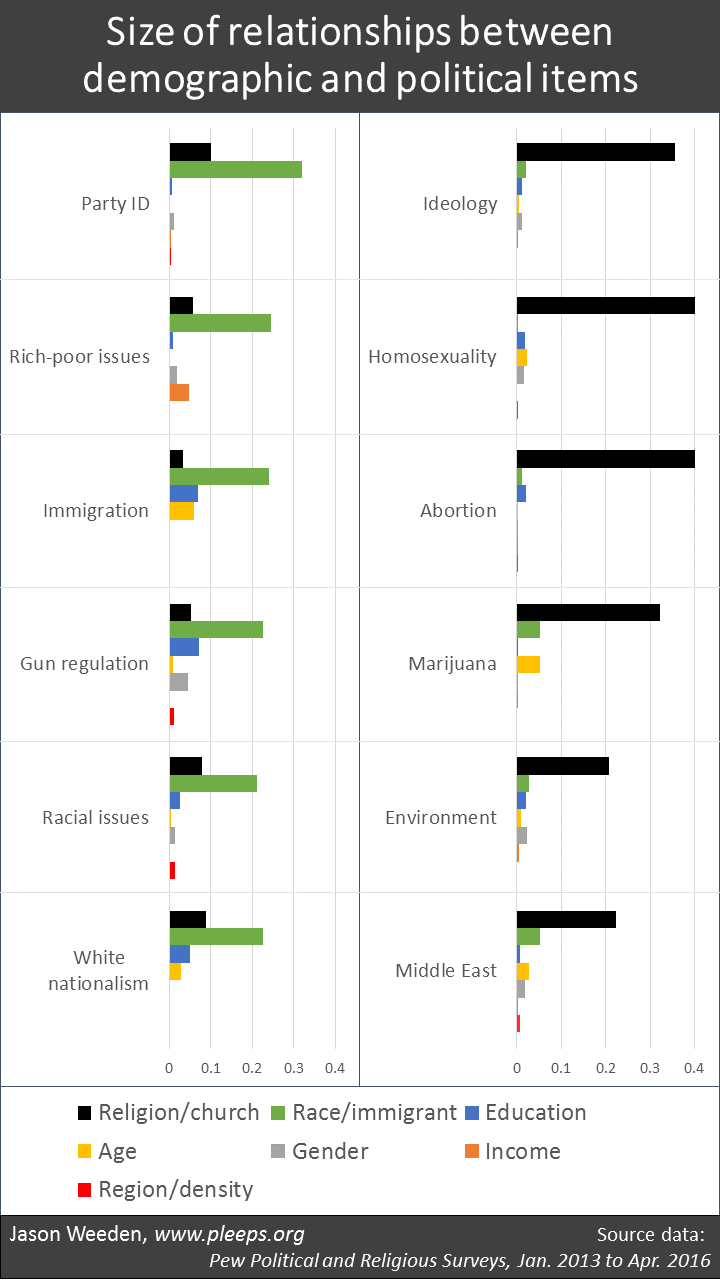 (Notes: The displayed values are additive contributions to the overall multiple R in forward stepwise OLS regressions. The predictor set included a large number of binary categories—being black, being Catholic, having a college degree, having an income below $40k, going to church at least one a week, and so on, and so on—as well as interactions involving all predictors. I entered individual predictors based on which had the biggest impact at any given step.)
The demographic categories other than religion and race are never seriously big deals (at least with this set of political items). Sometimes they’re moderate deals, though. Income is a moderate deal in predicting rich-poor positions. Education is a moderate deal in predicting views on immigration and guns. Age differences are a moderate deal when it comes to immigration and marijuana legalization. And so on.
Some of these demographic differences would be larger in a stand-alone analysis. Here, I’m using a regression analysis that accounts for the biggest differences first, and then shows only the marginal contributions for less important items. So, for example, age differences in issue opinions and partisanship are in part driven by the fact that younger groups are more racially diverse and less religious. Thus, when religion and race go into the models at earlier steps, the remaining marginal contributions of age differences aren’t typically very large. The story is similar with regional and urban/rural differences, which are largely driven by racial, religious, and educational differences.
Also, there are some key demographic items that aren’t typically measured in Pew samples. From other sources, for example, I’ve found political differences based on sexual orientation, veteran status, and occupational information.
Why avoid religion and race?
So it’s puzzling to me that Pew analyses often highlight age, gender, education, and income while often avoiding religion and race. I suspect the neglect of religion relates in part to the fact that Pew has separate groups focused on politics and religion, so perhaps the politics folks don’t like to crowd into the religion folks’ turf. I also suspect some of it relates to the complexity of the religious divisions. To really find the religious fault lines, you have to spend some time grouping and regrouping the categories. In my analyses, I’ve usually ended up settling into a not-entirely-obvious system that combines Mormons and non-Catholic evangelicals into one category, other Christians in another category, “nothing in particular” and those with missing information in another, specific non-Christians (Jews, Buddhists, etc.) in another, and then atheists and agnostics in yet another. There’s no great a priori insight that drives any of this for me; it just tends to be a set of categories that carves the sample effectively when looking at political differences.
I also suspect that lots of people just don’t really enjoy thinking about religious and racial differences, and particularly don’t enjoy noticing just how much of our current political differences are attributable to these sources. There’s something creepy about it—it’s too close to home and it’s too near the bone, and all that. Or maybe that’s not it; I really don’t know.