God, race, and party

Pew’s 2014 U.S. Religious Landscape Study (the datafile was recently made public) presents a good opportunity to dig more deeply into how religion and race relate to political party affiliation. It’s a big sample (over 35,000) that not only has unusually detailed variables on religion, but also has racial and religious information on the respondents’ spouses and partners.

First I’ll cut to the chase. The chart below shows party affiliation averages for discrete groups based on race and religion. I’ll explain the details of the race and religion measures below the chart, but the short answer is that the racial categories are largely (but not exactly) what they appear to be and the religion measure combines information on Christian and Evangelical identity, belief in God, and religious service attendance. The size of the circles is based on how many individuals are in each group (e.g., you can see that there are lots of whites with middle-of-the-road religion numbers, few blacks with low religion numbers, and so on). And the left-to-right position is average party identification.

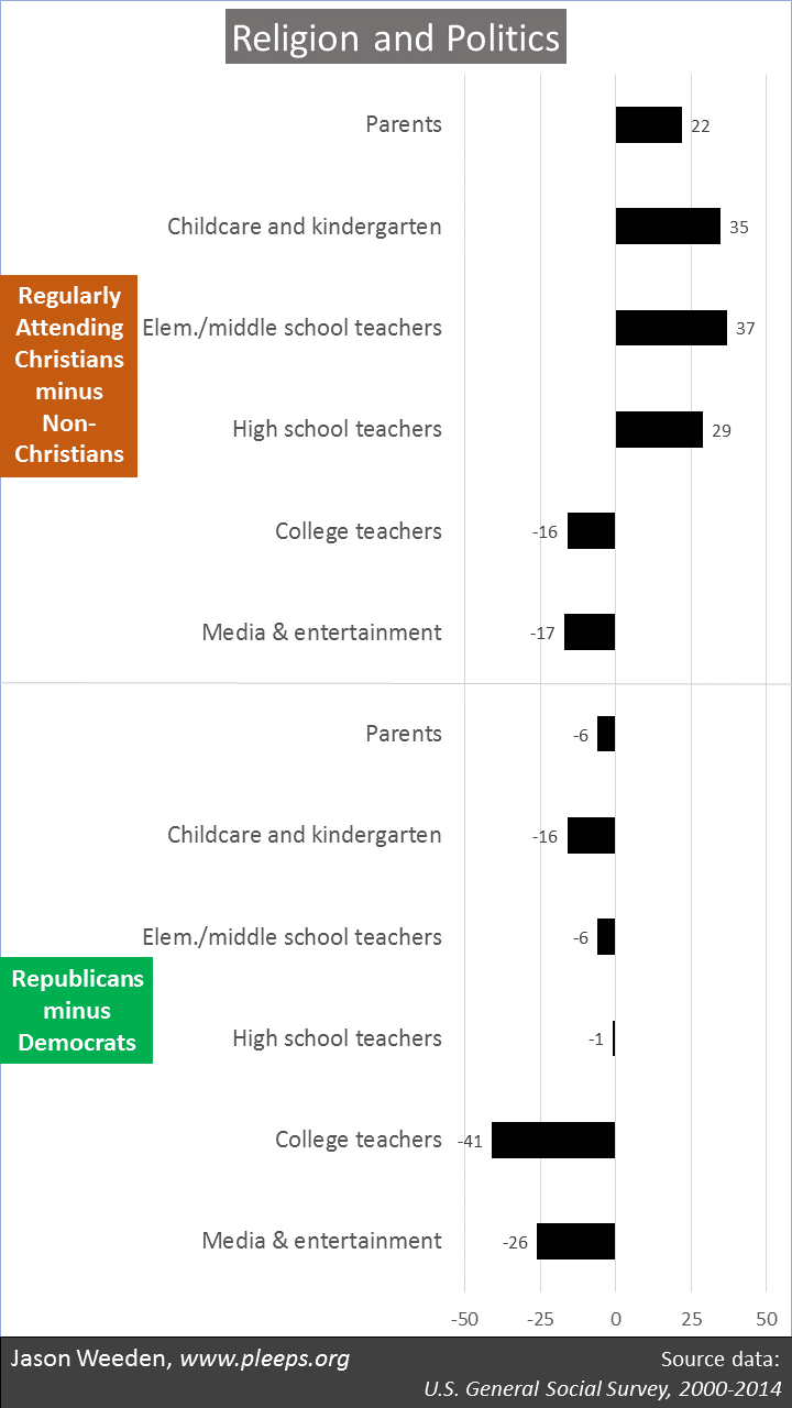
The main story is that Republicans are prevalent among more-religious whites, while Democrats are prevalent among blacks and less-religious whites and Hispanics/Asians/others. One way to look at it is to notice that religious differences are a very big deal for whites, a modest deal for Hispanics/Asians/others, and just not a deal for blacks (if anything, more-religious blacks are even more solidly Democratic than less-religious blacks). Another way to look at it is that, at low religion levels, racial differences in party affiliation are trivial; but at high religion levels, racial divisions are simply enormous.

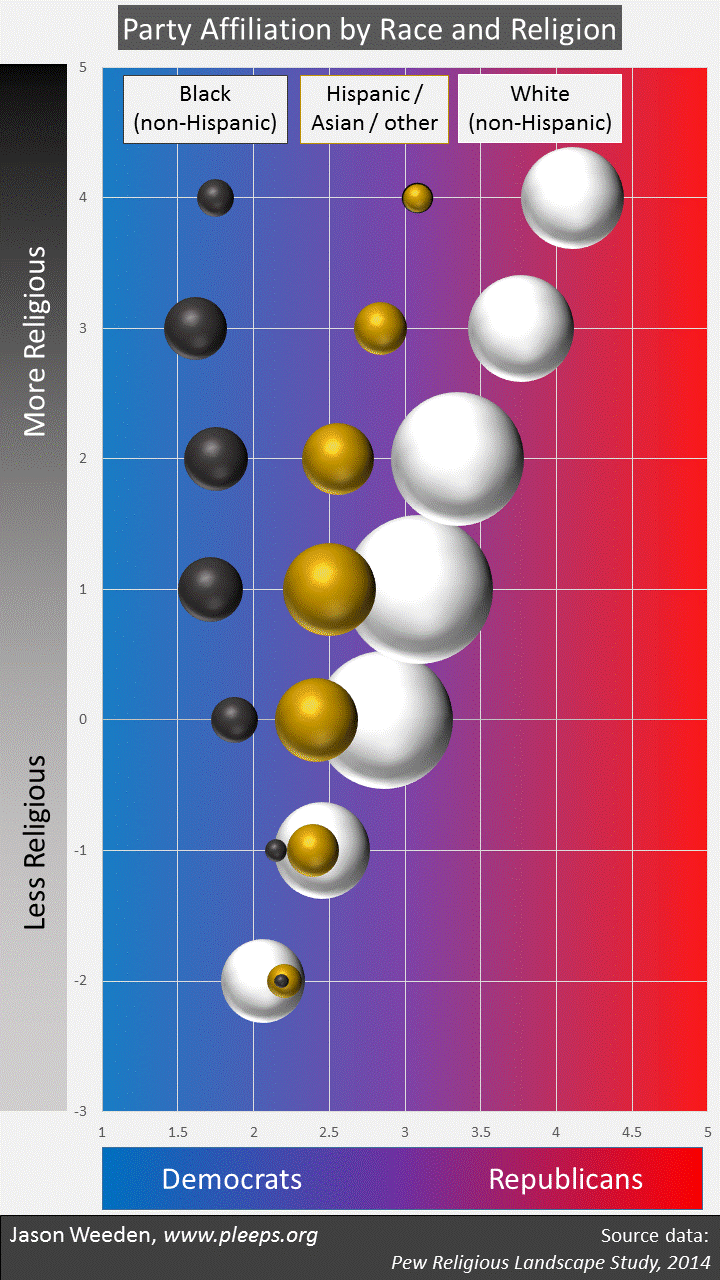
OK, now the gory details. The race and religion measures are cobbled together from various bits of information. On race, I found that information regarding spouses/partners made important contributions to party affiliation. So, for example, Hispanics/Asians/others with white partners look more like whites in party affiliation, while Hispanics/Asians/others with black partners look more like blacks. Further, whites with black partners and blacks with white partners look a lot like Hispanics/Asians/others in party affiliation. So, the chart makes those adjustments: (1) “White” means (a) non-Hispanic whites who don’t have black spouses/partners plus (b) Hispanics/Asians/others with white spouses/partners. (2) “Black” means (a) non-Hispanic blacks who don’t have white spouses/partners plus (b) Hispanics/Asians/others with black spouses/partners. (3) “Hispanic/Asian/other” means everyone else.

The religion measure involves a point system; I just poked around and found a particularly efficient way to get at the main party differences. Basically, add 1 point for each of the following that apply: The respondent is either Evangelical or Mormon (where “Evangelical” means a non-Catholic Christian who self-identifies as “born again or evangelical”); the respondent has a spouse or partner who they characterized as either Evangelical or Mormon; the respondent believes in God and thinks of God as a person (rather than an impersonal force); and the respondent attends religious services at least once a week. And then subtract 1 point for each of the following that apply: The respondent is not Christian, but excluding “nothing in particular” or non-responders (i.e., the respondent gave some affirmative identity that was not Christian, e.g., atheist, agnostic, Jewish, Buddhist, and so on); the respondent doesn’t believe in God (either as personal or impersonal); and the respondent has a spouse or partner who they characterized as either atheist or agnostic.

I’ll unpack a few of the religion numbers. When you look at the religion values on the chart, the super-religious 4s are all folks who are Evangelicals/Mormons, and have spouses/partners who are Evangelicals/Mormons, and believe in a personal God, and go to church at least once a week. The 3s are folks who lack one of these characteristics, but for whom none of the negative indicators apply—many are Evangelicals/Mormons who believe in a personal God and go to church weekly, but who aren’t married/partnered (or who have partners other than Evangelicals/Mormons or atheists/agnostics).

At the other extreme are the negative 2s (which actually combine -2s and -3s, because there just aren’t very many -3s)—these are overwhelmingly non-Christians (but excluding the “nothing in particular” folks) who don’t believe in God. The negative 1s are almost all not Evangelicals/Mormons, or partnered with Evangelicals/Mormons, or believers in a personal God, or weekly churchgoers; as for what they are, many are specified non-Christians (Jews, Buddhists, etc.) who believe in an impersonal God and many are “nothing in particular” folks who don’t believe in God. (But keep in mind that about three-quarters of those who say they’re “nothing in particular” also say they believe in God; the believers are split pretty evenly between personal/impersonal views of God.)

As for the rest—the 0s, 1s, and 2s—they’re, of course, somewhere in between. The 1s, for example, include lots of people who are mainstream Christians or “nothing in particular” folks, who are unmarried or have similar middle-of-the-road spouses, and who believe in a personal God but who don’t go to church weekly.

So that’s the chart. It uses racial and religious information, including information on spouses and partners. The race categories are pretty straightforward when thought of as a kind of family measure rather than an individual measure. The religion categories are based on a multifaceted scale, combining information on religious identities, belief in God, and frequency of service attendance. Put them together and you get a really powerful starting point in predicting party affiliation.

A key lesson here for me is that our understanding of the demographics of politics can often be improved with better measures. In this case, adding information about spouses/partners doesn’t change the fundamentals of how race and religion predict partisanship, but certainly picks up additional variance. The challenge for survey designers is to balance that extra explanatory power against the costs of asking more detailed questions.

The Big Overlap

What are the basic things that drive the electorate? Is it identities? Demographics? Partisanship? Ideology? Issues? Interests?

Opinions differ. So, for example, two books from 2016 gave plainly contrasting answers. In Democracy for Realists, Achen and Bartels say that voters are motivated by social identities but not really by issues or ideology. In Asymmetric Politics, Grossmann and Hopkins take the side of issues and ideology, arguing that Democrats are motivated by specific issues but Republicans by ideology.

Sometimes we hear that partisanship is the big driver of individuals’ issue opinions; and other times we hear that parties are made up of coalitions of diverse policy demanders (i.e., that individuals’ issue positions drive partisanship). Sometimes we hear that people are seeking to advance their self-interest (e.g., when rich people want tax cuts for rich people); other times we hear lamentations for their foolish lack of self-interest (e.g., complaining about downscale Kansans helping rich people cut taxes for rich people); and yet other times political researchers claim that self-interest just isn’t really a big motivating force at all in public opinion, but rather group interest is. Sometimes we’re told that ideology trumps interests; and other times we hear views such as those in the seminal book, The American Voter: “We have no quarrel with the view that ideological position is largely determined by self-interest.”

Here’s the thing. Most of these claims are right in their own ways when they say “Explanatory Category X is a big deal in understanding the electorate.” But most are wrong when they say “and Explanatory Category Y doesn’t really matter much.” What’s going on here is a big overlap in the various kinds of explanations. There are plenty of theoretical distinctions, but as a practical matter they all have strong relationships with one another.

Connecting dots

Social identities and demographics are obviously closely related. Sure, we can draw distinctions between people in a given group who closely identify with that group and people who don’t. For some purposes these are interesting splits. But as a practical matter researchers and commentators often just use a given demographic feature as the very thing that defines a social identity.

And it’s clear that such identities/demographics are a big deal in predicting voting, party affiliation, ideology, and a variety of issue positions (on racial issues, immigration, income redistribution, marijuana legalization, and so on). And, of course, it has become increasingly true in our sorted and polarized era that issue opinions and ideology and party affiliation and voting all tend to align. As a result, various distinctions—saying that politics is about identities but not issues or ideology, or that it’s about issues for these folks but ideology for those folks, or other similar sorts of contrasts—might have useful points to make about relative impacts, but are hardly ever true when stated too strongly.

Kurzban and I have also pointed out that there are connections with self-interest throughout these categories. Sometimes the connections are obvious—for example, noticing that wealthier and poorer people have different interests when it comes to income redistribution, and in fact on average tend to have contrasting opinions on economic issues. This is a pretty clear set of links among demographics, issues, and interests. But we’ve also noted other interest-related connections in the case of discrimination and meritocracy—it would be in some individuals’ interests to minimize different facets of group-based discrimination, but also in other individuals’ interests to maintain or increase (at least some forms of) discrimination. And we’ve argued that sexual and reproductive politics also involve strong interest-based connections. For example, abortion rights tend to be supported by those with Sex and the City lifestyles, for whom family planning is particularly important as a practical matter, but opposed by those with Father Knows Best lifestyles, for whom others’ lax sexual patterns are a threat to marital stability.

Further, we’ve argued that the academic contrast between group interest and self-interest doesn’t really hold up. “Group interest” often ends up meaning “personal interest that arises by virtue of being identified with a certain group,” which isn’t cleanly distinguishable from self-interest. And when the self/group terms are actually made distinct, it no longer makes much sense to say that group interest is a strong thing that matters more than self-interest.

(In fact, we have a brand new article in Advances in Political Psychology. Some parts are basically a summary of our book, but it also has some new and expanded points aimed specifically at an academic audience (the book was aimed at a more general audience). We hope this new article helps clear up some of the misunderstandings we’ve seen in reviews of the book, and it also provides a shorter version that would be easier to assign in upper-level-undergraduate or graduate courses.)

So, when it comes to identities, demographics, issues, partisanship, ideology, and interests, making this-matters-but-that-doesn’t kinds of claims is tricky. These days, to a substantial extent, to speak of one is to speak of the others.

Dogs and tails

Some of the ruckus in these areas comes down to competing views on causality. For example, researchers sometimes view issue opinions primarily as effects of partisanship, so that individuals take their issue cues from party leaders. But researchers also sometimes view partisan affiliations as importantly driven by issue positions, such as when African Americans in the mid-20th century aligned with the Democratic coalition in response to a series of events, including prominently LBJ’s championing of the Civil Rights Acts, or when white Catholics and evangelicals became more strongly identified with Republicans after the party’s alignment in the late 1970s and early 1980s with pro-life conservatives. (Achen and Bartels argue that these examples are more about identities than issues, but when I checked their abortion-related claims, it was clear that they were on shaky empirical ground.)

When it comes to party-issue causality claims, a key mistake is to find a clear example of one or the other directional process and then draw sweeping, general conclusions. Finding cases in which some individuals’ partisan allegiances drive particular issue opinions in particular circumstances simply isn’t evidence that there aren’t also cases in which some individuals’ prior issue opinions affect their partisan affiliations. And vice versa. Both can happen. Both do happen. The hard part is figuring out the dividing lines of when the causal flows work in different ways—when, with whom, on what issues, in what coalitional circumstances, and so on.

The new article contains a long section on causality, primarily explaining why Kurzban and I are fans of demographic predictors—because it’s typically the case that it’s safe to assume they’re acting as causes and not effects of political variables. So, for example, when we find that wealthier white men are more likely to be Republicans and to have especially conservative views on income redistribution, at least we know something general about the direction of causality—it’s just not plausible that adopting left-leaning political positions would turn wealthier white men into poorer minority women. Yet some demographics are harder to nail down than others. This is especially true with religious variables. Despite the frequent assumption that people tend to adopt the religious identities and church patterns of their parents, there’s actually a great deal of movement. (I sometimes notice political scientists analogizing party identification to religion, claiming that both are mostly just inherited from parents—e.g., in Achen/Bartels’s 2016 book and in Sniderman/Stiglitz’s 2012 book. My hunch is that the folks who say this have never taken a long look at the individual-level stability of religion, and are greatly overestimating it.)

Political psychology

Kurzban and I are psychologists, and our approach begins with a general view of what human minds are up to. Most basically, we think that minds are designed to seek tangible advantages across various domains—getting more stuff, yes, but also achieving social status, mating, forming coalitions, getting other people to do what we want them to do, and so on. And many of the most salient political issues track these kinds of fundamental concerns—issues about economic redistribution, about discrimination and privilege, and about sexual and reproductive lifestyles. And then there’s plenty that involves coalitions that seek opposing tangible outcomes, coalitions that are complex and always changing.

One of the most important and poorly understood design features of the human mind—something we talked about at length in the book but don’t say much about in the new article—involves the role of conscious speech. We humans are chatty apes, often describing to others our introspective insights involving our own motives and intentions. But our self-descriptions are strategic. Our speech systems aren’t designed primarily to reveal to other people things that are true; they’re designed primarily to issue utterances that advance our tangible agendas—utterances that make us sound reasonable and competent and generous, that encourage others to agree with us and do the things we want them to do, and so on. Consciousness doesn’t typically lie about its motives, but is systematically self-deceived about them. (Kurzban’s earlier book—Why Everyone (Else) Is a Hypocrite—was primarily about modularity and self-deception. It’s good stuff.) In short, people believe many of the things they believe about themselves because those are the things it would be most advantageous to say to other people. Minds are designed to seek tangible advantages—conscious speech is part of that design.

Indeed, one of the most striking features of political psychology is the extent to which people are often fairly obviously seeking concrete advantages for themselves, their families, and their coalitions, and yet typically refuse to acknowledge it (even to themselves). That’s what our book title is getting at—The Hidden Agenda of the Political Mind: How Self-Interest Shapes Our Opinions and Why We Won’t Admit It.

To note the key role that interests often play, though, isn’t to deny the importance of other fundamental explanatory categories—identities, demographics, partisanship, ideology, and so on. Again, there’s a big overlap. Demographics are often rough indicators of how interests are likely to be affected by competing issue outcomes. A central function of parties and ideologies is to coordinate diverse interest groups. Coalitional efforts often involve folks with an interest in a certain set of outcomes aligning their views with other sorts of folks on other sets of issues. These coalitional efforts might involve elite coordination, virtue signaling, and so on.

People taking self-interested issue positions is one of the big things going on in public opinion. It has been a real mistake for some political researchers to deny it. But I’ve also tried to be careful not to make the opposite mistake of claiming that self-interest is an explanatory category that excludes or subsumes all others. Individual differences in issue positions are complex, and there’s a lot going on at once.

Are educators and the media to the left of parents?

Conservative Christian parents sometimes express concern about what they suppose is a secular liberal tilt in education and in media/entertainment industries. But is there really a tilt? Are the people in these fields in fact less likely than parents generally to be religious Christians and Republicans?

Using data from the U.S. General Social Survey, the short answer is that childcare workers and K-12 teachers are overall pretty similar to parents in religiosity and party identification—if anything, particularly through middle school, childcare workers and teachers are even more likely than parents to be churchgoing Christians. But college teachers and people in media and entertainment really are substantially to the left of parents both religiously and politically.

The chart below gives the details. It shows basic religion and party numbers for parents with minor children at home, compared with people currently employed as childcare workers and kindergarten teachers, elementary and middle school teachers, high school teachers, college teachers, and media and entertainment creators (i.e., people working as producers, directors, reporters, writers, editors, artists, musicians, managers, etc. in industries relating to news, books, art, music, radio, television, film, etc.).

The top portion of the chart covers religion. It shows the percentage who are Christians who attend church at least a couple of times a month minus the percentage who are non-Christians (mostly including “nones” but also Jews, Buddhists, etc.). So, numbers to the right indicate more churchgoing Christians than non-Christians, and numbers to the left indicate more non-Christians than churchgoing Christians. The bottom portion of the chart shows the percentage who land or lean Republican minus the percentage who land or lean Democratic.

The sample size for the parents is over 6,000, so those are pretty safe numbers for the time period covered. But for the other groups the sizes are pretty small, in the 150 to 250 range. So take the exact numbers there with a grain of salt, though the overall trends are likely in the right directions.

For parents, churchgoing Christians outnumber non-Christians by 22 points. The skew towards churchgoing Christians is even more pronounced for childcare workers and K-12 teachers (though not as dramatically for high school teachers). But for college teachers and media/entertainment folks, non-Christians outnumber churchgoing Christians by around 16 or 17 points.

On party identification, all the groups in the chart have at least a few more Democrats than Republicans. This is true of the population generally. But college teachers have a remarkably strong Democratic tilt—Democrats outnumber Republicans by around 41 points. For media/entertainment creators, Democrats outnumber Republicans by around 26 points.

There are also interesting differences in race/ethnicity and education (not shown on the chart). For these demographics, parents actually look similar to childcare workers and kindergarten teachers—both groups are about two-thirds white and average around 13.5 years of education. But the other groups are each around 80% white and contain substantially higher education levels, averaging around 15 or 16 years for media/entertainment folks, around 17 years for elementary/middle/high school teachers, and around 18 years for college teachers.

So, are educators and media/entertainment creators unusually likely to be less-religious Democrats? For K-12 schools, no. For college and media/entertainment, yes.

Even if containing lots of non-Christians and Democrats, professors and the media might not actually have much influence. My sense is that studies of the determinants of people’s basic religious and political orientations don’t typically find big effects from educators or the media. In fact, they often don’t show big effects from parents themselves once genetic factors are taken into account, particularly when the children become old enough to make their own decisions. It’s very hard to sort these things out—the interactions between genetic and environmental effects, the causal complexities involved with being influenced by peers or media vs. choosing to hang out with some types of folks but not others and choosing to attend to some kinds of media but not others, and so on.

But that complexity also implies that it’s certainly possible that the strong overall leftward religious and political tilt of college teachers and media/entertainment creators does have some non-trivial influence on the children of religious Republicans. In other words, it’s not a crazy thing for their parents to worry about. For academic/media folks, it’s important to keep in mind one’s community’s atypical features when thinking about how to reach outside of one’s own circles, whether attempting to please broader audiences or attempting to change minds.

2016 vs. 2012: A simple analysis of state shifts

Trump won the Electoral College because he turned a number of Obama states red—Florida, Pennsylvania, Ohio, Michigan, Wisconsin, and Iowa—while Clinton failed to turn any Romney states blue. But the state-level shifts involved much more than just (or even primarily) these states.

When comparing Clinton-Trump margins with Obama-Romney margins, some of the biggest movements involved states that get a lot less attention. States where Trump did substantially better than Romney include a number of non-swing states, some red (such as North Dakota, South Dakota, and West Virginia) and some blue (such as Maine, Vermont, and Delaware). In Delaware, for example, Obama beat Romney by 19 points (59 to 40) while Clinton beat Trump by only 11 points (53 to 42).

And in some other states, Clinton actually did substantially better than Obama. These include most of the states bordering Mexico—California, Arizona, and Texas—where, apparently, the Big Beautiful Wall was not an effective selling point. In Texas, for example, while Romney beat Obama by 16 points (57 to 41), Trump beat Clinton by only 9 points (52 to 43).

So what accounts for the state-level shifts? A major part of the answer is that many of the states where Republicans did better in 2016 than in 2012 were states with lots of non-degreed whites, while many of the states where Democrats did better in 2016 than in 2012 were states with lots of Hispanics.

I took the state-level outcomes from 2016 and 2012 and loaded in a few state-level demographics (based on a large aggregation of Pew political surveys). And, indeed—though there’s more going on than just this—I find that a pretty efficient way to make sense of the bulk of the states’ shifts from 2012 to 2016 is to take the percentage of non-degreed whites in a state’s adult population (i.e., non-Hispanic whites without 4-year degrees), multiply that by 1.75, and then subtract the percentage of the state’s adult population that is Hispanic or Asian. So, basically, it’s non-degreed whites minus Hispanics/Asians (but weighting it such that the more important factor is the percentage of non-degreed whites).

The chart below gives the picture. The left-to-right axis is NOT Clinton vs. Trump, but is Clinton-Trump vs. Obama-Romney. That is, it’s the extent to which Democrats did relatively better in 2016 than in 2012 (values to the left of 0 on the left-to-right axis) or Republicans did relatively better in 2016 than in 2012 (values to the right of 0 on the left-to-right axis). The top-to-bottom axis shows states with lots of non-degreed whites relative to Hispanics/Asians towards the top vs. states with relatively more Hispanics/Asians and relatively fewer non-degreed whites towards the bottom. (Keep in mind the relative point here. Some states with low numbers are low mostly because they lack substantial numbers of non-degreed whites (e.g., DC and Maryland) while others are low mostly because of they have lots of Hispanics/Asians (e.g., California and New Mexico). The states with the highest numbers are all states where non-degreed whites are quite a high percentage.)

The overall trend is apparent: The more non-degreed whites relative to Hispanics/Asians that a state has, the better the Republican performance in 2016 tended to be as compared with 2012. And the more Hispanics/Asians relative to non-degreed whites that a state has, the better the Democratic performance in 2016 tended to be as compared with 2012.

The simple race/education number does a good job accounting for two of the biggest Democratic shifts—in California and Texas—and also does well with a cluster of states with very strong Republican shifts—in North Dakota, West Virginia, Iowa, Maine, South Dakota, Ohio, Michigan, Vermont, Missouri, and others.

But there are outliers as well. Two of them are so far-out that I couldn’t sensibly fit them on the chart. The biggest outlier is Utah. Utah has a non-degreed-white-vs.-Hispanic/Asian profile that looks similar to Alabama and Alaska. But instead of the small Republican shift this might have predicted, Utah instead was hugely less favorable for Trump than for Romney (though Trump still won the state). Utah was where the third-party candidate Evan McMullin had by far his best performance, getting 22% of the vote. This contributed to Trump performing about 29 points worse than Romney. McMullin also helps explain why Idaho is somewhat of an outlier—there, McMullin got 7%, explaining why Idaho landed very close to its 2012 margin even though it should have trended more Republican like other similar states. (In no other state did McMullin get even 2%.)

The other big outlier is Hawaii. Despite having dramatically more Asians/Pacific Islanders than non-degreed whites, Democrats actually performed worse there in 2016 than in 2012 (though Clinton still won easily). This, of course, probably has to do with Obama being a native son of Hawaii, thus getting an unusual level of support in 2012 that dropped off for Clinton. I wonder if something related is going on in New York (and maybe New Jersey)—perhaps Trump did get a bit of a home-field bump after all (though not enough to win there), even though Clinton is herself a (transplanted) New Yorker.

There were a few other states that didn’t line up quite as the simple demographics would expect. Rhode Island is especially noticeable—it had a shift one would expect from a thoroughly white-working-class state, though it’s not especially. I have no idea what might have led to this movement. (I found an article by a local reporter on the unusual Rhode Island shift, and that guy had no solid ideas either.)

Now, this kind of state-level analysis can’t tell us what’s really happening at an individual level (see my post about the ecological fallacy). But it’s a clue that’s basically consistent with the emerging picture. In particular, the 2016 exit polls showed a tremendous increase in Republican support among non-degreed whites compared with prior elections. This really does appear to be the central demographic trend of the 2016 presidential election, one likely to be fueled by Trump’s embrace of white nationalist positions that non-degreed whites already found appealing before Trump’s campaign. In short, Trump crafted a message to appeal particularly to non-degreed whites, and in the end they shifted his way—not enough to give him the popular vote, but just enough to give him the Electoral College, where white-working-class states have outsized influence.

As for Hispanics, though the exit polls don’t show an unusual margin for Clinton relative to Obama, they do suggest an increase in voter share that’s consistent with Hispanic population growth. It could be that Clinton’s gains in many Hispanic-heavy states involve some combination among Hispanics of population growth, increased turnout, and voting margins that were perhaps somewhat higher than the exit polls showed (this has been a matter of some debate). But here’s where the ecological fallacy comes in. You just don’t know with group-level data. It could be something funky—for example, college-educated whites in Hispanic-heavy states might have especially disliked Trump relative to Romney (something that would show up in group-level data as simply an effect of having lots of Hispanics in a state). Or it could be something else—for example, some other confounding variable that I didn’t think to check.

As always, I’ll need to see data on lots and lots of individuals before reaching firmer conclusions. That will come later this year as we get public releases from ANES, CCES, and Pew.

What you do and how you vote

What does someone’s work life suggest about their politics? I’ve been spending time with the U.S. General Social Survey’s revised industry and occupation codes to try to get a clearer picture. I previously showed my initial analysis of the entire GSS sample. Today I want to focus on college graduates, where some of the most potent political contrasts appear.

After poking around, I’m settling into a pretty good sense of where the Democratic-leaning vs. Republican-leaning industries and occupations are. For college graduates, Democrats are especially likely to be found in jobs and fields relating to social work, among lawyers and those with writing/editing jobs, and at universities, non-profits, and artistic enterprises. Republicans are especially likely to be found among CEOs, engineers, and people with financial jobs, and in industries relating to manufacturing, wholesale, and extraction.

I combined all these job-related factors and created three clumps for the college-educated sample: Liberal jobs (17% of the sample), conservative jobs (18%), and others (65%). The chart below shows examples of some of the most common occupation and industry classifications in the liberal and conservative categories. The rest of the sample (the “others” in the middle) are commonly K-12 teachers, nurses, doctors, accountants, tech workers, retail workers, and so on, working in industries such as schools, hospitals, construction, tech, real estate, restaurants, and so on.

How Democratic are folks in liberal jobs and how Republican are folks in conservative jobs? In the chart below, I show the college-educated sample broken down by job category and also by the even-more-important split between white, heterosexual Christians and everyone else (i.e., people who are non-white or lesbian/gay/bisexual or non-Christians). Overall, these kinds of racial/sexual/religious splits are the biggest factors driving party identification.

So how big of a deal are the job categories? Pretty big. In short, when it comes to the basic partisan orientations of the college-educated, people who are white, heterosexual Christians in liberal jobs are hardly distinguishable from racial/sexual/religious minorities in conservative jobs. The super-Democrats are minorities in liberal jobs (almost 80% land or lean Democratic) while the super-Republicans are white, heterosexual Christians in conservative jobs (over 70% land or lean Republican).

(Note: The sample size is 5,643.)

The job categories have some basic demographic skews loaded in. There aren’t big racial differences between those in liberal and conservative jobs, but there are larger differences in education, gender, income, and religion. Those in liberal jobs are more likely to have postgraduate degrees, be women, have lower incomes, and be non-Christians. And vice versa for the conservative jobs—fewer postgrad degrees, more men, more income, and more Christians. Even so, these job categories provide clues to party identification that go substantially beyond the usual demographics.

Of course, to notice a correlation of this kind is not to settle how causality works. Maybe these jobs attract people who already leaned in one partisan direction or the other; or perhaps the different fields encourage different partisan leanings; or, most likely, perhaps both processes occur to different degrees with different people. Nonetheless, when we talk of partisanship reflecting “identities,” it’s clear that these identities include not just who we are but also what we do.

The analysis in this post covers only those with 4-year college degrees. For people with less education, occupation and industry categories are less strongly related to partisanship. While police and military jobs are especially potent signals of increased Republican leaning among the non-degreed, I don’t see many other substantial and coherent themes. (That is to say, themes beyond the usual demographics—for example, less-educated folks do show solid connections between partisanship and race, income, and union membership. It’s just that, beyond these kinds of ordinary demographics, and beyond the point about police and military, there isn’t a whole lot there that seems important in their job info.)

Depends on what you mean by “elites”

At the beginning of chapter 6 of our book, Kurzban and I discuss how both parties like to complain about “elites”—the difference being that Republican complaints are mostly about educational and cultural elites while Democratic complaints are mostly about financial elites. We used the examples of Republican reaction to Obama’s “bitter” gaffe and Democratic reaction to Romney’s “47 percent” gaffe. Our discussion pointed out general demographic patterns where high-education folks are often Democrats while high-income folks are often Republicans.

The data on occupations and industries reinforces this point. Sure enough, even taking into account standard demographics, Democrats really are found disproportionately among college professors, writers, artists, Hollywood, and the news media. And, sure enough, even taking standard demographics into account, Republicans really are found disproportionately in executive suits and financial jobs. The two parties actually do represent (among other things) a major split between educational/cultural elites and financial elites.

But what makes liberal jobs liberal and conservative jobs conservative? I would be very skeptical of easy answers. There’s probably something going on relating to the fact that many liberal jobs are centrally supported by tax dollars while many conservative jobs benefit particularly from low capital gains tax rates. There’s probably something going on relating to the fact that many liberal jobs involve trading away money in favor of doing things that are “cool” while many conservative jobs are totally just frickin’ jobs. There’s probably something going on relating to basic personality differences that would drive some people to spend all day helping the disadvantaged while driving others to focus almost entirely on personal financial gain.

But all these kinds of explanations, to the extent they work at all, apply only in limited ways. For now, I’m happy to have a better sense of how jobs relate to party identification, even if I’m not sure why.

How do occupations and industries relate to party identification?

Summary: I look at how detailed information on industries and occupations (alongside standard demographics such as race, income, education, gender, etc.) relates to political party identifications. I find that Democratic support is higher for lawyers, social workers, those in art/media/writing industries, and members of labor unions. Republican support is higher for CEOs, financiers, engineers, and police/military. Many other categories that I looked at weren’t big deals—for example, scientists, physicians, tech workers, and accountants don’t lean heavily in either direction, and neither do people in fossil fuel, mining, manufacturing, real estate, healthcare, or various other industry categories.

I recently noticed that the U.S. General Social Survey (GSS) released an updated file in 2016 with recoded occupation and industry variables. This reminded me of something I’ve been putting off—looking more closely at how these kinds of items relate to political party preferences.

I’ve been putting it off because it’s, well, sucky. Occupation and industry variables are typically coded with hundreds of options, and you can’t just look at those groups individually because the vast majority of them don’t have enough people in the dataset to run meaningful analyses. You have to make a series of decisions to merge the individual codes into higher-level categories before analyzing them. This means going at it code-by-code—with over 250 industry codes and over 500 occupation codes—with some framework you hope makes sense, and recoding everything. Sucky.

But I bit the bullet. For the analysis in this post, I created three series of variables:

  • Using industry information, I came up with very broad type-of-business categories—whether the industries relate to raw goods, manufacturing of goods, wholesale of goods, retail sale of goods, utilities, construction, real estate, providing services to businesses, providing services to consumers, hospitality, non-profit enterprises (including governments, charities, etc.), and art/media/writing (including artists, newspaper and book publishers, film and recording industries, etc.).
  • Also using industry information, I did a set of variables involving various kinds of fields—chemicals, education, finance, food, fossil fuels, healthcare, machines, mining/logging, police/military, tech, textiles, transportation, and a category for professional service providers like law and accounting firms.
  • I did a limited set categories using the occupation information, tagging various high-education occupations (accountants, art/media/writing folks, CEOs, educators, engineers, financiers, general managers, lawyers, scientists, social workers, tech workers, physicians, and other healthcare professionals such as nurses and pharmacists) along with a few larger mixed-education categories (medical assistants, office assistants, and police/military).

I added these industry and occupation variables to a set of the usual demographic suspects—race, religion, sexual orientation, education, income, gender, age, marriage, region, and urban/rural population density. I also included variables on membership in labor unions, working for one’s self vs. someone else, and working for government vs. private enterprise.

So the question is, how do all these things simultaneously predict political party identification? And, specifically, do any of the industry-specific and occupation-specific variables make big additions to the usual demographic picture?

Predicting party

The GSS’s party identification variable (PartyID) is a 7-point item that goes, from left to right: strong Democrat, not-strong Democrat, independent who leans Democrat, independent, independent who leans Republican, non-strong Republican, and strong Republican.

I ran an analysis having all the various demographic bits (including the usual suspects plus the job-related variables) simultaneously predict PartyID, but only allowing in the big predictors and excluding the not-so-big ones—resulting in the chart below. It’s an additive analysis, where you should be thinking it terms adding and subtracting the displayed values from a baseline condition that’s a bit to the left of center. So, think of the PartyID measure as starting with 1 for strong Democrats and ending with 7 for strong Republicans, with a middle point of 4 for independents. The baseline for the analysis is 3.68. And then all the relevant values in the chart should be added or subtracted from that baseline for the estimate of different groups’ PartyID averages. (For those of you who run stats, the analysis was a stepwise OLS regression using 1/0 categorical variables to predict PartyID, and the chart shows the raw coefficients.)

The quickest information you get from the chart below is in the contrasting values for different groups. For example, taking into account the other items in the analysis (income, education, religion, etc.), blacks are around 1.1 to the left of the baseline and whites are .7 to the right on average. Which means that blacks and whites are on average 1.8 points (i.e., 1.1 plus .7) apart from each other on the 7-point PartyID measure. (This racial gap is the biggest deal in current American politics.) But we can also see from the chart that the gap between lawyers and CEOs is pretty big as well: lawyers are about .85 to the left of the baseline and CEOs are .7 to the right, meaning that lawyers and CEOs are around 1.55 points away from each other on average (again, taking into account the other items in the analysis). This 1.55 split is bigger than the gap between gays and non-gays (.7) or even the gap between churchgoing fundamentalists and nonreligious folks (1.2). (The lawyer-vs.-CEO split calls to mind Peter Turchin’s discussions of intra-elite competition.)

(Note: The sample size is 21,483.)

Here’s the basic story. The star demographics involve race, religion, and sexual orientation, with blacks, non-Christians (most of whom are non-religious), and lesbians/gays landing securely on the Democratic side on average, while straight white Christians (especially when evangelical and/or regularly churchgoing) anchor Republican support. There are also major subthemes involving income, education, and gender—poorer folks, the highly educated, and women skew Democratic, while richer folks and men skew Republican.

I also included some other standard demographics that didn’t end up being big enough deals to make it into the model. For instance, city-dwellers are a bit more Democratic and southerners are a bit more Republican, but not by much once you’ve got the big deals (especially race and religion) in the analysis. Also, people talk a lot about liberal youth and conservative elders, but in this sample, taking the big deals into account, older folks actually skew more Democratic (something that, it turns out, is especially driven by non-whites, where older folks are often solid Democrats while younger folks waffle more as Democratic-leaning independents).

OK, those are the demographic basics—race, religion, sexual orientation, gender, income, and education. (I find the same kinds of patterns when splitting up Pew data on party identification.) Taking all that into account, what do the job-related features add? Quite a bit, though not necessarily in all the ways one might expect. One addition is the well-known contrast between union members on the Democratic side and business-owners on the Republican side. If you sum across the relevant items in the chart, union members who work for someone else are about half a point to the left of the non-union self-employed on average. This half-point gap is comparable in size to the gap between those with family incomes in the top 20% of the GSS sample (i.e., above around $114,000 a year in 2016 dollars) vs. those in the bottom 60% (i.e., below around $76,000).

And then we get to the real focus of the analysis: the industry and occupation categories. Only a limited number were big deals—my earlier bullet-points list the many categories I created—yet the ones that stood out were interesting and mostly consistent with conventional wisdom.

Taking other demographic information into account, where do we see particular Democratic leanings? Lawyers, social workers (including counselors and psychologists), and a catch-all creative industry category that includes artists and writers as well as people who work in the news, film, recording, and related industries. And where do we see particular Republican leanings? CEOs, financiers, engineers, and police/military.

Many popular stereotypes survive: Lawyers, social workers, creative types, news media, and Hollywood on the left, and Wall Street, police, and military on the right. Keep in mind that these occupations/industries have their disproportionate leanings not simply because of basic demographics, but in addition to basic demographics. So, for instance, one might be tempted to think that creative/media types are more liberal because there are lots of educated-but-not-rich Heathens there, yet the analysis takes education, income, and religion directly into account—the left-leaning tendency of this industry cluster goes beyond ordinary demographics.

More surprising were some occupation/industry categories that weren’t big deals. As I was creating the variables, it seemed to me that folks in fossil fuel industries might be more Republican-leaning, along with, say, farmers and miners. But these kinds of splits didn’t pan out in the analysis. It also seemed to me that we might see people in education and government/non-profit fields on the left. And, actually, when I just look at college-educated whites in the GSS sample, that’s true—people in education and in government/non-profit fields (excluding police/military) do skew Democratic—but it’s not a major pattern when looking at the sample as a whole. (Having said that, keep in mind the background fact that, in general, Democrats tend to do well with people with more education than income, women, and union members, a cluster of features that often applies to educators. So there are certainly more Democrats in education fields, just not, when viewing the full sample, a ton more than you would expect given their other demographics.)

There were also plenty of industry/occupation categories that I wouldn’t have been shocked to see matter, but didn’t really. Overall, for example, there weren’t big differences when it came to accountants, scientists, tech workers, physicians, people in healthcare generally, people in real estate, construction, manufacturing, and so on.

Also keep in mind that there might be other substantial and interesting things going on with industries and occupations, but where discovering them would require category combinations that are different than those I created. Like I said at the beginning, there are lots of decisions to be made about how to categorize the basic data into usable groups, and I probably missed a range of useful splits. I’ll keep playing with these data and see if I can find others.