
President Obama is down to his last month in office. Here, I look at his two elections using data from the 2012 Cooperative Congressional Election Study (CCES), a large online sample administered by YouGov/Polimetrix and freely available (thanks!) through the Harvard Dataverse.
The 2012 CCES had both pre-election and post-election surveys of its panel. The pre-election wave included questions about whether and for whom the respondents voted in 2008, and the post-election wave covered 2012 voting. The surveys also included a range of policy preferences, including economic items about taxes and government spending, items about immigration and race, and lifestyle items about abortion and gay rights. I excluded non-citizens, people too young to have voted in 2008, and people with missing information on either 2008 or 2012 voting, leading to a final sample of over 42,000.
Looking back at the Obama elections is timely as a reality check for ongoing discussions on how Hillary Clinton fell short of Obama’s margins and how the parties (and particularly Democrats) should seek to alter their current coalitions. There’s been a lot of talk about how the “Obama coalition” failed to fully materialize in the 2016 election, despite Clinton’s significant lead in the popular vote. For some, that talk has included the claim that Obama attracted, and Clinton subsequently neglected, poorer whites—with the further implication that future Democrats trying to recapture Obama’s magic should focus more on economic populism and less on civil rights (or, in the language of critics, “identity politics”). Related discussions claim that lots of folks who “voted twice for Obama” switched to Trump, discussions often based on state-level or county-level analyses that can’t actually reveal such individual-level patterns.
So, as we wait for individual-level data on 2016 voters to become publicly available, let’s revisit this discussion’s baseline—the Obama elections of 2008 and 2012. Who was in the Obama coalition, really? And who was in the Republican coalition? And, just as important, who sat out those elections? Further, what are the basic issue preferences of the various demographic groups, and what does this tell us about the inevitable trade-offs of using different policy packages to reconfigure the party coalitions?
The chart below gives the core demographic divisions of the Obama elections based on CCES data. It shows the proportion of various demographic groups that reported (1) voting for Obama twice (the dark blue portions labeled “Obama 2”), (2) voting for Obama once and either not voting or voting third-party in the other election (the light blue portions labeled “Obama 1”), (3) voting (a) for neither Obama nor a Republican in either election or (b) once for Obama and once for a Republican (the grey portions labeled “Neither,” the majority of whom are people who just didn’t vote in either election), (4) voting for either McCain or Romney but not voting or voting third-party in the other election (the light red portions labeled “Republican 1”), and (5) voting for both McCain in 2008 and Romney in 2012 (the dark red portions labeled “Republican 2”).
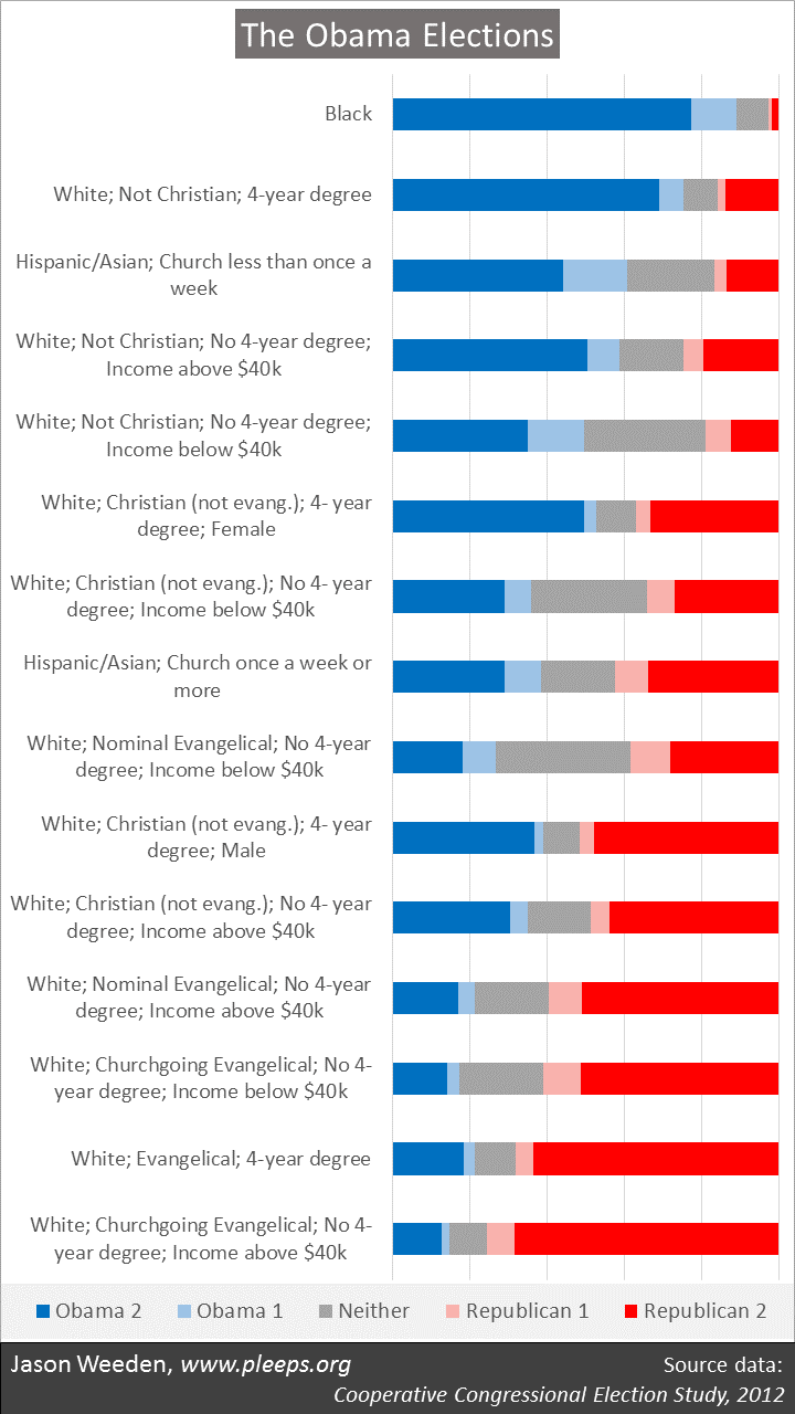 (Notes: Results are weighted. “White” means non-Hispanic white along with a few “others” (i.e., not black, Hispanic, or Asian)—I suspect the “others” in this sample combine some genuine “others” with lots of non-disclosing whites. “Not Christian” includes both the non-religious and those in non-Christian religions. “Evangelical” means Christians who self-identified as “born again or evangelical” or Mormon; “Nominal Evangelical” means Evangelicals who reported going to church less than once a month; “Churchgoing Evangelical” means Evangelicals who reported going to church once a month or more.)
The Obama Coalition (and the Pre-Trump Republican Coalition)
The Obama coalition is typically described as minorities and young people. Longer descriptions might add other demographic elements—for example, women (particularly college-educated women or unmarried women), the highly educated, and gays and lesbians.
There’s some truth to all these categories, but overall the conventional descriptions typically are somewhat misleading. Primarily, there are two key demographic features of the Obama coalition, and while one (race) is almost always mentioned, the other (religion) is almost always ignored. I’m not sure why that is.
Really, as shown in the chart, the central elements of the Obama coalition were: Blacks (who not only favored Obama very strongly in the CCES data, but also reported high turnout); white non-Christians (especially those with more education, or, if not more education, then more income); less-religious Hispanics and Asians; and white non-evangelical Christian women with more education—Hillary Clinton herself is an example of this last group. (These are the same kinds of divisions that I find when looking at post-2012 data from Pew political surveys on items such as ideology or party identification.)
Some of the demographic features often mentioned for the Obama coalition are probably best viewed as offshoots of the core demographics, or at best as second-tier themes. Yes, younger people tended to vote for Obama, but this is in large part because younger people are substantially more likely than older people to be racial minorities and less religious. If I look in the CCES sample at Millennials who are white Christians, for example, 35% reported voting for both McCain and Romney while only 23% reported voting for Obama twice. These folks are just not properly viewed as part of the Obama coalition. (Yet it’s worth noting that I would normally expect younger people to be less likely to vote, but this doesn’t really show up as a big deal in the CCES data—suggesting that these elections had unusually high turnout from Millennials relative to a low-expectation baseline.)
In a related manner, those with college degrees often voted for Obama, but not when they were white Christian men or white Evangelical women. And, sure, unmarried women often voted for Obama, but lots of black and/or less religious women are unmarried relative to religious whites.
Most of the typically mentioned features, though, do make differences at the margins. If I had made even more splits beyond those shown in the chart, then there would have been some additional marginal roles for age, gender, marriage, and education, mostly in line with the standard story. Also, even taking all these features into account, union members were more likely to support Obama and military veterans were more likely to support Republicans. But, still, the biggest deals (in terms of getting the most bang for one’s buck in teasing apart Obama voters from Republican voters from non-voters) are as shown in the chart.
The 2008/2012 Republican coalition was mostly the reverse of the Obama coalition. The chart shows the central Republican demographic groups: White evangelicals (especially when churchgoing and non-poor) and, secondarily, white non-evangelical Christians (especially with some combination of more income, moderate education, and maleness). Also, Hispanics and Asians who go to church weekly favored Republicans over Obama.
Many discussions of Democrats’ “identity politics” seem a bit weird when looking at both the Obama and Republican coalitions simultaneously. Was the Obama coalition more grounded in race and religion and gender than the Republican coalition? Not really. It’s just that it’s often noticeable when racial minorities, non-Christians, and women seek to level the playing field, whereas it’s more likely to be an unnoticed “normal background state of affairs” when white Christian men want to maintain the field’s tilt.
The myth of white working class Obama voters
As I mentioned, there have been some (revisionist) takes about how Obama attracted widespread support among the white working class (and particularly from low income whites), something Clinton failed to do. It certainly seems to be the case that whites without college degrees voted for Trump by historic margins and, in a related vein, that income differences between the two parties’ voters narrowed. But the CCES data should caution against the view that the white working class had previously been a core element of Obama’s voters.
Really, the CCES data suggest that whites who have both less education and less income were unusually likely to not vote at all in the Obama elections (i.e., in the chart above, there’s lots of grey in those groups). This is likely in part a general phenomenon—people with less education and less income are just less likely to vote, regardless of the candidates. But it also might be in part a response to the specific candidates in those races.
Given the low turnout of low education/low income whites in the Obama elections, one shouldn’t jump to conclusions about Trump’s voters. Some of Trump’s enhanced support from working class whites could have been Trump picking up previous Obama voters, but lots could have come from previous non-voters deciding to come out for Trump, or from previous Obama voters staying home in 2016. We’ll need to see very large individual-level (and not just state-level or county-level) datasets on 2016 voting in comparison with 2012 voting to figure out what really happened. (This, presumably, will be coming in 2017 when CCES releases its 2016 sample, and Pew probably already has such data as well, though public release won’t happen for a while.)
The complexity of coalitions
So now Democrats are thinking through how to fortify their existing coalition, which is still larger than the Republican coalition, but is not well-positioned geographically and is made of up some folks who require a lot of prodding to actually go vote. Many are calling for a renewed focus on low income whites, and while that would help geographically, it’s still a group that often has low turnout. But it’s also important to keep in mind that there are other options. For example, Trump’s white nationalism creates further Democratic openings with degreed whites—especially degreed non-evangelical Christians—who would actually be attracted by the adoption of more center-right rather than more progressive economic positions.
Whatever groups are to be courted, the key, ultimately, is giving them what they want—it’s in modifying existing position packages of the parties, perhaps not wholesale, but at least as a matter of emphasis. For example, many proponents of expanding Democratic appeal among the white working class argue (correctly, as we’ll see) that low income whites would often prefer more emphasis on economic populism coupled with less progressive positions on civil rights.
But such appeals are never without costs. For each voting group drawn closer by a given agenda, there are other voting groups that are pushed away.
To help in thinking about these complex matters—what groups might be further wooed, and what groups would be turned off by wooing them—I show in the chart below a basic analysis of how these demographic groups in the CCES sample land when asked about their policy preferences on economics (i.e., tax-and-spend items), immigration/race, and lifestyle (i.e., abortion and gay rights). The redder the dot, the more conservative on average; and the bluer the dot, the more liberal on average.
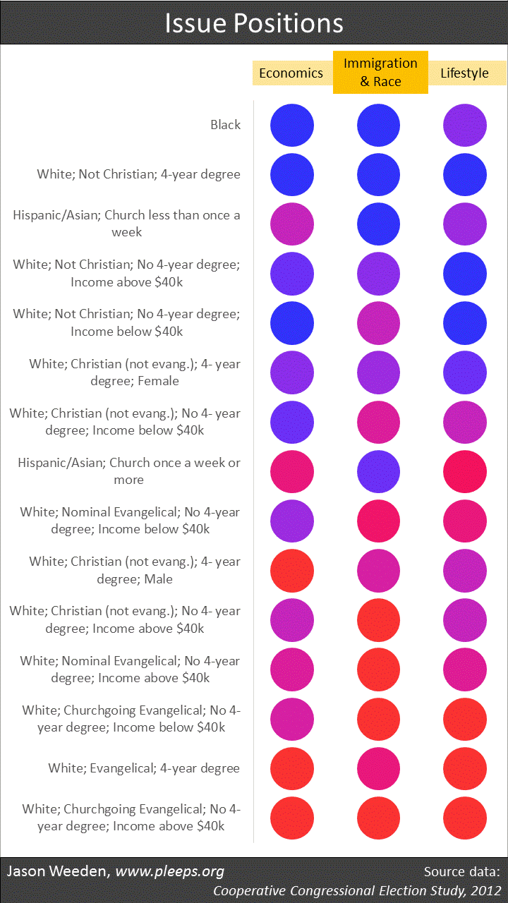
Yes, if you look at the white groups with low education and low income, they’re more conservative on immigration/race than on economics. But who’s more conservative on economics than on immigration/race—that is, who would be relatively turned off by an increased Democratic focus on progressive economics coupled with a decreased focus on civil rights? Mainly, it’s Hispanics/Asians, who are often economic centrists but progressive on immigration/race. Also, white non-evangelical Christian men with college degrees—they’re on average economic conservatives but more moderate on immigration/race (and on lifestyle issues).
I’ll leave the analysis there for now. Both of the charts in this post have other interesting things going on—take some time with them. (And if you’re really interested in this kind of thing, Kurzban and I have a book on the demographics of political positions using General Social Survey data, with issue-by-issue analyses as well as demographic group-by-group analyses.)