
Trump won the Electoral College because he turned a number of Obama states red—Florida, Pennsylvania, Ohio, Michigan, Wisconsin, and Iowa—while Clinton failed to turn any Romney states blue. But the state-level shifts involved much more than just (or even primarily) these states.
When comparing Clinton-Trump margins with Obama-Romney margins, some of the biggest movements involved states that get a lot less attention. States where Trump did substantially better than Romney include a number of non-swing states, some red (such as North Dakota, South Dakota, and West Virginia) and some blue (such as Maine, Vermont, and Delaware). In Delaware, for example, Obama beat Romney by 19 points (59 to 40) while Clinton beat Trump by only 11 points (53 to 42).
And in some other states, Clinton actually did substantially better than Obama. These include most of the states bordering Mexico—California, Arizona, and Texas—where, apparently, the Big Beautiful Wall was not an effective selling point. In Texas, for example, while Romney beat Obama by 16 points (57 to 41), Trump beat Clinton by only 9 points (52 to 43).
So what accounts for the state-level shifts? A major part of the answer is that many of the states where Republicans did better in 2016 than in 2012 were states with lots of non-degreed whites, while many of the states where Democrats did better in 2016 than in 2012 were states with lots of Hispanics.
I took the state-level outcomes from 2016 and 2012 and loaded in a few state-level demographics (based on a large aggregation of Pew political surveys). And, indeed—though there’s more going on than just this—I find that a pretty efficient way to make sense of the bulk of the states’ shifts from 2012 to 2016 is to take the percentage of non-degreed whites in a state’s adult population (i.e., non-Hispanic whites without 4-year degrees), multiply that by 1.75, and then subtract the percentage of the state’s adult population that is Hispanic or Asian. So, basically, it’s non-degreed whites minus Hispanics/Asians (but weighting it such that the more important factor is the percentage of non-degreed whites).
The chart below gives the picture. The left-to-right axis is NOT Clinton vs. Trump, but is Clinton-Trump vs. Obama-Romney. That is, it’s the extent to which Democrats did relatively better in 2016 than in 2012 (values to the left of 0 on the left-to-right axis) or Republicans did relatively better in 2016 than in 2012 (values to the right of 0 on the left-to-right axis). The top-to-bottom axis shows states with lots of non-degreed whites relative to Hispanics/Asians towards the top vs. states with relatively more Hispanics/Asians and relatively fewer non-degreed whites towards the bottom. (Keep in mind the relative point here. Some states with low numbers are low mostly because they lack substantial numbers of non-degreed whites (e.g., DC and Maryland) while others are low mostly because of they have lots of Hispanics/Asians (e.g., California and New Mexico). The states with the highest numbers are all states where non-degreed whites are quite a high percentage.)
The overall trend is apparent: The more non-degreed whites relative to Hispanics/Asians that a state has, the better the Republican performance in 2016 tended to be as compared with 2012. And the more Hispanics/Asians relative to non-degreed whites that a state has, the better the Democratic performance in 2016 tended to be as compared with 2012.
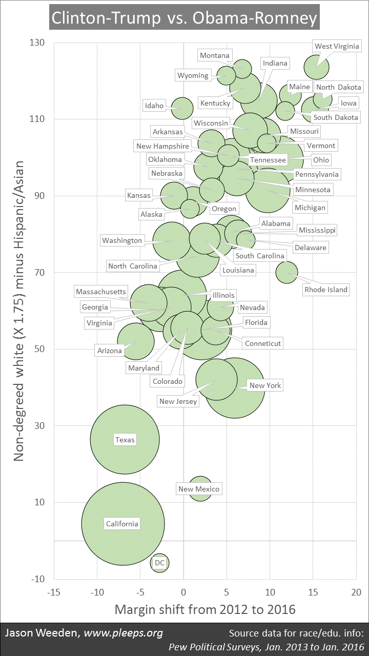
The simple race/education number does a good job accounting for two of the biggest Democratic shifts—in California and Texas—and also does well with a cluster of states with very strong Republican shifts—in North Dakota, West Virginia, Iowa, Maine, South Dakota, Ohio, Michigan, Vermont, Missouri, and others.
But there are outliers as well. Two of them are so far-out that I couldn’t sensibly fit them on the chart. The biggest outlier is Utah. Utah has a non-degreed-white-vs.-Hispanic/Asian profile that looks similar to Alabama and Alaska. But instead of the small Republican shift this might have predicted, Utah instead was hugely less favorable for Trump than for Romney (though Trump still won the state). Utah was where the third-party candidate Evan McMullin had by far his best performance, getting 22% of the vote. This contributed to Trump performing about 29 points worse than Romney. McMullin also helps explain why Idaho is somewhat of an outlier—there, McMullin got 7%, explaining why Idaho landed very close to its 2012 margin even though it should have trended more Republican like other similar states. (In no other state did McMullin get even 2%.)
The other big outlier is Hawaii. Despite having dramatically more Asians/Pacific Islanders than non-degreed whites, Democrats actually performed worse there in 2016 than in 2012 (though Clinton still won easily). This, of course, probably has to do with Obama being a native son of Hawaii, thus getting an unusual level of support in 2012 that dropped off for Clinton. I wonder if something related is going on in New York (and maybe New Jersey)—perhaps Trump did get a bit of a home-field bump after all (though not enough to win there), even though Clinton is herself a (transplanted) New Yorker.
There were a few other states that didn’t line up quite as the simple demographics would expect. Rhode Island is especially noticeable—it had a shift one would expect from a thoroughly white-working-class state, though it’s not especially. I have no idea what might have led to this movement. (I found an article by a local reporter on the unusual Rhode Island shift, and that guy had no solid ideas either.)
Now, this kind of state-level analysis can’t tell us what’s really happening at an individual level (see my post about the ecological fallacy). But it’s a clue that’s basically consistent with the emerging picture. In particular, the 2016 exit polls showed a tremendous increase in Republican support among non-degreed whites compared with prior elections. This really does appear to be the central demographic trend of the 2016 presidential election, one likely to be fueled by Trump’s embrace of white nationalist positions that non-degreed whites already found appealing before Trump’s campaign. In short, Trump crafted a message to appeal particularly to non-degreed whites, and in the end they shifted his way—not enough to give him the popular vote, but just enough to give him the Electoral College, where white-working-class states have outsized influence.
As for Hispanics, though the exit polls don’t show an unusual margin for Clinton relative to Obama, they do suggest an increase in voter share that’s consistent with Hispanic population growth. It could be that Clinton’s gains in many Hispanic-heavy states involve some combination among Hispanics of population growth, increased turnout, and voting margins that were perhaps somewhat higher than the exit polls showed (this has been a matter of some debate). But here’s where the ecological fallacy comes in. You just don’t know with group-level data. It could be something funky—for example, college-educated whites in Hispanic-heavy states might have especially disliked Trump relative to Romney (something that would show up in group-level data as simply an effect of having lots of Hispanics in a state). Or it could be something else—for example, some other confounding variable that I didn’t think to check.
As always, I’ll need to see data on lots and lots of individuals before reaching firmer conclusions. That will come later this year as we get public releases from ANES, CCES, and Pew.